Patterns with distinct edges and shapes have been implemented by humans for centuries to use geometry as a form of expression. Studies of Palaeolithic cave art have revealed that even the earliest humans were fascinated by geometric patterns. Some of the earliest documented artistic examples came from the Geometric Art Period (circa 900-700 B.C.) in Ancient Greece.
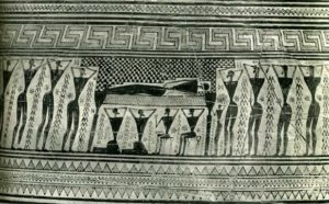
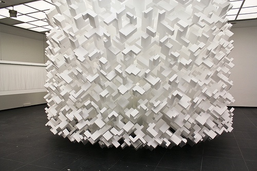
Greek philosophers Pythagoras and Plato were strong believers in the idea that these geometric patterns, or “sacred geometry”, had symbolic and sacred meaning to them. There is no available explanation for why these patterns were deemed sacred. However, the concept of using geometry as an art form stuck and evolved to take on a wide variety of meanings. Geometric art is found in religious architecture all over the world, but it also evolved to take on a more creative than functional position in the art world. One massive example is John Powers’s God’s Comic (Fat Bastard).
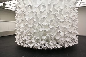
The only readily available information on this piece is that the large piece was “constructed” in 2010 when John Powers meticulously arranged and rearranged polystyrene shapes. The process that the artist went through to create this work clearly identifies a desire for structure and organization, which is embodied by the piece itself.
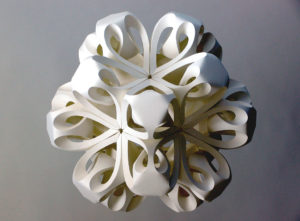
Other examples of contemporary geometric art include the paper sculptures of Richard Sweeney. He studied Three-Dimensional Design at Manchester Metropolitan University after finding that he had a knack for sculpture. Sweeney claims that he is driven by “an experimental hands-on approach, utilizing the unique properties of often mundane materials to discover unique sculptural forms. Again, this suggests a desire for creative organization. One of his sculptures is shown below.
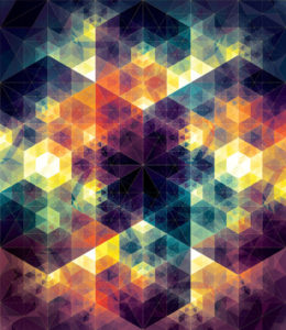
Geometric art has also had an influence on paintings and photography, particularly booming in the 1960’s with psychedelic and fractal art. One such artist who took inspiration from this style was Andy Gilmore. A graphic artist from New York, Gilmore seems to have taken some kaleidoscope-esque inspiration from the geometric art of the 1960’s in the piece below. Another major influence on Gilmore could be the industrial nature of his community, inspiring a passion for geometric patterns.
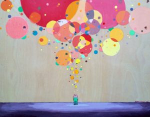
The painting below by Stephen Lursen also exhibits some of these influences but uses softer lines with a circular pattern rather than the hard edges seen in Gilmore’s work.
One artist takes this concept to another level creating entire giant portraits from shapes. Included is a link to a short video of Josh Bryan creating a portrait of Marilyn Monroe by using triangles. He has created many other portraits of celebrities like this one, which can be found on his website.
Geometric art is even used in art that we incorporate into our every day lives. One man decided to decorate his newborn-to-be’s room using a 3-D printed triangle and grid lines on the walls.
References:
“An Explanation for Our Aesthetic Appreciation of Geometry.” Sam Woolfe. N.p., n.d. Web. 25 Jan. 2017.
Author: Department of Greek and Roman Art. “Geometric Art in Ancient Greece | Essay | Heilbrunn Timeline of Art History | The Metropolitan Museum of Art.” The Met’s Heilbrunn Timeline of Art History. N.p., n.d. Web. 25 Jan. 2017.
Richardsweeney.co.uk. “Biography.” Richard Sweeney. Richard Sweeney, n.d. Web. 25 Jan. 2017.
Images:
http://blazepress.com/2015/01/geometric-art-andy-gilmore/
http://www.neatorama.com/2012/02/23/geometric-art-of-john-powers/
http://donnadowney.typepad.com/.a/6a00d83451929069e201a511f245ab970c-pi

4 Comments. Leave new
[…] tiles have become quite popular, but their timeless geometric aesthetic ensures they remain stylish for years. Their versatility allows them to fit into various interior […]
Just realized I submitted my previous comment to the wrong post, I apologize for that.
Here is my actual comment:
Good background on the specific aesthetic. The examples were really nice and spread over a large portion of geometrical shapes. The video was super interesting and showed a great way of applying the aesthetic. Geometry in art and design is fascinating and this was a great introduction to the subject.
Things to improve include labeling examples with specific names and titles (dates would help as well). The video is a bit long for the post as well.
Gave some great insight into a more modern aesthetic that not many people know about. Lots of great examples were provided throughout the write up with good background on how they relate to the aesthetic. The writing style seems to flow throughout and pull the audience in to be more interested in what is being explained. Only things I noticed that could use some improvements were some of the placements of some of the pictures and the lack of labels on some of them towards the end.
The usage of geometry to improve aesthetics is fascinating because it seems to be abundant in various works of art. They appear in civilizations that have little to no exposure to one another, suggesting they have value beyond elements that are considered a cultural construct. Geometry is an element of mathematics, which is the quantified representation of the natural world. Therefore, geometry itself is a representation of the natural world. It’s no wonder they have sacred ties because if god created the natural world, then geometry can be thought of as a framework or blueprint in which the world was designed. For humans to artificially recreate geometry in the form of art is to mimic their own creator’s design process.
Strength:
There’s a good variety of examples of where geometry is demonstrated as an aesthetic in artwork. This is demonstrated in terms of different timelines and geography. Finding commonality (geometry) across all of these different usages helps analyze the aesthetic for its own merit, demonstrating a “truth” about it.
Suggestion for Improvement:
I would like to see more synthesis on the topic. There is a good deal of analysis from different works of art. I’d be curious to get your take on why geometry is used as a form of aesthetic.