The sub-genre of pop-cult minimalism can be most easily traced to the emergence of Pop Art in the 1950s in England and America. Notable figures such as Andy Warhol and Eduardo Paolozzi pioneered pop art by taking culturally relevant imagery—often of a commercial nature such as advertisements or product designs—and putting a critical spin on the subject matter. Pop art of the ’50s was largely considered a reaction to abstract expressionism from the ’30s and ’40s, a trend of surrealism and spontaneity in art that included splatters, geometry, high-contrast reductionism, and other styles often vaguely included in the concept “modern art.”
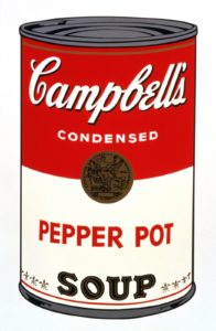
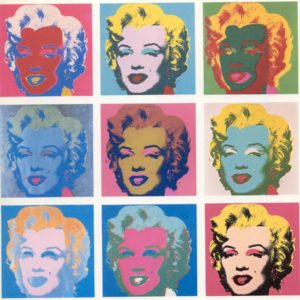
Andy Warhol
The status of comic books, musicians, and film in the cultural eye made them perfect subjects for this treatment, coming to define the trend as it were, “popular” art. This genre has gradually expanded to included books, television, and in recent decades video games and even board games. The aesthetic of young English graphic designer Oliver “Olly” Moss is a modern expression of many classic pop art ideals… simplicity in design, a connection to an established icon, but a twist on the interpretation or understanding of the content. Born in 1987 (he turned 30 this week), Olly Moss is perhaps best known for his film posters and audiobook covers, having been commissioned by Amazon for the 2015 publication of the Harry Potter set on Audible.com.
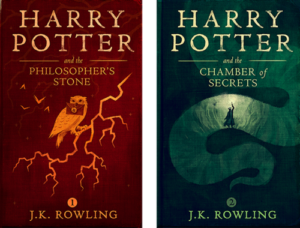
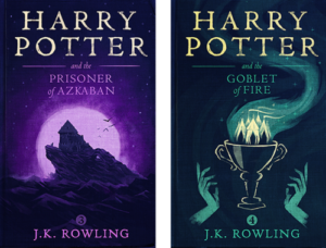
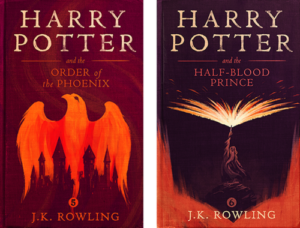
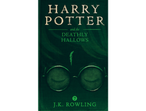
Beyond the immediately-noticeable single-hue or single-gradient coloration of these paintings, Olly has taken known imagery and iconography and presented it in a unique fashion. The key aesthetic here could be described as a high-contrast double-image… in every Harry Potter cover there is an immediate interpretation of the image, such as a book or a bird, but in moments the second image becomes apparent, like a wizard’s spell or the towers of a castle. This double-image style connects multiple subjects and often offers an easily-accessible hidden meaning: an outside joke, if you will. It doesn’t hide from the audience, but still provides a moment of excitement and appreciation when noticed. This is on top of the skilled artistic nature of the works, which is not to be ignored. Olly’s command of physical, digital, and mixed media color and contrast is superb, showing itself in a wide range of pop-cult minimalist pieces. His film posters (both commissioned and for personal enjoyment) for example are typically a combination of Photoshop vectors, watercolor, and oils, blended digitally with text to achieve the final product. Below are some notable examples following his single-gradient, double-image style.
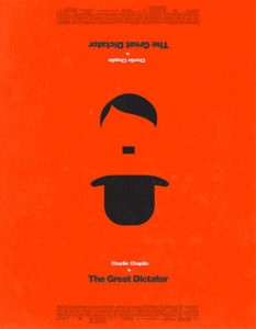
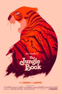

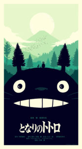
Occasionally available to the public as limited-run screen prints, these posters sell out online in seconds. The Star Wars set (see Empire above) was sold for $50 each through the online art shop Mondo Tees in 2010 but is so limited and is considered so iconic that the complete set has sold for over $8,000 through art trading websites.
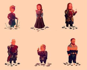
But beyond the high caliber of these productions, Olly combines this artistic style with his ability to re-imagine popular culture characters and stories as something else, often presenting an image starkly contrary to the actual content. For instance, his series on Game of Thrones portrays barbaric players (including rapists and assassins) as lovable children’s book characters. These pieces are much in the vein of his Pokemon miniatures, but with far more adult content behind them. This presentation—beyond some academic claim that it makes us “rethink” something—simply imbues the subject with an endearing quality likely to have a profound effect on audiences already fans of the reference material. Nostalgia, lovability, even a sort of poetic tragedy can be conveyed in this manner, the aesthetics clearly expanding (or in some cases, redefining) the emotional impact of the work. In this case it’s not literally a second image within the main one, but a contradictory emotional image understood by the observer. This sort of artistic irony is a direct application of “classical” pop art styles from decades earlier.

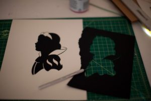
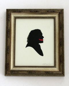
A particularly unique exhibit of Moss’s work featured hand-cut paper silhouettes of pop-culture characters, from Super Mario to Saved By The Bell. One of the most striking images in the gallery was Heath Ledger’s Joker from The Dark Knight, well regarded as one of the most haunting and memorable portrayals of a villainous character in film. Of over 200 finely-crafted silhouettes, this was the only piece to contain a color other than black and white… Olly added a slash of red to the Joker’s face, the iconic “smile” that asks of us, why so serious? He could have left that part out. The image is entirely recognizable without that bit of color; Olly’s ability to convey identity with outlines and B/W detail is unquestioned. But he broke the style of the exhibit, created an exception in this aesthetic, almost suggesting that the ideal itself had been scarred, had been damaged. Or perhaps to speak to the tragedy of Ledger’s death following this role, that this was the only subject who had been killed by the character, the image, he took on. As observers, it is up to us.
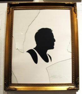
My personal favorite piece from that exhibit was the depiction of Bruce Willis from Die Hard. Each work of this exhibit was mounted on a simple white wall, framed and glassed. This entry, however, had the glass broken and pieces on the floor. Another instance of Olly’s love for double imagery, fans of the film may recall the chilling Die Hard scene in which Willis scrambles across the floor under gunfire, bleeding profusely from unavoidable shattered glass. In this instance the dual-image comes not from the picture or its emotional effect; the very presentation of the physical artwork itself refers to a scene that begins to play in our mind, sending shivers down the observer’s spine at the thought of having to sprint over a veritable carpet of glass shards.
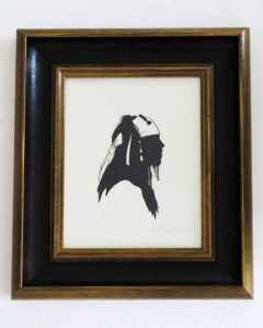

This ability to portray immediately recognizable subjects and attach a secondary image to the artwork all while employing minimalist design techniques makes Olly Moss one of the most skilled and influential contemporary pop artists.
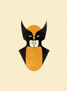
Bonus Olly Moss: Wolverine that’s also two Batmans.


2 Comments. Leave new
I really like the attention to detail that you had in this post. Giving a brief history of the aesthetic gives the reader a great insight into the pop cult minimalism culture. Olly’s interpretations on many classics are one of my favorite things to look at.
Gave some great insight into a more modern aesthetic that not many people know about. Lots of great examples were provided throughout the write up with good background on how they relate to the aesthetic. The writing style seems to flow throughout and pull the audience in to be more interested in what is being explained. Only things I noticed that could use some improvements were some of the placements of some of the pictures and the lack of labels on some of them towards the end.