Santiago Calatrava is one of the worlds most revered modern architects. He has bold iconic and polarizing designs that span the globe and draw mixed opinions from all of those who encounter these designs. When looking at the designs themselves distinct features flow through the years of Calatrava architecture. White natural flowing shapes are something that can be seen through all of his work.
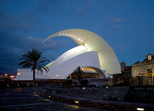
photo: http://www.jmhdezhdez.com/2012/07/fotos-auditorio-de-tenerife-calatrava.html
The work above symbolizes a wave crashing onto the music hall below. situated right on the edge of the water the iconic music hall is one of Calatrava’s early works from 2003. The building is made of all concrete which is then painted white to give the sharp contrast with the surroundings that has become a signature of Calatrava. This building sets a tone for some of the futuristic and aesthetic first buildings that are later to follow in his career.
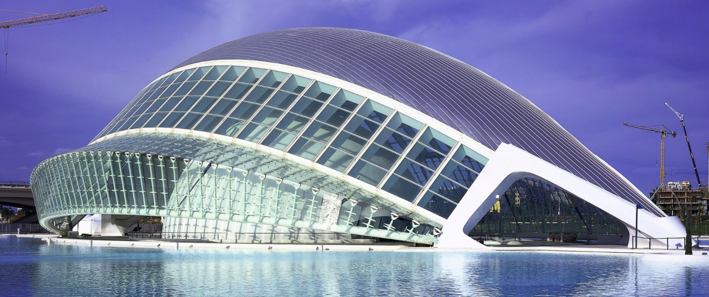
Photo : Calatrava.com
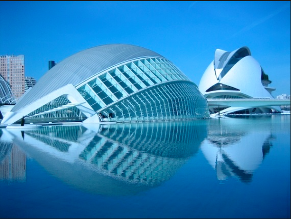
Calatravas work has followed a similar pattern as it has progressed forward. Some of his more recent designs feature a ribcage like features which create a large auditorium within for the users. The design here again uses white concrete as the support structure of the and to provide a smooth flowing aesthetic which seems to just rise out of the ground. This is one design of a large site with many more Calatrava buildings on it. the below picture shows more of the same building as well as some of the other Calatrava features in the same area of Valencia. the other buildings also follow and extremely similar characteristic to some of his other works.
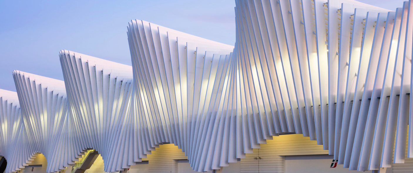
The below building is a train station in northern Italy which shows similar features of Calatravas signature white concrete rib design alone the entire feature. The natural flowing mimics waves in the sand and provides a welcoming feeling when approaching the building.
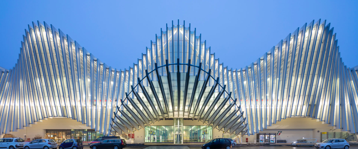
Photos: calatrava.com
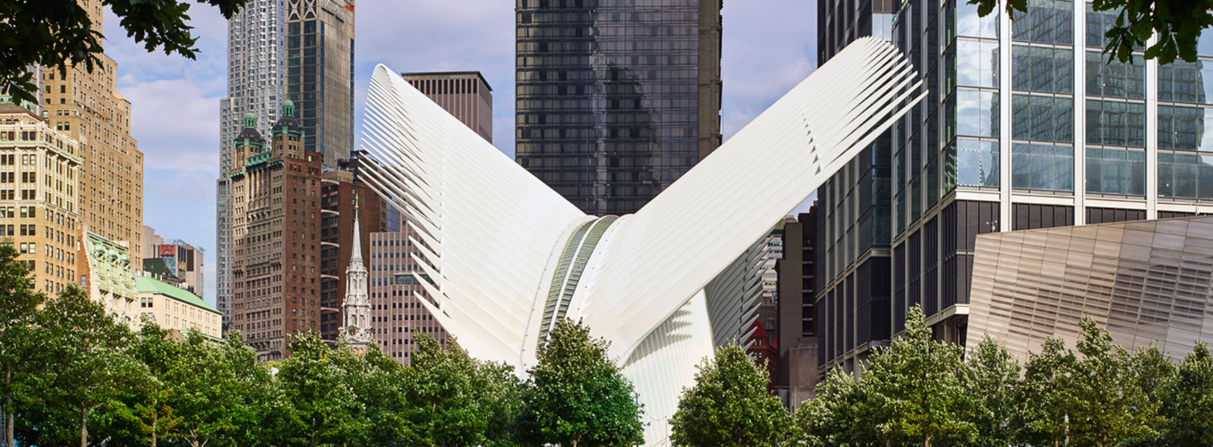
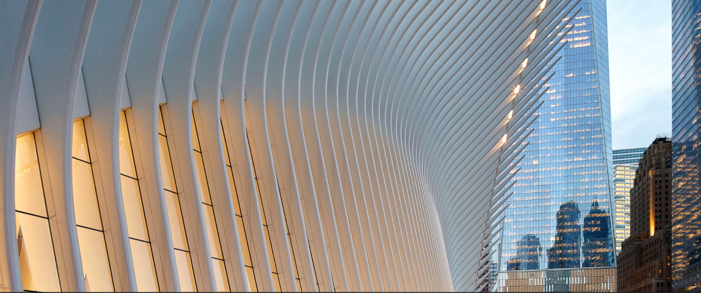
The new transportation hub located in the World Trade Center complex is Calatrava’s most recently completed work. This building demonstrates the smooth flowing white concrete signature design with the incorporation of the ribcage like structure. Above the ribcage appears to emulate a birds stretching its wings which fits very well given the location of the building. The building is symmetric across a diagonal axis of the roof with the extended wings, and creates a large open space atrium within for all users to appreciate. There are several views of the new transportation hub below.
Photos: calatrava.com
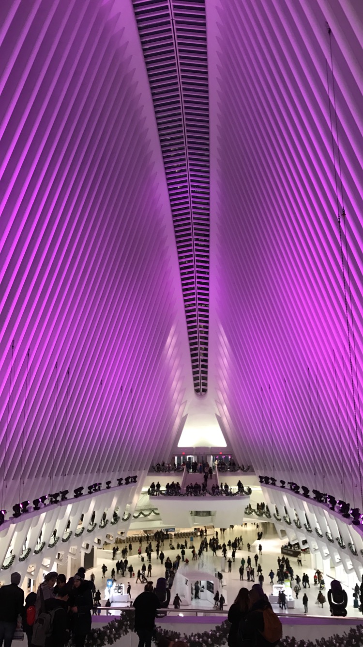
Photo: Max Scrimgeour


4 Comments. Leave new
This is really cool architecture! I now want to go to these buildings and appreciate the art in the design of each one. I wasn’t aware of this architect, but I now want to look into more of his work.
Very cool post! Calatrava evokes complex simplicity through his modern designs. The use of white makes his design modern and clean, while the intricacy of the spines and organic shapes are mesmerizing. The symmetrical aspects of Calatrava’s designs are also very intriguing. Thanks for sharing.
Calatrava is one of my favorite public architecture architechts. His style is definitively defined by white, curvaceous structures. Several of the structures have a dynamic component to them as well, such as the Milwaukee Art Museum, which has “wing” like structures which open and close. Great post!
These are actually really cool designs, I really wonder how they build those. I didnt know about Santiago, but he really put some thought and aesthetics into those buildings. Great post!