The aesthetic called a “touch of color” or “dash of color” has been used in still art, photography, and film for years. The aesthetic uses backdrops or settings that are substantially desaturated or even gray-scale with a single saturated element. It forces an instant response from audience to focus on the saturated element and uses the extreme contrast to dramatize the scene.
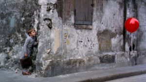
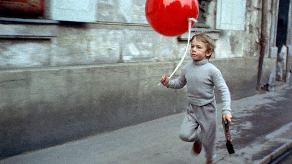
One of the most famous early examples of this aesthetic comes from the French film “The Red Balloon” directed by Albert Lamorisse, as seen below. The dash of color exhibited by the balloon creates feelings of hope and frivolity.
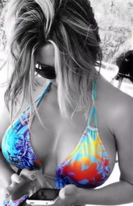
The following images use the “touch of color” aesthetic to similarly invoke positive feelings in the audience using different colors.

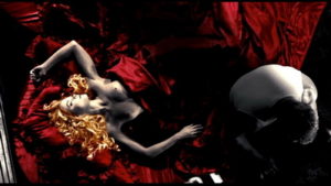
In juxtaposition with “The Red Balloon”, The films “Sin City” and “Sin City: A Dame To Kill For” are modern, graphic novel-themed takes on the noir films of old that use the “touch of color” aesthetic, specifically with red, to invoke feelings of shock, dread, and excitement by highlighting the extreme aggressive and violent nature of its male characters as well as hyper-sexuality of its female characters.



References:
Beautiful Girl. Digital image. Media Cache. Media Cache, n.d. Web. 24 Jan. 2017. <https://s-media-cache-ak0.pinimg.com/564x/5a/9e/69/5a9e69cd4d451ab20aabd77c2b50da29.jpg>.
Goldie. Digital image. Tboake. Tboake, n.d. Web. 24 Jan. 2017. <http://www.tboake.com/film_06/sincity/SIN_CITY_RECUT%20%20%20%20%20%20%20%20%20%20%20%20%20%20%20%20%20%20-123_resize.jpg>.
Kevin. Digital image. Avclub. Avclub, n.d. Web. 24 Jan. 2017. <http://i.onionstatic.com/avclub/5502/80/16×9/960.jpg>.
Marv. Digital image. Youtube Images. Youtube, n.d. Web. 24 Jan. 2017. <https://i.ytimg.com/vi/OqvYwxNzjO8/maxresdefault.jpg>.
ModArt. Digital image. Media Cache. Media Cache, n.d. Web. 24 Jan. 2017. <https://keithandthemovies.files.wordpress.com/2012/08/red-balloon.jpg>.
Red Balloon – The Opening. Dir. Albert Lamorisse. Perf. Pascal Lamorisse. Youtube. Youtube, 3 Jan. 2013. Web. 24 Jan. 2017. <https://www.youtube.com/watch?v=Z__JAVAJcE0>.
Sin City: Stills : 1629. Digital image. Moviesmademe. Movies Made Me, n.d. Web. 24 Jan. 2017. <http://www.moviesmademe.com/stills/460_16929.jpg>.

2 Comments. Leave new
I have actually seen this aesthetic before, but never knew that it was a trending thing. I think the red balloon looks awesome to highlight some sort of symbolism to the rest of the photo. Black and white photos tend to be kind of gloomy and sad at this day and age, and the touch of color really brings a different emotion to it. I think you could also add different touches of color to make a sad reference to something. You could also use this for advertising in a subtle manner,
Would it look bad to highlight more than 1 color? I think it would definitely break the point of this aesthetic.
I’m a fan of this aesthetic. I’ve seen some beautifully executed examples of this. I’ve tried searching for them to include in my reply, but I can’t find them, unfortunately. However, I think this is an aesthetic that amateur photographers or photo editors often try out and the end result is cheesy or poorly executed. But when there is a lot of thought put in to the object shown or to a specific color, I love the results. I feel like these kinds of photos usually give off a sad and somber emotion, and the color pop is some sort of form of hope or happiness within the picture.
Do you think that the object highlighted is more important, or is a focus on specific colors more important in this aesthetic?