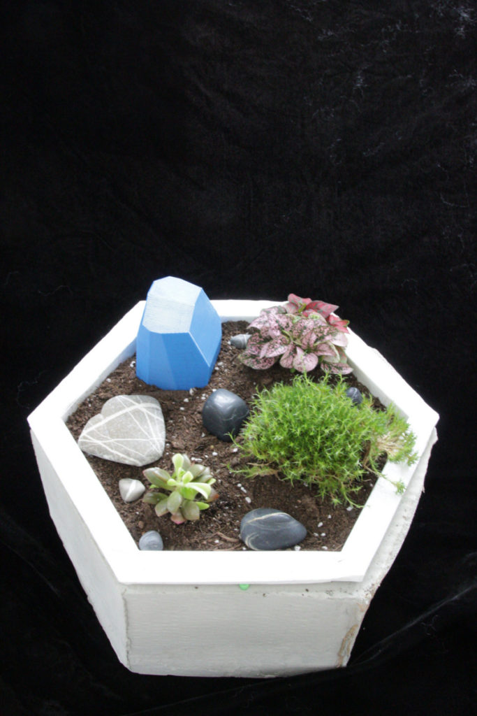
The desk garden is currently a nice addition to my desk. I made it because I like plants and wanted to start keeping some. My desk is a little bare, so the desk garden livens it up.
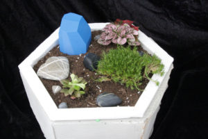
Originally, I thought I would use a square footprint and that the planter would have an overhead watering system. I decided that square wasn’t interesting enough, and the corners would be too sharp. Hexagons are cool, so I decided to make the garden a hexagon. I also originally intended that the planter would water itself when it was dry, and that it would light itself during the day when it gets dark in my room. I was unable to add these capabilities over the course of the semester, but I still really want that functionality.
At the design expo, people reacted well to the desk garden. Most thought it was a cool idea, and a great concept for offices, especially people who want office plants, but forget to water them. I got many suggestions on things I could do with the planter, but the one that most stuck out to me was ‘micro irrigation’. Instead of having a tube that sprays water at the plants, I could run a drip tube around under the dirt that more evenly distributes the water.
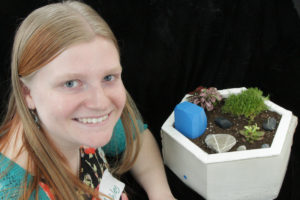
I learned quite a bit from this project. Firstly, as is usually the case, projects will always take way longer than anticipated. I tried to stay on top of it and get it done early so I would have time to get all the features working, but it didn’t quite work out that way. I also learned that nothing I make will ever be perfect, but at some point, I need to stop looking at the flaws, and enjoy it for what it is.
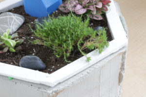
What will I do next with the Desk Garden? Get the watering feature working, and make the rock a little thinner so the lights are visible during the day. I may also add more lighting that is powerful enough to actually give the plants what they need. I would also like to learn how to work with ceramics so that I can make a lighter and prettier base. I’m pretty happy with the dirt box, so I’ll leave it be. The Desk Garden is indeed living on my desk right now, near the window. I like it, and I’ll take it with me when I move. I really hope the plants thrive, especially the moss.
What would I have done differently? Devoted more time to this project. I really wanted to have it water itself, and I wish I could have gotten that working for expo. I also wish I had fixed the concrete and the waviness in the plastic. I also should have tried to make the bottom of the base even, but I was afraid to touch it, lest the mold break again. As I mentioned in the last post, I would like to have made the base out of ceramic so it fit the minimalist aesthetic. I also would have liked to use dark wood veneer around the visible surfaces of the dirt box, because that would have been much prettier than the plain white plastic.
I’m not exactly sure what I expected to learn in class. I guess I thought that there were rules to designing pleasing, or not pleasing, objects. I have learned that in a way, there are rules, such as the Universal Principles of Design, but also that design is first and foremost about functionality, form, or both. Design is much more open-ended than I first appreciated. The most interesting thing to look at in the class were different ‘aesthetics’, because there are an endless number of them. I also found the major Design Movements interesting, but for some of them, I’m still not too sure what they are, like post-modernism, or International Style.
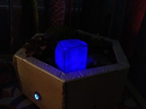
Overall, I’m pretty pleased with my final product. In the end, it accomplishes its goal, and it looks pretty cool in my room, even when it’s dark, thanks to the glowy light box.

1 Comment. Leave new
I agree 100% with the statement that we shouldn’t focus too much on the flaws and enjoy it for what it is, which is a big lesson I learned from my project too. And I think that’s what’s great about this class. It allows us to practice new skills, and what we make in the future can only get better. Once again, this is a great project that’s very unique and technological.