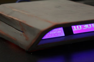
The journey of designing and manufacturing this digital display was both frustrating and time consuming, but there were a lot of good lessons taken away despite the troubles.
 Wanting to pursue a cheaper option for manufacturing but also wanting to learn a new fabrication technique, I found tutorials online on how prop makers work their magic in the days before 3D printing. Their process involves assembling pieces of paper together to form a basic shape that could later be reinforced with fiberglass and resin and finished off with body filler. This seemed easy on paper, but to do it for the first time led to a lot of mistakes and challenges.
I hadn’t realized the mistakes I had made until much later when I was applying the body filler. Mistake number one was that I should have taken my time assembling the paper body and ensuring that it was absolutely symmetrical. The second mistake was applying resin alone to the paper body without the fiberglass step. Once the resin dried without any structural support from the fiberglass, it deformed the paper body and further caused asymmetry and uneven surfaces. Next time, I would apply the resin and fiberglass at the same time. The third mistake was using clear tape to attach the pieces of paper together. As it turns out, the body filler doesn’t adhere well to smooth, non-porous surfaces such as clear tape. In the future, I would just use glue.

I had to take the body filler and fix these asymmetries and uneven surfaces, which is why this project took so long to complete. Sanding the surface wasn’t too bad as it turns out, which is why I wouldn’t discredit the usefulness of this manufacturing method. In the future, if I were to use this method again, the design should be asymmetrical and avoid flat surfaces.
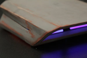
However, this doesn’t mean that this project was a complete failure. Despite still having asymmetrical issues and still poor surface finish, it taught me how to use this new fabrication method in a more efficient way. In the end, I accomplished the aesthetic I was going for, and I really enjoy the beat up edges.
Expo Reactions
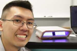
The project received some good feedback, and people were generally interested on what it actually was since it wasn’t evident at first. One feedback I got, which I didn’t think of when designing this, was that the use of blue lights would actually keep the person awake at night if this were used a nightstand display. Also, the brightness of the LCD was overwhelming and needed to be toned down. Based on this feedback, I would choose a different LCD display that allows me to change the color and intensity.

Thanks for sticking around!

3 Comments. Leave new
Despite any difficulties you had while building it, I think it still looks cool. It would’ve been interesting if you could make a silicon mold and make the structure that way. The coloring also seems pretty realistic.
You really did a fabulous job in both finishing this project and the senior design expo. The process is painstaking, but still, you at least learned some professional 3D printing skills which is really useful in your future engineering life. Good job!
This turned out really well, and I really admire the extra work you went into to make it more authentic. It’s tough to avoid the 3D printing, as it is so easy, but the easiness of it takes away a lot of the craft. I think what you’ve been able to do with older techniques is much more impressive. I’m glad you got that feedback at Expo as well, it makes sense what they are saying. Side table lights need to be subdued, as in pitch black everything looks really bright. Way to finish strong!