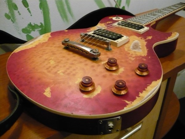
If you haven’t been following along, in my last update I had just gotten the amplifier circuitry working but with just noise coming out when the guitar is plugged in. Through a bit of finagling I was able to get a clean signal coming through the power amplifier and to the speaker. The speaker was very quiet though. You basically have to put your ear up to it to hear it and it is actually quieter than the unplugged electric guitar.
After more fiddling and testing I was able to determine that part of the issue is that the speaker doesn’t have an enclosure at this point. The majority of the speaker volume comes from the enclosure pushing back when the speaker begins moving air causing it to compress. Despite this after throwing together a rough enclosure I decided that the speaker I had chosen simply required more power than my little circuit could provide. To rectify this I have ordered two new speakers with lower resistance and power requirements.
In the meantime I have transferred the working circuit from the breadboard to a little solder-able breadboard I got from sparkfun. Now all of my circuitry fits on a little 1″x2″ board. This should allow me to easily fit it into the guitar either with the existing electronics or near the speaker.
My plan moving forward is begin drawing up where I need to make cutouts in the guitar body while I wait for the new speakers to arrive. Once they are here I will test them with my new breadboarded circuit and finalize the cutouts for the best of my speakers.
I haven’t talked much about my aesthetic lately as I have been elbow deep in electronics for the past few weeks. As a reminder I want to achieve a “road worn” aesthetic; in other words, this brand new guitar should look like it has been someones everyday or touring guitar for at least a couple decades. This aesthetic really falls into the realm of radical design, or anti-design. The anti-design movement was a backlash against modernism seeking to create objects and spaces that were unique and functional rather than stylish and mass produced for maximum sales [1]. The timing of this movement matches much of my inspiration, coming from rockers of the late 1960’s through 80’s.
My aesthetic goal does counter the ideology of anti-design in one key way: it is not meant to be thrown away. Part of what the anti-design movement disliked about modernism was that the objects it created were meant to be permanent. Anti-design practitioners wanted their objects to be used and thrown away. My “road worn” aesthetic in a way combines these two ideologies. It takes an object that was likely mass produced and through use and possibly modification creates something that is unique and functional.
References:
[1] http://www.arthistoryarchive.com/arthistory/antidesign/

2 Comments. Leave new
Whoa, is the picture you posted really the shiny new guitar I saw a couple of weeks ago? This looks sweet! Definitely hitting your aesthetic of road worn and anti-design, like you mention. I think it is a real challenge to put real design and engineering work into a project while making it look like you didn’t.
I haven’t thought about this until now: are you going to put a cover over your speaker?
The sanding you’ve done to make the guitar look “road worn” looks great! Before you put electronics in it, maybe you could hit the body with a hammer a few times to give it some dents too. Or maybe a sock full of quarters for a nice effect?