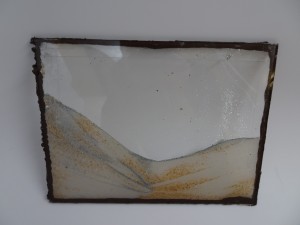
If you haven’t been following this project, I am building a sand picture frame as shown in the image below. (My first prototype)
I will break this post into two sections, the first is a quick update on the progress since the last post, the second section will cover the aesthetic influences on the sand picture frames.
Update:
This week I got all the new materials in and am ready to start building my next iterations. The next iterations I will focus more on the finish of the frame. I am also planning to filter out the course sand grains so that the sand flows better.
The image below shows the tools and the materials I have been experimenting with to build the first sand picture.
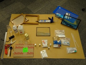
The following images are the tools that I am using with a description on their captions.

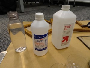

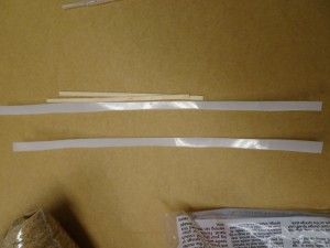

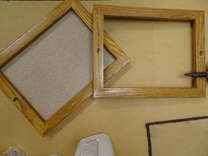
Right now I am working on:
- Looking for transparent or white silicone
- Designing a frame to house the glass
- A mechanism that will allow the user to flip the frame upside down easily
20th century design movements that affected my aesthetic:
At first I wasn’t sure what design movement affected my aesthetic, but now that I thought more about it I think it’s a mix of some design movements as well as some art trends. I think that the sand picture frame I am trying to build is very close to the Arts & Crafts movement 1850s to 1914s because it is more of a decorative piece. The Arts and crafts movement is well known of its furnishings and decorative galleries and the sand picture frame will be displayed a decoration in an office or a house setting. However the shape of the sand picture and frame that houses the glass are more flexible in the sense that they can borrow from different design movements. I think I can change the shape of the sand picture to have more curvy edges to follow an organic design or have the frame in vibrant colors to follow the pop aesthetic movement. I am happy that this post got me thinking about the 20th century aesthetic movements so I can use what we have learned in my design decisions.


2 Comments. Leave new
Wow, you are make really great progress. How are you going to filter out the different granularity of sand? Would you just pass it through finer and finer filters? What kind of finishes are you looking for in your new iterations of frames? I agree with your aesthetic inspirations.
I like your idea to use curving edges or vibrantly colored sand to create a specific aesthetic. Sand frames have always seemed very flowing and organic so the curving intrigues me. It may be interesting to use rustic beach wood with a light blue water and white sand. It would appear like the edge of an ocean which could be interesting – or I just really need a vacation! :-).