Originally, I was aiming for a highly angular design with bright colors and brush fonts, similar to the 80s “High Tech” aesthetic.

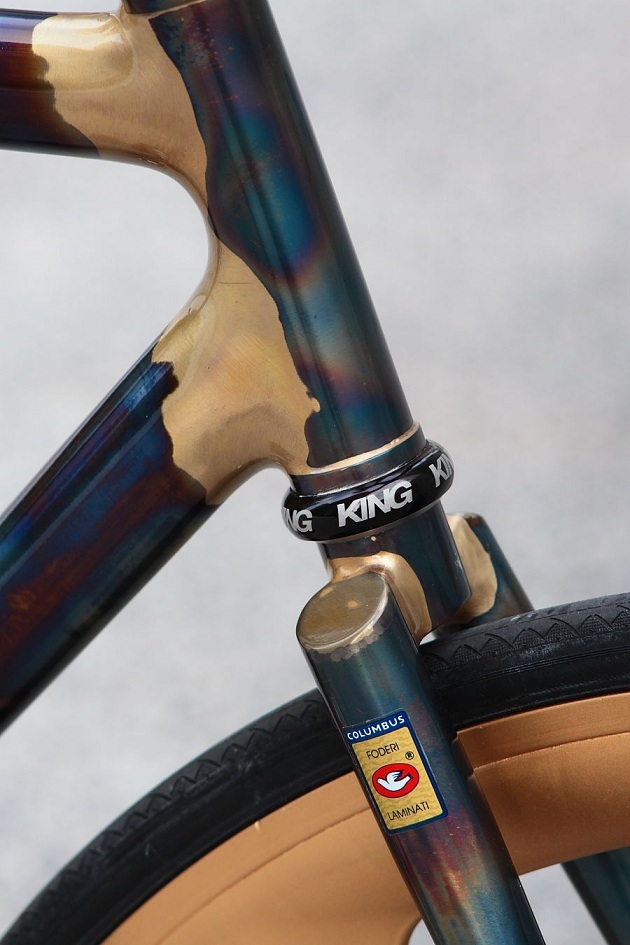
I’ve moved over to a more conservative aesthetic, that I see as having numerous, more poorly defined design inspiration. I have always been fascinated by blued steel and gilding, which I see as having some purely practical roots (case hardening), but also the late 1800s Aesthetic Movement.


At this point, I suspect that contemporary case hardened guns are an example of an Aesthetics Movement revival. Afterall, there are no real pictures of the 1800s stuff and most of the relics have blackened by now.
For a while, I thought Steampunk may have been my other aesthetic inspiration, but now I think it might actually be Art Deco. My design isn’t ornate, nor does it have superfluous tubing or gears. In fact, I’m trying to keep it clean and angular. I want my braze lines clean (though that’s hard to do), my steel dark, my carbon darker and my lug interfaces at 30 and 45 degree angles.

I see my design as a minimalist take on both of these movements.


3 Comments. Leave new
I am a bike nut as well, and I am glad you are going with a classic steel aesthetic with the moody purple paintjob. I don’t know if it’s the skinny tubing, simple lines, or something else but the aesthetic of a nice steel frame can’t be matched. It definitely fits well with the 80’s aesthetic you’re aiming for, as the vast majority of bikes were made from steel back then. Unlike Sreyas above me, I think it’s a good thing that you stayed away from carbon fiber. Carbon fiber frames existed but weren’t mass produced back in the 80’s. I own three carbon bikes right now, and while they’re amazing, they just seem a bit cookie cutter to me since everybody’s using it now. A classic steel frame has way more character and uniqueness, and is definitely more likely to stand out.
Oh, I’m keeping carbon. I’m hoping its black will contrast the heat treat and brass accents on the lugs.
I still feel that the blue/purple steel, epoxy-covered carbon fiber could have really fit the 80’s aesthetic, but I understand why you moved away from that direction. The braze welds between your components very much exude art deco though. I’m interested to see how the carbon fiber fits in. I get the feeling that a metal frame may have made your new aesthetic goals easier to achieve (ie: featured image), but carbon fiber is undoubtedly more rewarding/fulfilling. Keep it up!