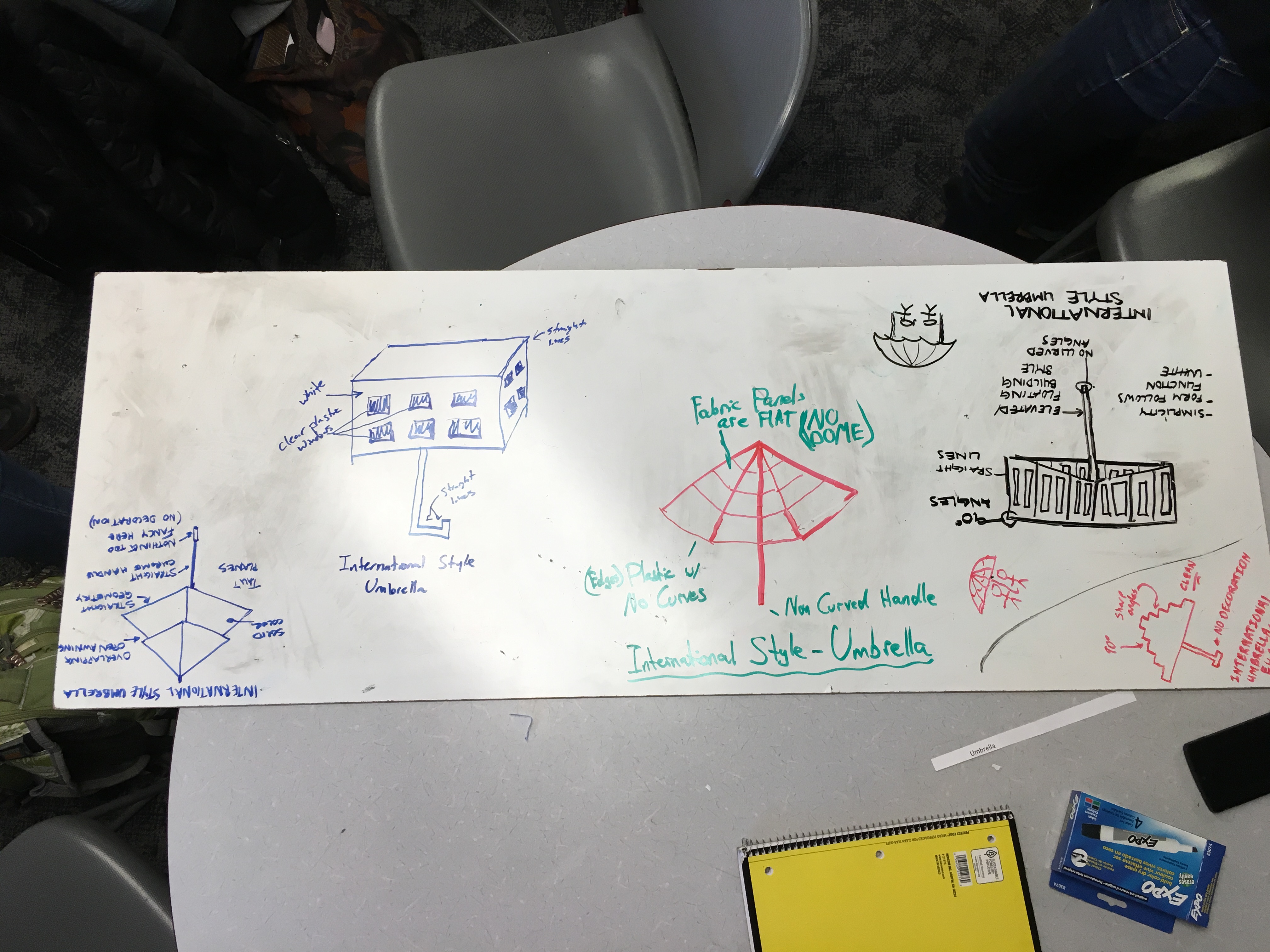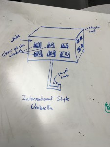
For Monday’s aesthetics game, our table received the object umbrella and the aesthetic of international style as our picks. The image above is our entire groups whiteboard of designs. Below is the design I (Sami) came up with.

For my design I went with a more artistic rather than functional design. I was inspired by the various building that were built in an international style. The umbrella is very square and would be white with clear plastic square cut outs that parallel to the windows of buildings. The handle also continues in the theme of right angles and straight lines. Overall the entire design is meant to be clean and rigid.


3 Comments. Leave new
https://www.aesdes.org/2016/03/30/aesthetics-game-international-style-umbrella-3/
Here is the link to my sketch from this board: https://www.aesdes.org/2016/03/29/aesthetics-game-international-style-umbrella-2/
[…] picture accompanies Sami Maierhofer’s original post for the aesthetics […]