Aesthetic Choice:
As a fan of the modern rustic look a few people brought up in Aesthetic Explorations, I decided I wanted to do something with an old shipping pallet. I figured they would be easy to get a hold of, relatively easy to work with, and I would have lots of options for what I could do with it. After finding a stack of pallets behind an auto parts store and seeing a pile of knitting yarn in Goodwill, I grabbed a hammer and crow bar, and started ripping my old pallet apart. A few iterations later, and above is the final product.
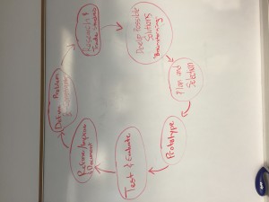
At first, things progressed right along my team’s drawn design process, and re-assembling the wood into a flag-like arrangement was a straight march through the first few steps of our loop (seen below).
Once the initial wood “prototype” was done, I began adding screws (borrowed from my landlord’s storage garage) in the general outline. Eager to see what my final flag would look like, I added screws by hand, and then zigzagged the colored yarn across it. The initial version is shown below:
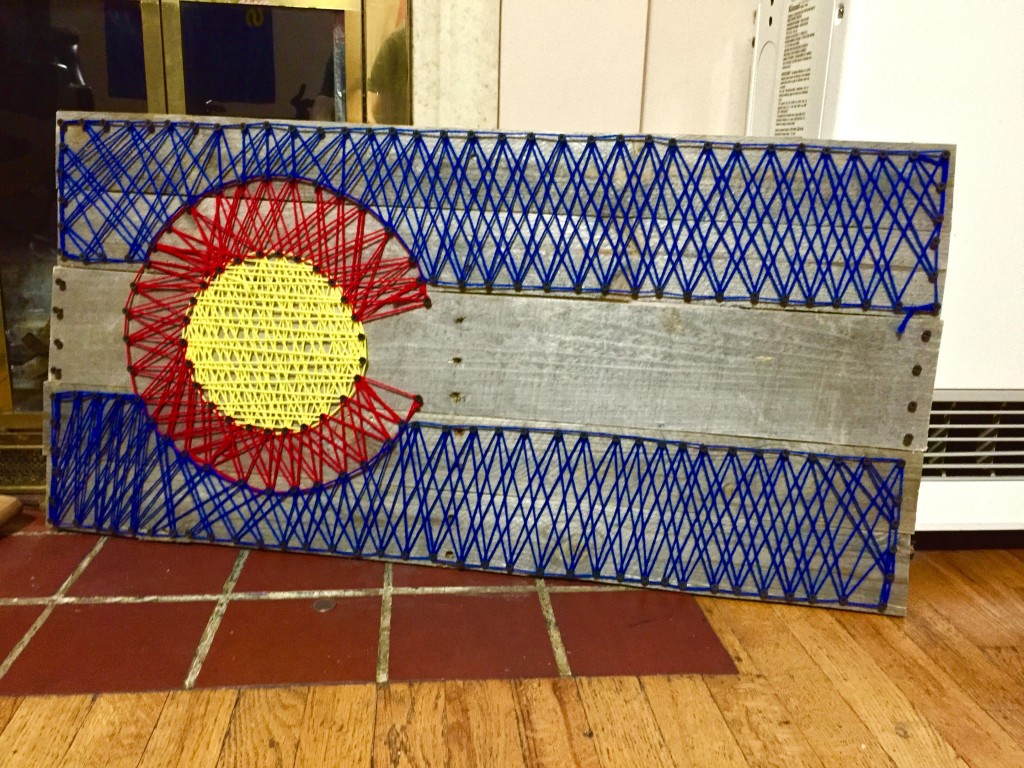
After documenting with a photo, I continued around my design loop- the uneven “C” shape was driving me crazy, and I knew it couldn’t stay that way. Further, I didn’t like how much the yarn covered up the cool wood pallet I was using (especially in the yellow area), and also wasn’t a fan of the random cross-hatch.
I stuck with our initial design loop, and went back to research- browsing photos of other “string and nail” art pieces on line, I decided that parallel lines looked best, and the crooked “C” (in the above photo, the red section is thicker on the top than on the bottom) had to be fixed. The obvious possible solution (round 2, this time) was to pull all the string off, and start over.
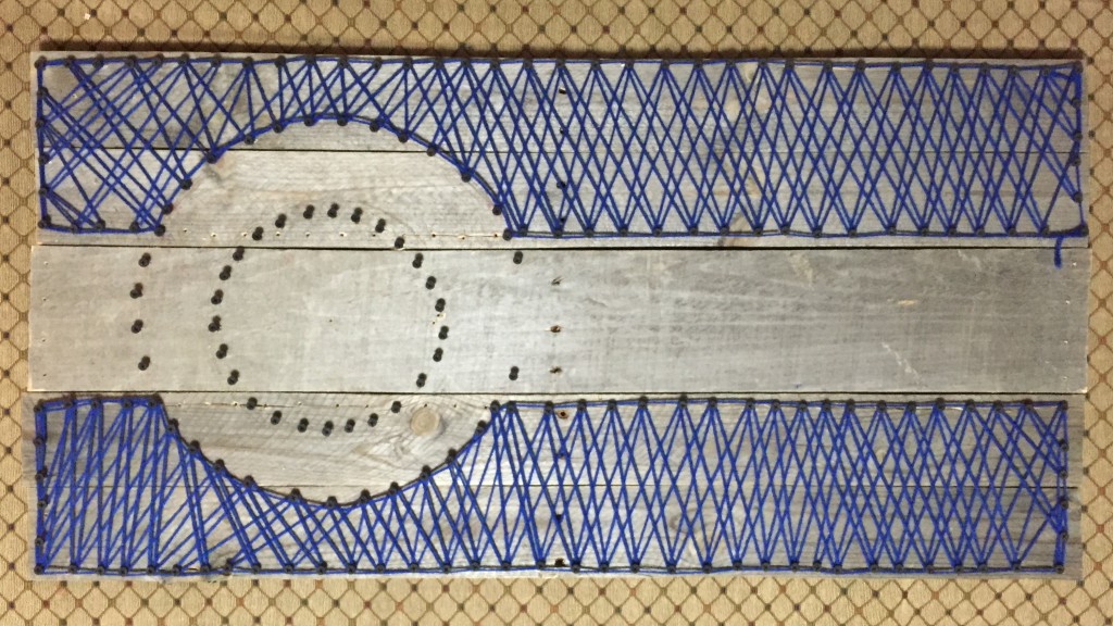
Back to planning- you can see the lopsided circle in this photo of removing the v1 yarn. I had been holding off on removing the double-layered blue, but quickly decided that should go as well. The plan keeps circling!
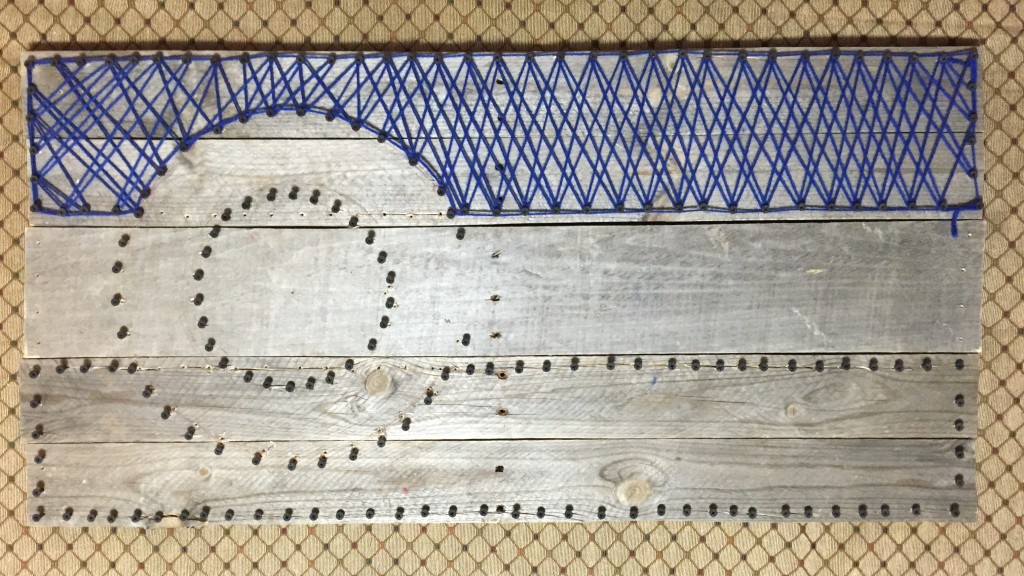
Fixing the circle. At this point I realized I should have been more mathematical about my screw placement, but I got it pretty close by being a little more cautious in my eye-balling it.
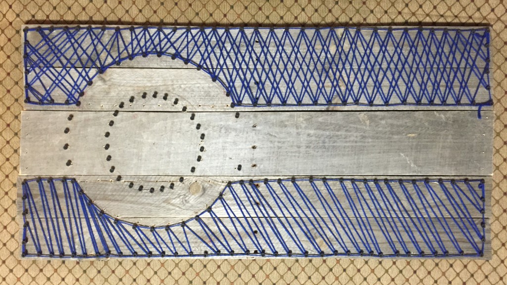
Second pass through the prototype loop- the circle is more even, and the bottom, single-layer stitch shows a little more of the original wood than the old top section. Pressing on!
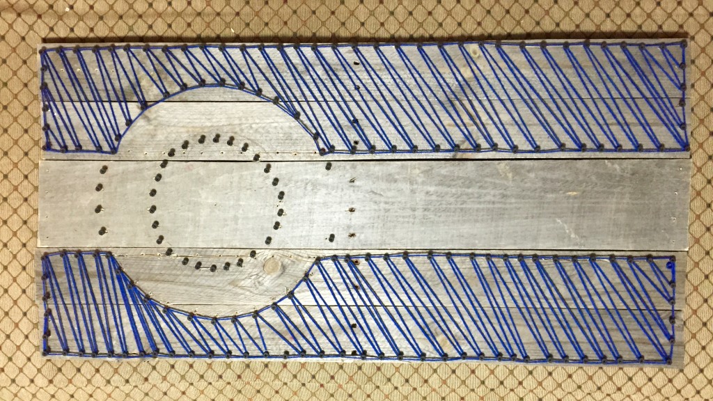
Ahh, much more even. While I was almost starting to regret tearing v1 apart and starting over, these parallel lines were really satisfying. I decided to take a similar mathematical approach to the yellow section (though with two layers, as I didn’t want it to be too transparent and the yellow pop is an important part of the Colorado flag), and a radial approach to the red C. I also added in the white- though I had originally left the white out (as to not hide the wood), I decided only one layer might be the best compromise.
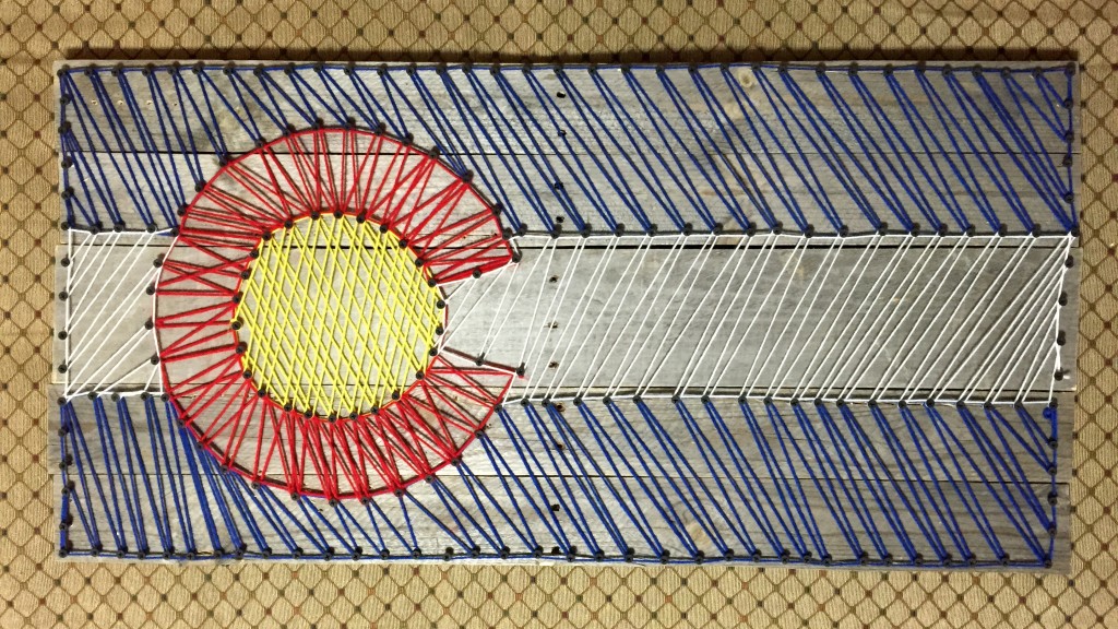
The final product:

Finally, a result I was aesthetically pleased with after two loops through our design process. I think I got pretty close to the rustic modern look here, and am really happy with the amount of gnarly old wood visible behind the bright popping colors.
Functionally, I plan to hang this guy on my wall in my house- the closer I get to graduating and potentially leaving Colorado, the more I realize how much I’ve loved it here. I’m really happy with how this turned out, and might even try more nail-yarn designs in the near future! For the next attempt, I think I will try some sort of exact grid system of perfectly spaced nails, just to make the lines even more straight and satisfying.

36 Comments. Leave new
Looks like a pen sketch! I like the attention you payed to ensuring that the lines move in an even fashion. You achieved some serious density in the center!
Have you considered bleaching the wood, or does the rugged aesthetic synergize with your vision of Colorado?
Great work! I definitely like the second yarn pattern more than the first one. It looks cleaner
This turned out really well. I like that you were that selective of your wood, even though they came from used pallets. Good job!
I love the look of the rustic wood and the yarn over it! Nicely done.
Nice symmetry in the yarn, looks really clean and nicely done.
Neat project – it would fit in with the aesthetic at a snowboarding lodge up in Breckenridge. I totally hang it in my house! If you’re interested in doing something like this again you could use the tools at rasterbator.net/ to print out a pattern.
I really like the look that the old wood gives it. I also really like how clean the lines look. I think that it will fit in well with your house!
You should definitely hang this up somewhere you can show it off, it looks fantastic. When you hang it maybe see if you can light it from the bottom like many flags on poles.
Awesome! I wonder if you’d fill in even more space on the pallet if you started crosshatching every peg to every other peg rather than just the “truss” approach. That’d be interesting to see. Either way, looks great. Colorado rules!
It turned out really well! I love the precision of the string art.
Looks great, I like the woven effect. This would be a neat addition to any Colorado home.
This came out really well – i’ve always thought of doing a similar project by looping a long distance of yarn/string.
Great Aesthetic. It was important to get the right wood. I would be really nice if you have the yarn more dense. This might add more vibrant colors for the flag. It would be great if you can fix the screws on the back. I love flags so I really like your choice. I would like to add maybe mountains on the frame. But really it looks great, Good Job!
This is sweet man! The pallet base adds a very rustic look to it. Really well done, you could open a business selling those
The flag looks nice. I am impressed that you decided to make the flag so large. The colored strings were a neat idea. Making the strings go in opposite directs for each row helped with the aesthetic. It is interesting that you went straight to putting screws into it, but had to remove them and try again.
The project came out looking incredible. Very professional look and definitely captured the aesthetic. I could see this being hung above a fireplace in a mountain cabin.
The Colorado flag is definitely an aesthetic in itself. I wonder if you could put the pallet in laser cutter and have it etch in the spots to put in the screws. Then you could use a computer to make the grid before hand. It turned out really well, and I would totally hang this up at my place.
Great design, like the Colorado, rustic feel. Final look is clean and well built, definitely can sell on eBay. Looks like it belongs over a fireplace in some ski cabin. Good work.
I like the modern rustic look that your project has achieved. The flag cam out really well. It was good to see the revisions made to your project. It turned out really well. It will fit the space above your chimney really well.
Really cool project! Compared to the original yarn the redo looks much more subdued and rustic. Great work!
That looks super cool! Have you considered staining the wood background to give it a little more color? In order to get rid of the screws sticking out on the back, you could just cut them off with some pliers.
Looks good. I like the Colorado pride you went for. The way you arranged the yarn looks great and this will look awesome in your house. I like the rustic look of the wood.
Very clean looking final design. I have seen the flag on old wood before but never with the string. Great job! I like that you were able to find everything as either scrape of at thrift store. It really embraces the upcycling feel. Have you given any thought into how to hang it on a wall? Are there brackets on the back?
You mentioned nail art. You might like the staple art of Bapiste Debombourg:
http://www.mymodernmet.com/profiles/blogs/baptiste-debombourg-aggravure-agony-in-the-garden
This is neat.
I like how you made a pattern with the string! I have seen them laid out in a completely random design but yours fits the flag design really well! Your design gives it a very clean and structured look but still maintains that rustic aesthetic.
This is really cool and unique. I could see this in a tap house or restaurant. I also really like the different textures and patterns made by the yarn in the different areas of the flag. I do sort of wish the yarn was a little denser, but nonetheless really great job!
The people of Colorado are proud of this flag! The rustic look from the pallets was a good choice for a good-looking aesthetic. How long did it take you to “knit” the yarn?
I love how professional yet simple this looks! Using this method you can probably effectively make any flag that exists. You mentioned that you are going to try different methods next time, do you know what kind of flag you plan on making?
Good job with your aesthetic. It is pretty clear what you were going for here. You have great craft and it turned out really nice!
I’m not a fan of the Colorado flag as an aesthetic, but you made it work with the rustic, handmade approach.
Nice work Kevin, did you end up re-centering the yellow part of the flag? I like it, the color looks darker than I thought initially.
Nice, I’ve never seen a colorado flag made with a pallet before. I like the detail you put into the actual weave of the different parts of the flag.
This came out really nicely, and very accurate shapes in the flag. Nice symmetry.
I like the artistic elements. I would hang this at my place!
Nice job! I think it’s great that you fixed the ‘c’ and evened up the yarn. It turned out great. I really like how you used white yarn for the center stripe, too, instead of leaving it bare. The way the zig-zag patterns match up is neat and very professional looking. The wood is clearly visible throughout the panel now, which certainly gives it a rustic look. I would agree that you captured the rustic modern aesthetic here. The colors and patterns of the yarn are very modern, while the fasteners and wood are rustic.