Introduction
My relationship to the upcycle project can be categorized as nothing but tumultuous. The aspect of the this assignment with which I struggled with most was not time constraints or a lack of resources, but rather a barrier of creativity and originality through which I could not breach. I saw upcycling as a beautiful concept: at times, turning something vaguely useless into something with purpose; and at others, converting an object from one use to an entirely new one. But I found myself completely devoid of creativity or inspiration for this project. I don’t really need anything for my room, and while a shelf or wine rack would be nice, I wasn’t all that interested in making one. While I do have quite the surplus of wine bottles on my desk, and I toyed with the idea of making drinking glasses or wine glasses or even a light fixture out of the empty, dormant bottles, I found these ideas entirely devoid of originality. Searching “wine bottle chandelier” on Google returns countless search results for images of elegant bottle-adorned arrangements, accompanied with a step-by-step guide on how to obtain this exact result in one’s own upcycling project. And this left me, time after time, completely devoid of interest in that particular project. The nature of DIY on the internet is one of immense accessibility, with Pinterest and Instructables at the forefront of the scene. And while they give individuals the ability to produce things they maybe never thought they otherwise could have, I personally feel like they take the creativity and originality out of production, whatever the product may be. In order to subdue any possible feelings of imposter syndrome on my behalf, I decided not to try to use the internet for inspiration, and instead chose to look inward for inspiration; exploring my own interests and passions and extrapolating them out into more fleshed out project ideas.
I briefly explored the idea of making a vinyl record clock, and did actually follow this project through to fruition. I took apart an old clock, which I had lying around my home, and reassembled the components into a retrofitted vinyl record, which came from similar circumstances. But I found this project to be immensely unsatisfying, from both an aesthetic and technical standpoint.
Inspiration
In the process of delving into the depths of my own psyche, I thought of graphic and poster design as two of my most genuine interests and passions, and almost instantaneously, I thought of legendary Swiss graphic designer, Josef Müller-Brockmann. God of the grid, Müller-Brockmann pioneered modern design techniques and continues to be a major influence for designers from all disciplines. Some examples of his work are pictured below.
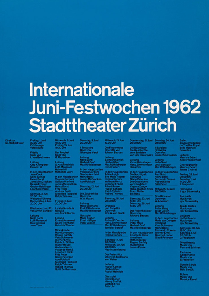
Poster designed by Josef Müller-Brockman for the State Theater of Zurich in Switzerland
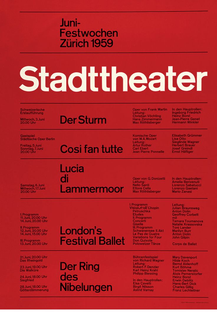
Poster designed by Josef Müller-Brockmann to list showtimes for the State Theater of Zurich in Switzerland
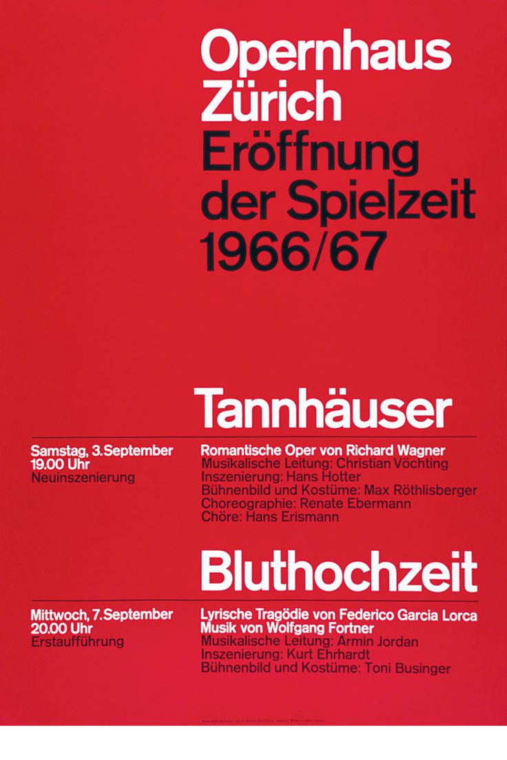
Poster designed by Josef Müller-Brockmann for the Opera House of Zurich in Switzerland
One of my all-time favorite posters was designed by Müller-Brockmann: a Beethoven poster for an event to be held at the Zurich Town Hall, which can be seen in the featured image as well as below.

Poster designed by Josef Müller-Brockmann for a Beethoven event to be held at the Town Hall in Zurich, Switzerland
Artistic Vision
Inspired by this truly classic and groundbreaking design, I decided to recreate one of my favorite pieces of functional art using materials other than paper and ink; or to be more specific, I wanted the base of the poster, which would be representative of the paper, to be acrylic, while the actual content of the poster (i.e. the design itself) would be made from vinyl records. The vinyl records would be tangible representations of the music-oriented influences and meaning behind this poster; I wanted any onlooker to be able to look at my creation and know that it was in some way related to music, devoid of text or music-related imagery. But more than anything, I wanted to create something that would do justice as an homage to one of the most iconic and beautiful posters ever made, which to me, was a nearly impossible order.
Materials
In keeping with the minimal design of the poster, I kept the materials used to create my piece relatively minimal as well. In all, I used a total of three materials: an 11″ x 16″ x 1/4″ sheet of clear acrylic which I procured from the scrap section of McGuckin’s for a modest $2.18, a total of three vinyl records which I already had at my house, but were likely purchased years ago at a garage or estate sale, and finally a very minimal amount of hot glue to secure everything together.
Process
I first started by printing off the poster onto a sheet of 8.5″ x 11″ paper in order to take measurements of the arcing, black semi-circles which make up the majority of the poster: this process was done by use of a ruler and a compass. Next, in very non-Müller-Brockmann fashion, I took my design to the computer and recreated the poster in AutoDesk Inventor; my reasoning behind using the Inventor platform over a product from the Adobe suite, which would be a more modern and traditional platform for poster design, was because I planned to laser cut the vinyl records and sheet of acrylic on the laser cutter in the ITLL, which requires the use of .dxf files. An image of my design in Inventor can be seen below.
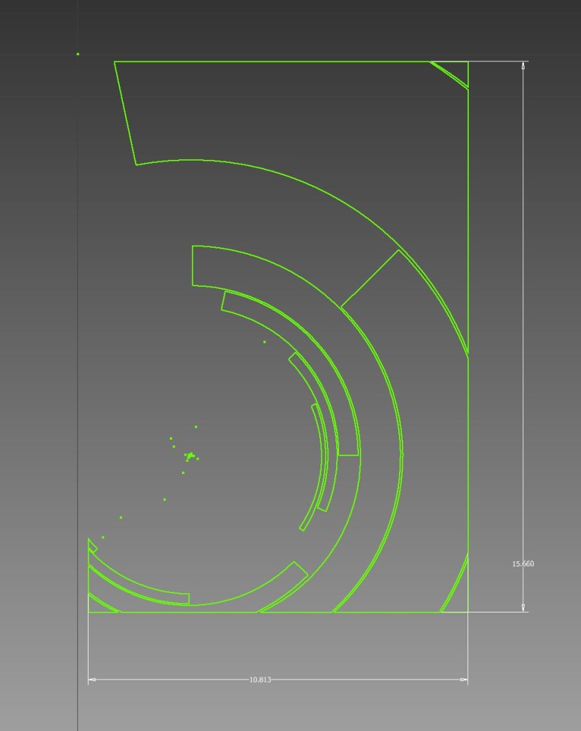 Screen capture of the poster design in AutoDesk Inventor
To produce the necessary .dxf files, Inventor requires a two-dimensional face on a three-dimensional object in order to export the face as a .dxf file: related to SolidWorks, which allows the user to export two-dimensional objects as .dxf files, this seemed like a series of tedious, but unfortunately necessary extra steps. Screen captures of the extruded pieces, which would eventually go on to become the vinyl pieces, can be seen below.
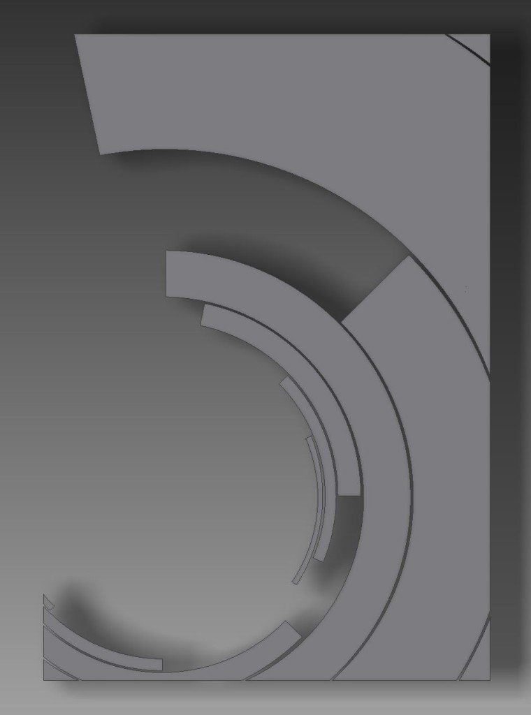
Top view of the extruded objects which make up the semi-circle elements of the poster’s design
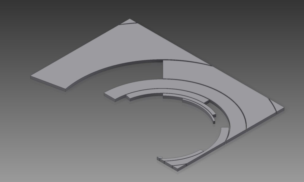
An isometric view of the extruded objects which make up the semi-circle elements of the poster’s design
In addition to designing the components of the poster’s design which would go on to become the laser-cut, vinyl pieces, I also wanted to superimpose the design onto the acrylic, in order to ensure that all vinyl pieces would have proper placement. To do so, I made a negative image of sorts in Inventor by placing the semi-circle pieces onto an 11″ x 16″ extruded rectangle, using the geometry of the semi-circle pieces to cut through the extruded rectangle, and exporting the resulting top face to a .dxf file format. Screen captures of the end result of the process I just described can be viewed below.
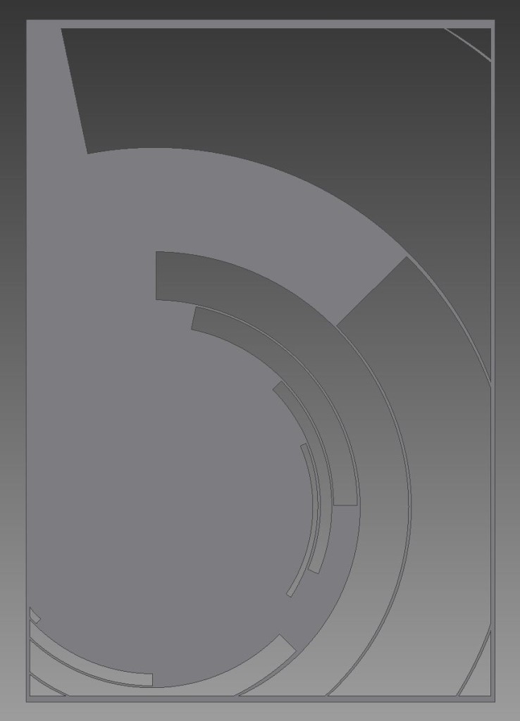
Top view of the extruded rectangle, cut through with the semi-circle elements to produce a negative of the poster’s design
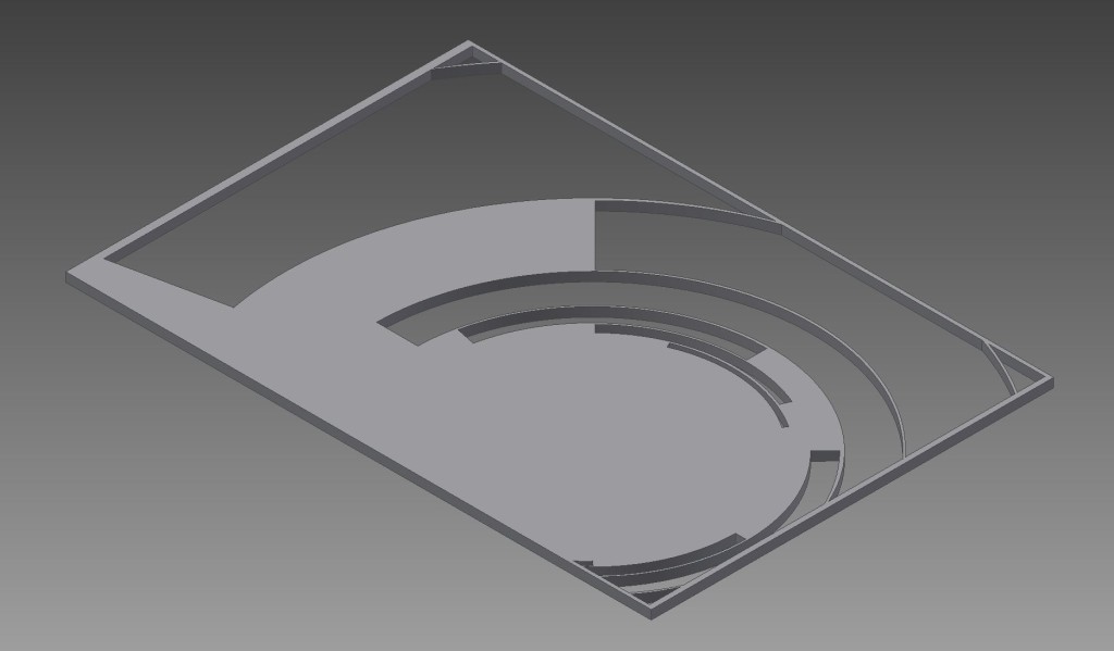
An isometric view of the extruded rectangle, cut through with the semi-circle elements to produce a negative of the posters design
As stated previously, the purpose of producing the negative image of the poster’s design was to ensure that all laser-cut, vinyl semi-circle elements would be properly placed on the acrylic: graphic designers make no compromises for perfection in their work, and in the pursuit of a proper and honest homage, neither did I.
The next step in the process came fabrication and assembly, which went in the following order: laser-etching the semi-circle elements onto the acrylic, in order to assure proper placement during assembly, laser-cutting all twelve vinyl, semi-circle pieces, and finally product assembly. Of the three of these, laser-etching the acrylic was by far the easiest and least time-consuming. The laser-etching itself took a little over ten minutes, which turned out to be only a small fraction of the project’s total time to completion.
After laser-etching the acrylic, I moved on to laser-cutting the vinyl pieces, which turned out to be much more difficult and time consuming than I predicted. The main problem I encountered when trying to laser-cut a few of the pieces was the mere fact that their size and geometry made them either exceptionally difficult or impossible to cut the whole piece on one vinyl record, while maintaining the monochrome black-and-white-only aesthetic of the original poster. With each piece having a stranger geometry than the last and varying in size greatly, it made positioning the pieces digitally in CorelDraw on a virtual square plane representative of the bed of the laser cutter exceptionally challenging, especially considering they would all need to be cut from a material which inherently has a circular profile. This part of the process involved a significant amount of trial and error, which resulted in an unfortunate amount of material and time loss.
The final step in the process was a rather simple, but somewhat unnerving endeavor, which was hot gluing the vinyl pieces to the acrylic. Each vinyl piece was secured in its proper place by dotting small amounts of hot glue along the perimeter of the piece, and then carefully setting it in place on the acrylic. The act of assembly took no longer than thirty minutes, but the results were far from perfect and didn’t quite meet my expectations for myself or this project.
Achievements
While I did succeed in producing what I set out to do, the final product didn’t exactly meet my initial expectations or what I believe I am capable of producing. Several factors of this project have left me unsatisfied, including the spacing of the vinyl pieces on the acrylic, which is integral part of the poster’s original design being that Müller-Brockmann achieved perfect spacing on his poster with no other tools than a pencil and a ruler, the geometry of the laser-cut pieces, being that I neglected to account for the amount of material which would be cut away by the laser itself during fabrication, and the appearance of the vinyl after laser-cutting (the heat of the laser left clouding on the surface of the vinyl). In spite of this, I am still relatively proud of the project’s end result.
What’s Next?
I would like to continue to refine my design and production, in the form of a complete redesign from the ground-up, until I am able to produce a recreation which I deem to be a proper and just homage to one of the greatest designers to ever live.

42 Comments. Leave new
Youu may have to have a small sum of money to invest iin the product,
however then you may promote it at a much larger
return and make somee quick cash.
We hope you will appreciate our work and discover Quick Cash Recorder Premium
even more convenient to manage ypur cash!
Neat idea. I like the texture of the records, it’s a cool effect to add to the poster. You could paint the letters to make them stand out against the clear background. Overall, I think it looks great.
I’m impressed with the final project! You definitely put in a lot of time and effort and it shows.
This is a really gorgeous piece! Glad you didn’t liberate too much chlorine!
I think you chose an awesome poster to base your project on. It turned out really nicely. You can probably cut upholstry vinyl, while cutting high density vinyl on the laser cutter is no good. Anyways, nice job!
I like that you etched the acrylic so each piece had a place to be set, looks really nice.
Really neat project – this is something that I’d want hanging in my house. It would be interesting to experiment with ways to light it. I think if you shine the light upwards through the acrylic, the lettering would stand out really nicely.
Very nice reinterpretation. I love the vinyl aesthetic, I support lighting it in a cool way on your wall. That would really help it pop.
Good to hear you doubled back on your progress and challenged yourself. As a result, you created an awesome piece. Great work.
It turned out really well! Instead of laser cutting, you could over print and overlay a piece of paper, and then dremel out the shape. Nice work!
I enjoyed hearing about the graphic artist behind the poster design. Cool idea using vinyls as your material. As you mentioned, I think some colored vinyl to catch some ambient light or LEDs would go over well with your overall aesthetic. Great work!
**meant colored acrylic
First Glance it looks great. It looks like a door from the future. I thought that the black was paint but its old records that’s awesome. Great finish on your project. Its always great to give credit to your design. Good description of the process. I am really impressed with the circular patterns.
I really like how this turned out. Most replication projects turn out looking somewhat like the original but this was spot on. Good Job!!!!!
The aesthetic is amazing. I like how you kept to a black and white poster. Using the laser cutter was a good idea, I would not image that you could safely cut vinyl with a laser. I wish you sealed the vinyl in a plastic frame.
Wow, I love the use of vinyl records. I think the part where the sticker was is a bit poor, but as you mentioned resurfacing would be nice.
It’s hard to be original with much of anything these days. I like your take on a veteran poster.
This is great Joe. I completely agree with the difficulty of the upcycle project in terms of trying to find your own voice. It’s difficult to recreate something out of already diminished pieces. That being said your poster adds a great effect upon the original by making it hard shell though the use of acrylic.
I like the thought of making a poster with something that wouldn’t be thought of being used to make a poster. The poster recreation is spot on and really well done. Your design process seemed really refined, which is nice to see. It might be nice to have some sort of back-drop to it. Perhaps it might be a good idea to frame this piece (like it was a classic poster you wanted to showcase) and that might be able to help make everything really stand out. Great project.
I love how this looks exactly like the original. Your design is very precise and authentic! Very great job overall!
I like how you brought a poster to 3D. I’m a huge fan of this aesthetic and found it very interesting to learn how the style started.
This is a really cool idea and the original poster almost invites the comparison to a record. Getting the grooves in the record to match the curve really adds to the look.
I think that your final piece looks great especially with the material you used! You should include an image of your final product in the blog so we can all be inspired by it!
I think the project turned out very well and I love the clean lines of the vinyl pieces. In the future, it might be interesting to add a backing to help the engraving stand out and hide the attachment of the vinyls.
your recreation is very awesome and beautiful, nice work!
Great piece of art, love the use of an actual record and the laser cutter to translate the image to a three dimensional piece. Would reversing the image, cutting the acrylic to fit a record rather than vise versa may allow for cleaner design.
Really cool that you were able to get the vinyl to break so cleanly in order to put it together in the form of the poster. Great piece of art!
wow this turned out really well! It looks professional and clean. I like that you followed your passion of poster and graphic design and applied it to your project.
Fantastic inspiration behind your piece. I enjoyed the art history lesson behind your piece, it adds a lot of character and background to the acrylic poster. Laser cutting was definitely a smart move, gave a really clean look.
End product looks nice and clean. I like the contrast between the black and clear. It is cool that you were open to trying different project ideas. Did you ever play around with designing your own design based on the artists aesthetics?
A wonderful homage, well done.
I’ve never seen an acrylic poster, but it’s a really cool idea. The final product looks really good, although I’d recommend filling in the writing with some black acrylic paint. Your process is also really good too. Have you thought about replicating other posters from the same era or artist in acrylic?
I really like where you got your inspiration from. I think your 3D poster turned out really well and I love the fact that the poster has a texture.
I like the way the rings of the vinyl perfectly match the circular aesthetic of the original poster. The laser-etched letters make it look very classy as well.
Joe! awesome job. I remember when we looked at this poster in our typography class last semester.
Excellent work. This is one of the most impressive projects in the entire class. Excellent description of the design process.
I’d like to see a picture of the finished product! Kudos to you for continuing to push yourself to make something that you are proud of. Sometimes it is easy to settle on a project, but it is cool to hear that you tried something else after not being totally satisfied with your clock. I really like this idea. It is very unique and personal to your interests. Hopefully you do feel inclined to keep iterating on this design! It would be cool to see how it progresses, and maybe you could work on re-creating other famous poster designs that you like. I could see this being a series.
I really enjoyed your approach to this project. The combination of minimalism and vinyls seems like an excellent combination. I know that it is difficult to work on a project that requires you to create an original design when much of the inspiration is very similar. I think your design is unlike anything I have seen when we looked at this project originally. I cannot wait to see your final design in person. Will there be color in the final design? That could add another layer of originality.
I loved reading through your blog post and found many similarities with your design process and thinking similar to my own. First off, I absolutely love your project. I am a huge fan of this graphic artist as well and find graphic art beautiful in a way not other design is. They have the dual purpose of being contained on a single piece of paper, appearing aesthetically beautiful, and conveying the message to reach the appropriate audience. I love that you took on this challenge for your upcycling project and recreated it as something new, taking it out of the 2D world and making your new “poster” 3D. I completely feel you when I felt at loss at the beginning of this project. I struggled with finding the right inspiration and creativity and not merely reproducing my own version of a pinterest DIY. I admire you for attempting to stray from this mold as well. You clearly explained your design process, which was neat to hear and understand your struggles with this project and your triumphs. I also love that you chose to pursue a design based on what you love, rather than what was convenient (like your empty bottles). I cannot wait to see the final project and am sure it will look great. I understand your frustration as well at not being able to produce the final image in your mind at the end in real life, but I feel like you fully accomplished your goals. Wonderful job!
I really like this retro poster aesthetic. The music school has a couple of series (BLOrk and Pendulum New Music) that make and hang-up similar style posters that always grab my attention.
I can understand your gripes with imposter syndrome, but I see the documentation and accessibility of projects on places like Pinterest and Instructables a little differently. In my experience, other people’s step by step guides have been a great resource and place to start when I am intimidated about a topic I know nothing about yet. For my upcycling project, I learned the basics of sewing just by watching videos on a YouTube channel. I think it is incredible that you can do that. I do agree that this sort of accessibility makes it difficult to feel like you are making something unique. No matter what project you chose, there is always somebody that has already done something similar. I think the originality comes from your take on something, and the passion that you have to capture what it is that you have swirling around in your head. Even if you completely copy an online project step by step, it can still be fulfilling to go through the creation process yourself and learn new skills. Did you feel challenged while creating your vinyl record clock? The projects that I gained the most from are the ones that I struggled with and turned out the worst.
You ultimately found inspiration in exactly replicating (measuring and digital drafting) an existing piece of art by applying your own twist. You said it best yourself, “graphic designers make no compromises for perfection in their work, and in the pursuit of a proper and honest homage, neither did I.” It sounds like you went through an important process, an even though you weren’t satisfied with your first attempt, you ended up creating something that you are proud of. When you get the chance, you should upload some images of your final product. You did a really nice job verbalizing your process, and I look forward to seeing the end result!
I appreciate your sharing of the difficultly in doing a forced project while maintaining an original design that you are truly proud of in the end. This is definitey a challenge in the college of engineering and I personally do think that the way we are taught actually reduces our creativity. However, the cool thing about this class is how we are able to break out of the norm and make something entirely because we want to!
What does your finished product look like (don’t see a picture at the time of reading this)?