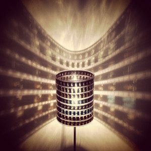
Deciding on an upcycle project was difficult. It was overwhelming to look at all the possibilities online, and it was even more overwhelming to try and come up with a completely original idea. After digging around on the internet for a long time and not being captivated with anything I saw, I decided to dig around my apartment to see what I had excess of that I could use for this project. I came across all my 35mm film negatives. I have a lot of negatives, some very old that I never look at anymore. I settled on the idea to do something with my neglected negatives. I took back to the internet for inspiration. After some research and brainstorming I decided to create a lamp out of the negatives. I thought this would be a great way to display the pictures that I had stuffed away for along time. I found inspiration for some lamps that are sold on etsy. Here is a picture of one:

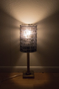
The lampshade I created is made up of strips of film, a frame from an old lampshade, and a clear bendable folder. I found an old lampshade at Goodwill and cut it up to use the frame. I hand-stitched the strips of film onto a clear folder for support. I fit the folder to the frame and used embroidery thread to attach them together. The process was simple, but did take a considerable amount of time due to all the hand stitching. I really like how the hand stitching turned out. I think that it adds to the DIY aesthetic of the lampshade. I think the final product succeeded in being both functional and aesthetically pleasing. I am excited to have it in my room.

In class we discussed the design process. The typical design process that the class drew was circular. We discussed how the process is never perfectly linear or even perfectly round. There is always jumping back and forth between steps as you are designing something, running into mistakes and then iterating on your design. That was pretty much true for this project. It took me a couple tries to figure out a sturdy way to construct the lampshade. The main barrier I had to overcome was that the film curls up easily. Attaching it to a clear folder eliminated this problem. I also experimented with some different stitching patterns to see what looked the best. Overall, I am very happy with the end result.

42 Comments. Leave new
Your project completely blew my mind with how gorgeous and practical is it!! I love the illumination of the photos on your film, and it think it is especially precious with how all of the photos in the film mean something to you. I would practically buy this from you. Fantastic work!!
This light casts an amazing shadow! I’m not sure if you want soft light or not, but I imagine an unfrosted filament bulb will produce the sharpest shadow, and maybe even project images.
Very cool idea. Hopefully you can find a light bulb that creates a warmer glow!
I love the finished product! Its very unassuming when its off and has a lot of potential to be very impressive when its on. I would maybe try a more diffuse bulb or a less bright bulb just to help the light diffuse through all the film better.
Liz! Excellent work I love the way it turned out!
Wow, this looks great! My favorite part is the stitching, it’s cool how it stands out from far away, whether the light is on or not. How did you select which film to use?
Nice job! It does look a bit dim though. I wonder if it would look better or function better if you positioned the light bulb lower so that the intensity is greater at the base.
This is a cool way to use old negatives! It would be interesting to use one of the red/orange light bulbs used in darkrooms. Nice job!
I like how even from the far back corner of the room that I sit in, when the light is lit up, it is obvious that the lamp is made out of film and you can vaguely see the images that are on the film. It looks extremely artistic!
Wow! As a hobby photographer, this is really fun and interesting styled piece. The lamp gives a unique mood lighting aspect, that is really captured with your photography. The piece also adds a bit of your personal own personal style and history to the piece. The sewing job looks awesome, keeps a nice clean, sleek design.
The stitching looks incredible, I love the way it contributes to the overall look of the project. This is a really neat idea, and I like the nostalgic feel that the film and the glow-y light promotes.
Lovely lighting, idea and execution. The whole aesthetic is charming and beautiful. Any favorite images in there?
very awesome project I really loved it. I want to have something like that in my room especially if the pictures means something for me. It’s nice that you didn’t damage the films but rather preserved them in an elegant way.
Awesome work!
Awesome photography. I like the idea of making something you need on your own instead of buying it. This is a great use of upcycling. I would love to learn dome of this photography skills, it really matters when you are presenting/selling something. I like the dim light. Are there any durability/safety issues? Like are films flammable? Otherwise looks great. An outer clear layer might be a good idea. You can always replace the films if you want.
Makes a fabulous wall display! Stitching idea works well. Nicely done.
This is an awesome idea! Do you think that the film will be damaged after using it? The stitching looks really nice. Does it cast the film images on the wall when you light it up?
I like the effect that the film has on the walls. the cylindrical shape turned out really well too! Maybe raise up the shade a tad bit to allow some light through the bottom!
I really like this idea. The stitching and arrangement of photos is very clean and the overall effect is quite intriguing. I think if you experimented using different lights, you could find one that would project the photos on the walls instead of overpowering the images. Great work!
This is incredible! From a distance, it seems so simple, but the attention to detail that you see up close is amazing. Really cool how they are all your photos. I think it would look even sleeker if you painted the post with a brushed aluminum finish.
Those stitches look amazing. Maybe a softer light bulb would diffuse light a little better?
I really like the look of your lamp, it’s incredible. I also like that you did not want to damage the film in any way. I agree with your thoughts on trying to make the light less harsh. Are you concerned about the film getting hot and catching on fire? It looks like there is enough ventilation, but I’m not sure. Also, would you want an easier way to the light on/off? Excellent work.
Really cool idea, the pictures don’t reflect the nice frosted finish on the outside of the film/lampshade, but in real life it looks very nice.
I love the use of film and and lighting. The hand stitching looks beautiful! It might be interesting to move it up so that more of the film was lite up.
The stitching is awesome! I think that really makes this look professional. Awesome lit up too!
Very cool lamp, maybe you could use an Edison bulb to add to the aesthetic.
Great feel with the brass and the negative film, excellent work with the stitching, wondering if the bulb is causing too much focused light, try a long skinny halogen, more distribution of light and a little less intensity. Wonderful design and finish.
The attention to detail is amazing. The stitching looks really professional and durable. I like the idea a lot, nice job!
Nice stitching! The lamp looks very cool when turned on. It’s always nice to make something that has a theme you like.
I like the way you stitched the film together so that they wouldn’t get damaged. The final product looks great and is really visually interesting. I still like the idea of turning it into a carousel so that all the pictures can be viewed. Great job!
Amazing end product. I like the detail you put into manufacturing the lampshade to keep the integrity of the film. It is a great way to incorporate your passion into a project.
Liz this is such a great idea! What a wonderful way to keep memories from the past and I like how you incorporated your love of photography. A cool idea would be to have some type of removable slip to sew the photos on and then you could change them out whenever you feel like it . overall great job !:)
This lamps creates an awesome aesthetic. I like how it projects pictures onto the walls. The black and white photo aesthetic was well done. It felt like you had 1 aesthetic inside of the other. I wish the base of the lamp was black or white to keep with the aesthetic.
This lamp is so damn cool! The stitching is quite nice. I wonder what it would look like with a colored light, like red or green.
I really like this lamp idea. The detail stitching really makes it look nice.
I love the whole idea of this lamp! It seems like a really cool way to project your images and see your pictures in a unique way! The hand stitching is amazing and really adds a beautiful design to your lamp!
How well does your lamp project the images on the film onto nearby walls? If it doesn’t, are there design changes you can make to add that aspect to the project?
This is such a cool project! I love the inspiration and the aesthetic that you created. I like that you stitched the photos together, adding to the effect. I feel like your project could really tell a story. Great job!
This is a reat idea and creative aesthetic. Maybe using a brighter bulb would bring out the film shadows even more!
The shadows cast are super cool. What an awesome way to use old film!
Shadow pattern is really impressive, I wonder how many iterations it took to achieve just the right amount of light bleeding through.
Stunning shadow pattern. I would definitely use this lampshade, great work!
This is an awesome idea!!! and it looks amazing. did you thought of placing paper at a distance where you could see the image clear enough that you could tell which one it was? the final product looks great and I can see potential for this product in the market. I wish that you put more instructions on how you put it all together or even a few links from where you got this idea. Reading your report I was able to visualize your steps on how you got the idea and a bit on how you got started, but I have to say I wanted to know more. More pictures or more of a description on your thought and building processes would make this report better. I loved your project, it is very unique and I was hooked on the Idea and the potential that could come from it. can’t wait to see this lamp in person. Great job on your lamp.