One of my primary gripes with most upcycling projects is that they often seem to leave behind just as much trash as there was before the project started- after sawing apart a bicycle, or stripping the components and plastic from some discarded tool just to use a component in the name of recycling, I thought I would look for a project that could effectively be made from things I’ve found in the garbage. In the building where I work, that garbage is largely corrugated cardboard, and it really is incredible stuff.
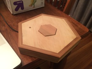
Like I might have mentioned in the project progress report, I have a thing for hexagons. I’ve put them in a number of other projects that I’ve built, like this light controller I built recently:
I wanted to play with the idea of tessellating flat hexagons into a type of hexagonal prism. Geometrically, this presented a number of challenges, until I ran into an interested lamp design that I found while searching the word “hexagon” in Google:
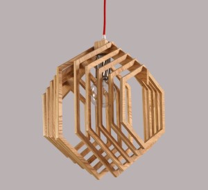 This lamp was for sale on Alibaba, but there was almost no mention of who designed it or where it came from. I decided to embrace a similar approach, but to use laser cut cardboard shapes instead of wood.
Most of the challenge in the design process came just from working out the geometry and dimensions of the overall lamp, which I did by starting with an initial dimension (8 inches), then taking the length of one side and dividing that by the thickness of the cardboard (0.15″). Then, I used Rhinoceros to draw half the number of hexagons needed to fill each side (in order to leave even gaps between each layer) and scaled them proportionally to meet the edges of the original “master” hexagon.
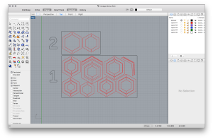
That last paragraph pretty much just exists to make this whole process sound really complicated, but in reality I just drew a shitload of hexagons in a computer and sized them until it looked right. That’s the short version. This is what the CAD file looked like once I added the notches to each hexagonal ring:
So then all that was needed was to take the large sheets of cardboard I had harvested from the dumpster, cut them to fit in the laser cutter, and then cut them out. Several times I made mistakes in aligning the pieces in the cutter, primarily because the pieces all ended up having bizarre dimensions after I cut off the packing labels, glue covered sections, etc. Once the cuts were done, I had a pile of hexagonal rings (which make great throwing toys, I might add):
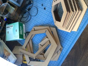
Assembling the rings was obnoxiously difficult. Aligning the top and bottom sections provided a number of challenges. One of my goals was to assemble the lamp with no adhesives, simply using pressure fitting of the cardboard to keep things in place. While I was able to achieve this, the number of rings made it challenging to line up the top and bottom fittings. Ultimately, I ended up separating the bottom portion into two sections, which expedited the whole assembly. Which looks like this:
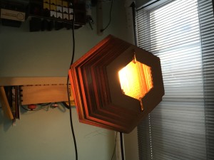
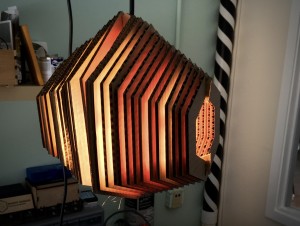
It’s hard to take a photo of a light fixture. Don’t judge me. I’ll try and take some better photos soon.
UPDATE:
Initially I was pleased to have an extra week between when I finished the project and when I had to present, but this turned out to be more of a curse when I started having some serious structural issues with the lamp- most notably because I had only used two support pieces to keep the hexagons aligned, and they started to fall apart over time. As you can see here:
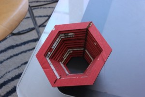
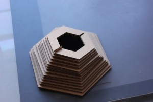
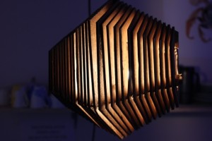
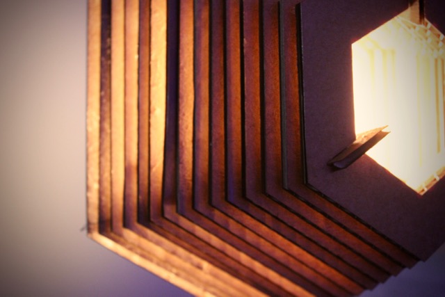
Instead of bringing that version to class, I remade the entire thing, redesigning it to have three lines of support rather than two- the lamp is much stronger and less uneven looking than in version 1. It also hasn’t broken yet, which is a plus.
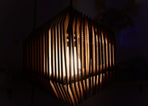
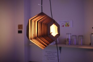
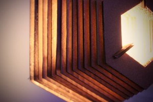
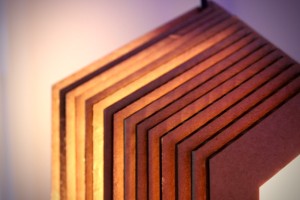

42 Comments. Leave new
The symmetry of the lamp is so satisfying. It seems like changing the bulb presents some issues but thats a later problem.
awesome work, I really like the aesthetic, it is also hard to believe it is made of cardboard, more like wood. Might look simple but it really takes lot of detail and concentration. It’s nice that you can recycle this any time. I am also really glad that it’s fireproof
This is a NICE lamp. “Fan of hexagons” awesome. Good description of the process. I really like the looks of this lamp. You can have a hanger to put it on the wall.
I love the geometric pattern and that there were no adhesives left. In the future, it might be interesting to make a larger version.
It’s brilliant how you not only made a fantastic looking lamp out of cardboard, but also how you left little waste in the end.
I was wondering how you got the edges to come out so straight, the laser cutter is a great idea, I hadn’t thought of that for cardboard. It looks really nice, very professional looking considering the medium used.
Like the geometric look, great use of laser cutter and fitting the parts together. Like the use of no glue or adhesives, has a great glow, good work.
I really like how this had the upcycle feel to it since cardboard is such a reused project. Turned out great!
Great work! It is very clean looking and looks great when lit. Is there some way to cover the ends to keep the light focused between the strips?
I really like the simplistic, geometric look of it. The cardboard creates a nice, warm atmosphere. I’m glad it didn’t break when it fell!
That’s very cool! I love the simplicity of the design and the clean geometric shapeness of the hexagon. The pictures you took are great and really enhance the look of the lamp! A great skill if you’re trying to sell one.
How did you prevent scorching on the cuts?
The piece looks really good, I’d prefer to it the official. Looks like it would cast a gentle and diffuse light. Have you considered stiffening it with an adhesive?
I like how simple the design is. I’m glad you used the laser cutter to get clean cuts, because that’s part of what makes the lamp look so good. Good work!
Nice featured image. I like the geometry of the the light, and that you ended up using 3 supports rather than 2. I bet it makes cool patterns on the walls. I also think it’s great that you stayed true to upcycling and made sure to minimize waste and not use new products like glue in your final design.
I really appreciate your honesty in your critiques with this project, as well as your opinions in regards to upcycling as a concept: I shared many of the same sentiments with my own project. Overall, I really love your design, as geometry and its use in design is an interest and a passion of mine, and seeing your project come to fruition was immensely satisfying and inspiring.
Great job! This would be at home in any designer furniture showroom. From afar the cardboard looks like wood.
The slits in the cardboard that allow the light to escape, do so quite perfectly, such that the perfect amount of light escapes to make a beautiful glow. Plus it appears to be very sturdy so that is a pretty nice added bonus!
Looks great! I love how precise it looks with it all being laser cut.
I liked how your project was totally recyclable – I also appreciated the fire safety testing you did !
Well designed object and presentation. Takes on a very architectural look. It would be nice if the ends were diffused.
The Nordic cardboard lamp looks great. Something I would hang in my own home. I really enjoyed your design constraints, since we had to use scrap or remnant materials, your idea really encompasses the use for recycling materials. Also, I like hexagons too they are a very satisfying shape.
Looks awesome! As an idea for future iterations, alternating materials such as wood, acrylic, and metal could add some interesting effects–especially if you used different colored acrylic.
I like the idea and it’s a really beautiful design Danny. I’m glad that 2.0 didn’t break too.
Wow, I really like how this project turned out. I would definitely put led, or maybe an old Edison bulb.
The lamp looks really good! Maybe even better than the design you ripped off because yours obscures the bright bulb more.
It would be cool to put a face plate on either end of the lamp so that you don’t get the spotlight effect coming out. It looks amazing!
This has a much more sturdy appearance than it may actually be. Really captures the point of the project, that you took true trash and turned it into something so useful. I also like the look of the unfinished cardboard. Great cover photo by the way!
I appreciate your inspiration for wanting to pursue an upcycling project which doesn’t create more trash! The lamp looks like it came out really nice after the first iteration!
The design is very nice – simple, yet elegant and modern. I like the design especially with the color and texture of the natural cardboard.
Looks very cool. I like how you used laser cutter to make it really neat! Nice prototyping and testing, I think you can make a lot of these and sell them
I liked your design, and appreciate your honesty in where your design came from. Are you concerned about any heat build up? The light seems fairly robust, and looks good. would you consider adding a white paper to the ends to help diffuse the light?
I really like that the amount of light that comes out of it changes depending on how it’s oriented. I bet it casts really interesting shadows.
I really like the layered cardboard aesthetic. The pictures in your presentation are really nice as well.
So much artsy-er than the rest of us. I love how precise your cuts are, it looks very well put together.
I really like the aesthetic of this. I may consider making one myself but out of wood.
This is such a cool lamp! I love it and think it is very aesthetically appealing and gives off a nice light effect. It seems a bit like a lantern since the light shines straight through the openings on both sides. Great aesthetic and warm light feeling. I like how you revised it to use three support beams since triangles are the most structurally sound form. I also appreciate your honesty with your problems and the difficulty of working with the cardboard material.
The lamp looks cool and it is useful that it is sock absorbent. I wish you covered the end somehow because the light does blind anyone who looks at it. This looks like a fair bit of work, good job following through with the design. Could the cardboard be set on fire?
I like the modern look you went for. It looks really cool how the light shines through it. Also, nice job on making a durable project.
This is a really awesome product. Now that you have the files, you could easily create this again out of different material types. It is a really interesting geometric shape which is quite aesthetically pleasing. If you end up hanging this up, you could glue the joints together so they don’t shift around. Really nice job!
I like the warm color of the cardboard. The hexagon design is clean. I appreciate the no-glue aesthetic. I worry about the heat load; how big of a bulb is safe?
Looks so cool with the light shining through it! Looks like you layered it very well, seems to flow nicely.
I really love how you truly embraced the concept of upcycling and recognized the flaws in most upcycled designs! Your concepts and approach to this project seem to really embrace your style and interests. I would love to know more about other challenges you encountered using the 100% upcycled approach or just more detail about the design iteration you had to do when assembling the pieces. Also what are your future plans for this piece? Did you want to make larger ones or paint this one or add reflective pieces to help produce more light? Do you like the way it turned out?