For my first Aesthetics of Design project, the challenge was to upcycle in some way. I’m a fan of upcycling, but I wanted to build something that I wouldn’t just throw away after graduation. I wanted to build something that I could foresee in my house someday. Because of this, my table might not look upcycled in any way, but that was the look I was hoping for.
My inspiration came from a combination of furniture and architecture. Last year, I helped my parents remodel their kitchen to a contemporary and functional space. The inspiration for my table came from the clean white surfaces with a hard and shiny finish that contrasts to the dark wood. I wanted to combine the easy-to-use nature of straight forward, clean design with the aesthetic I explored at the beginning of the semester, which focused on melding organic materials into inorganic shapes and forms.
The first picture was the inspiration my parents used for their kitchen, the second and third is their actual kitchen before it was completely finished.
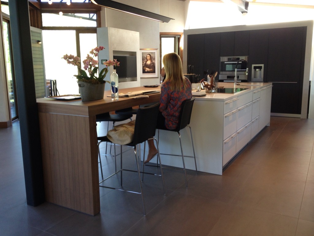
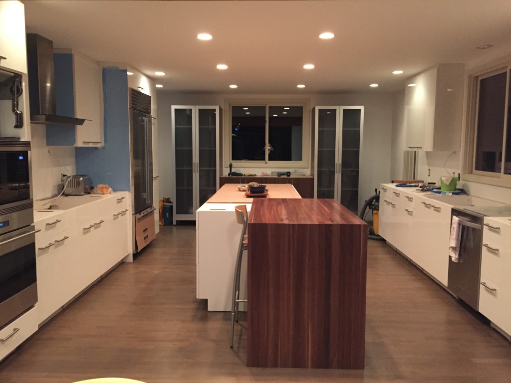
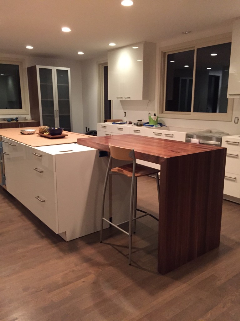
The elements I would try to incorporate in my design was the cascade of one material, only broken by a contrasting material. In the case of the kitchen, the cascading material was the wooden end. In my design, I would swap the wood’s role for a hard, inorganic looking material. I would also hope to make a very approachable and functional side table. Again, I’m aiming for a high quality piece that I would be happy with using for years.
I starting sketching ideas and came to the final design that I was generally happy with. I was going to build the one with the blue shelf, but instead of having a colored drawer face, I would use a dark hardwood.
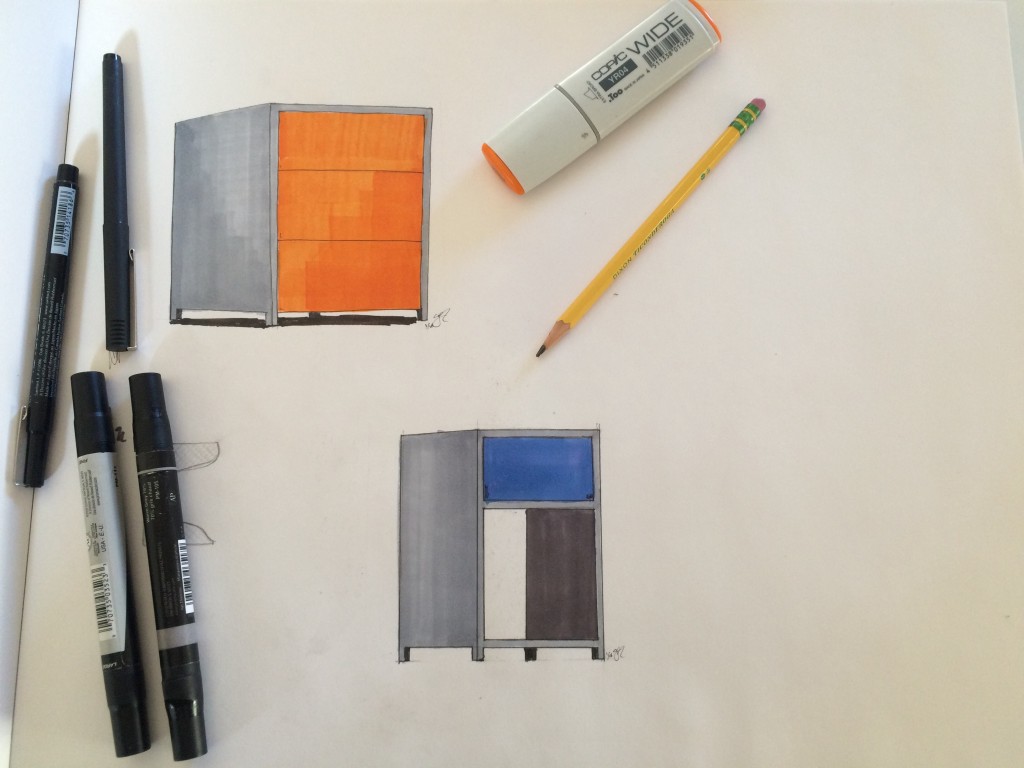
From this point, the design process was quite linear. I went to ReSource in east Boulder and found a decent piece of poplar wood from an old shelving unit. I also found some 1/2″ thick plywood that I would build the drawer with. Once I knew what I was working with, I laid out a design with all the dimensions need for the cabinet and the actual drawer. The ITLL wood shop became my main workshop. Below are pictures of the cabinet being clamped for pocket screws and glue.
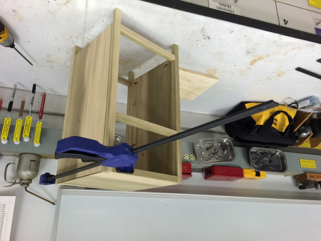
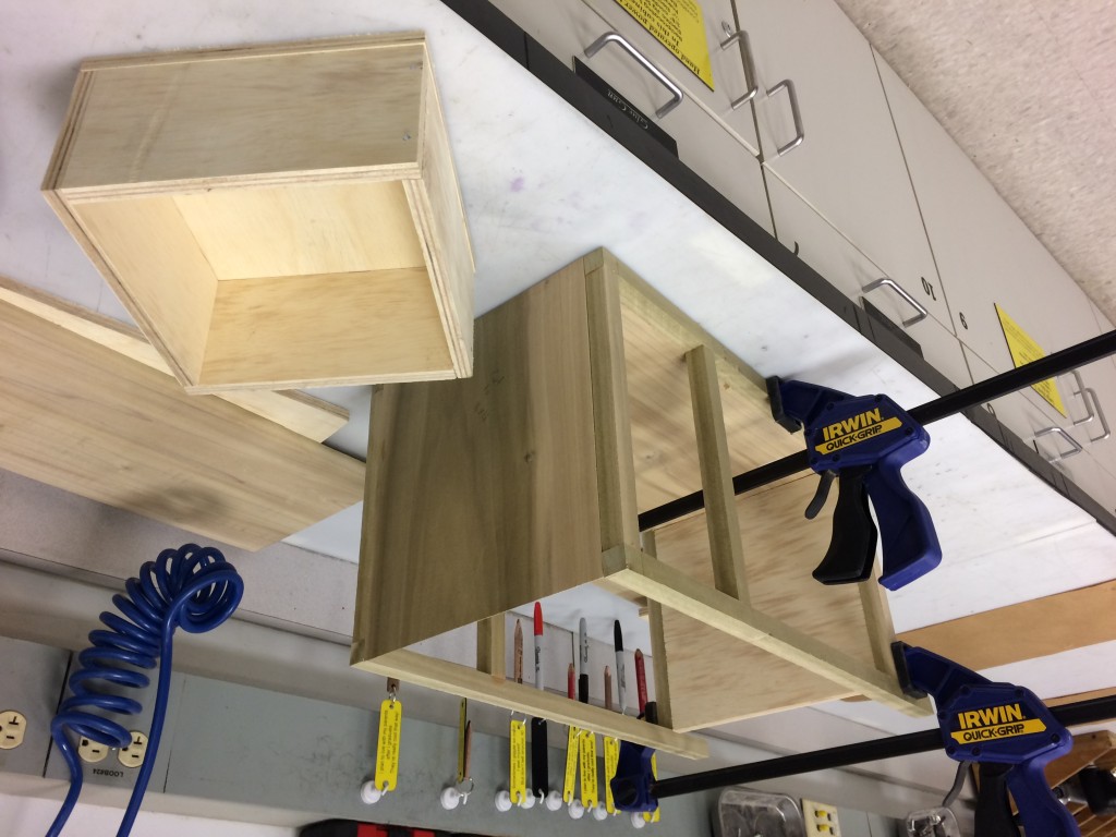
Once the basic structure was made, I was not surprised to see that the wood I found was somewhat warped. This meant that there were ugly creases and cracks throughout my table. To solve this, I went to McGukins hardware and found wood epoxy that I used to fill in all the cracks. I also picked up some high quality white acrylic spray paint. Below is the cabinet with the putty cured and ready for sanding.
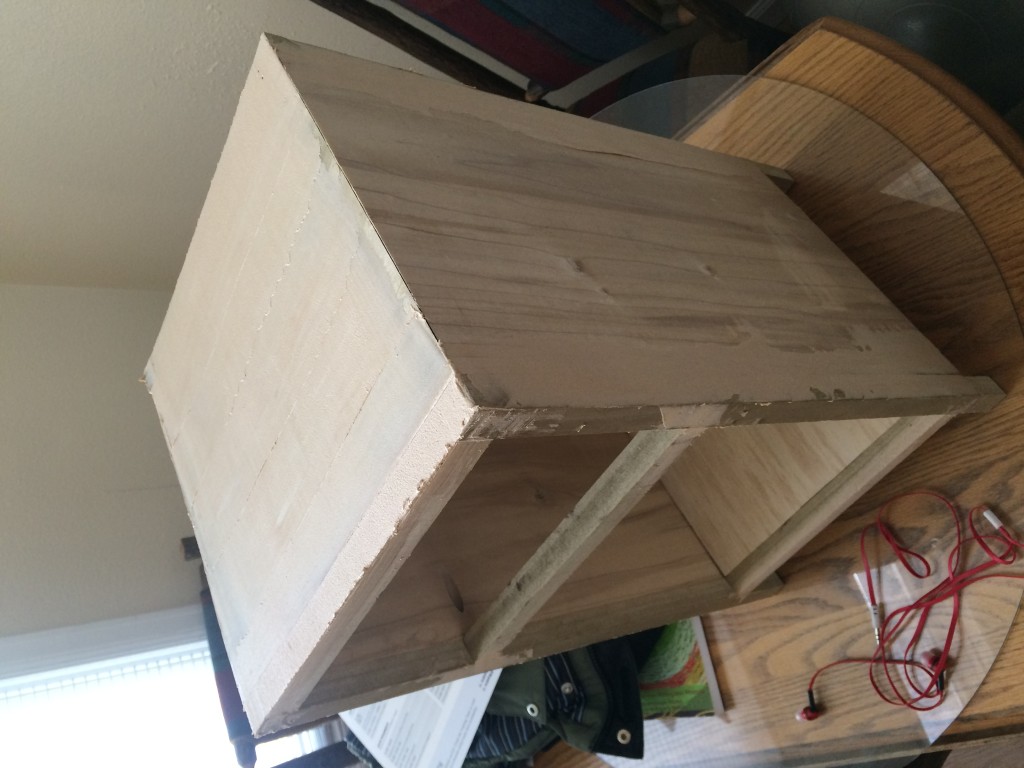
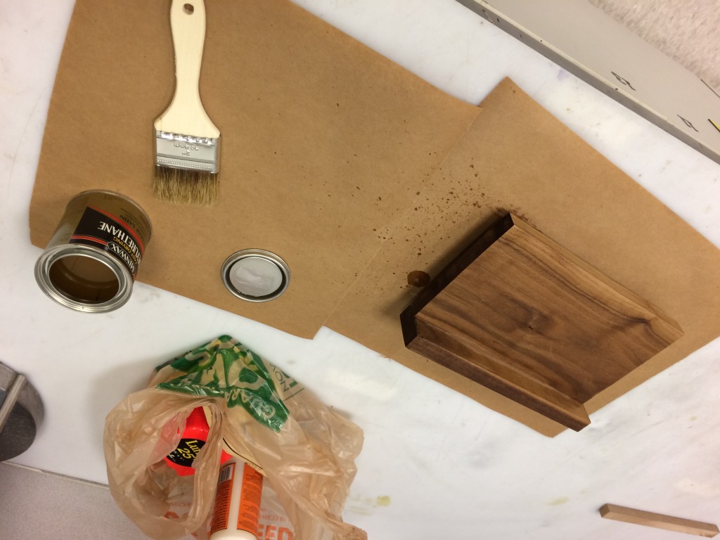
Once I sanded down the edges to a clean shape, I painted it all white. With that being easy enough, I made the drawer front by gluing together two pieces of walnut I found at the scrap pile at home depot. I also put a matte clear coat on the drawer front to make it look a bit more “finished”.
From here, it was easy to nail the drawer front to the actual drawer and install the sliders I also picked up at home depot. And just like that, I had a finished side table!
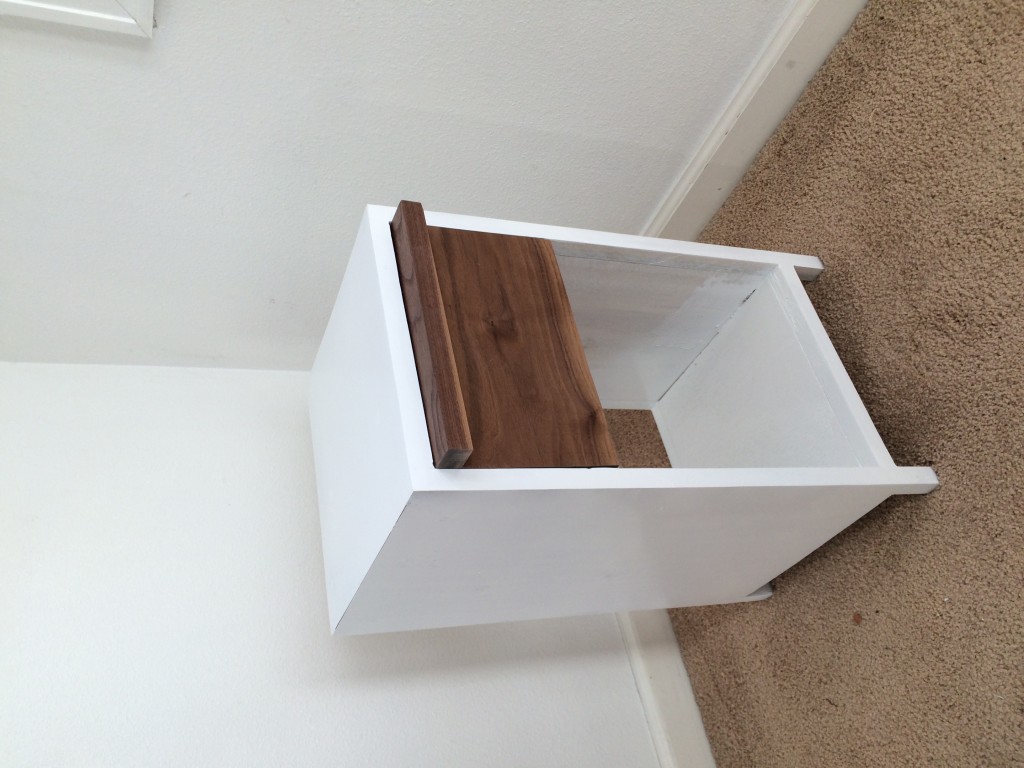
Through this process, everything was pretty linear and easy. I suppose I was designing a pretty easy product and I made all my measurements before I cut any material. A few hitches arrived when I had to fill in the cracks from warped wood. I also decided to take out one of the horizontal members on the front of the table, but these are more aesthetic tuning than big setbacks. I did also have to cut the drawer sliders so that they wouldn’t protrude from the back of the cabinet. However, with a finished side table, I can truthfully say that with good preparation, the design and fabrication process can be very smooth and linear. It probably helps that I was working alone and didn’t have to answer to anyone if I wanted to make a change.
I think this table meets all of my functional goals. The drawer is smooth and and the table supports my weight. In a perfect world, Id like to have a completely flush front with a “push-to-open” drawer slider.
This table looks nice, but I can’t say it completely meets my artistic goals. I wish the white was glossier and even harder. To solve this, I could use more paint and even add a layer of hard resin on top to get a really solid feeling cabinet. I’ve also had the thought of making the white part out of stone, like my parents kitchen. This would be more involved than wood, but it would also reach the aesthetic more and possibly be a higher quality piece.
I’d like to keep trying at this type of furniture, maybe I’ll make something bigger with the same style, but with higher quality wood and better hardware and sliders.

37 Comments. Leave new
This looks exactly like your inspiration! You definitely captured it. I feel like this is the futurism of the 90s, but maybe that’s just me.
Your final project fits right into the aesthetic you were going for very well. Great craftsmanship!
Love the natural look of the surface!
Awesome, seems like the surface finish is a bit rough though. The design however I like a lot. Very minimal and functional. Also, your parent’s kitchen looks sweet.
The table turned out quite well. You might want to consider using white Formica (countertop laminate material) to get a nice, clean, durable surface. Nice job!
Very nice execution and follow through with your aesthetic. Your skill and patience to make such clean furniture and joints is impressive.
That’s great! It looks like something from IKEA, which is impressive.
I like the clean white color on it. What are you going to put in it. Nicely polished, looks like something that I would love to buy. Great combination between the brown and white. Enjoy using it.
Great job! This project definitely ended up as something that I would expect to see at a store like IKEA or something. It’s simple, yet gets the job done!
So cool. think this is my favorite one of the class. Awesome!
The final product looks great, and definitely captures the modern/contemporary aesthetic that you were going for. It would fit right into an Ikea catalog!
The table looks awesome, and the drawer really captures the modern style you were going for. Also, great carpentry work on the drawers, they look flawless!
The finish on the wood drawer combined with the stark white paint creates a really nice look– great job!
I love this! very modern, clean looking aesthetic. This looks professionally done and it is totally something I would buy!
Great work, it looks like this should last you a few years. The table really seems to follow your aesthetic well.
Really contemporary, I liked your choice of colors and the drawer “woody” look. Might consider covering the back so you can use it even if the background isn’t a wall.
Nice job.
That is a nice side table with a simple design – meaning not overly ornate or complicated. Do you plan to use it? Good job!
I love the combination of natural and painted wood! It turned out really well. I would love to see other furniture pieces like this!
Cool project, I like woodworking. This might just be personal preference, but I prefer the look of wood over the white. I would choose a different color or use stain to keep the wood feel.
Really love the stain color you chose, especially in contrast to the white. Looks very professional and neat, well done!
Like the aesthetic, white with natural wood, simple clean design. A bit more paint would help with the white to pop, great use of used wood, belongs in Ikea.
I like how polished the final design looks. I agree, some more coats of paint and gloss would look nice. Did you consider using some recycled stainless steel for the drawer face. I think that would fit the contemporary aesthetic even better and make it look cleaner.
I think this table came out great. It definitely nailed the aesthetic and is useful as well.
This is a type of aesthetic that I am generally not a fan of, but you did it well. I think that a few more layers of paint are needed to prevent the original wood from showing through.
Very clean looking final result. Is the table top big enough to function as an end table. It looks like youbut a lot of time into it. Great job.
This looks like something I would buy in a store! The wood finish on the drawer is a great addition in the sense it offsets the white frame.
I think putting another few coats of white gloss paint would make it really pop, more so than it does now. I do love the finish of the drawer though, that wood came out really beautifully.
Your table turned out really nice. Is your side table big enough to serve your purpose? I like your ideas for for how to make your table more robust. It has a timeless look to it that can be used for years to come.
Definitely usable! Simple and clean, good stuff.
I love how well you were able to stick with the aesthetic you were creating. Your design is very clean and beautiful and really reflects what you were trying to achieve!
You did a great job making it look super clean and professionally made. Good work!
I really like the inspiration for this project, huge fan of that kitchen style. Came out very simple and sleek, nicely done.
I really like your inspiration from contemporary furniture with the wood juxtaposing the clean white material. Your finished project looks very clean and nice and I can see it fitting into a room nicely. I also liked how you had sketches of different designs you initially thought of. Great job!
Your final product looks really professional, good job.
Good job. I like your attention to detail that made the wood fit together nicely and the drawer slide smoothly.
Excellent work. The finished product looks very clean and well made, additionally it seems to follow your original design closely. It sounds like your only gripe with it is that the white finish didn’t turn out quite the way you would have liked, maybe in the future you could use metal for the frame and have it powder coated for a hard, ceramic texture.
Very nice! I love the front of the drawer, it’s so pretty. I also like how the rest of it is so smooth. Does the drawer open easily? I’ve never tried to make one, but it seems like it would be difficult.