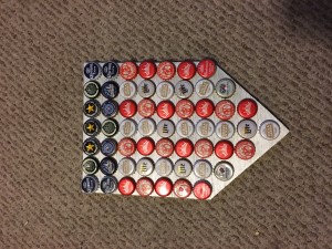
When I sat down to think about what I wanted to do for this upcycling project, I wanted something that could last, something that I would like to keep around. I ended up using a blend of two things I like very much: beer and the United States of America. I decided to use old bottle caps of mine to make an American themed mural of sorts.
At first I thought I would like to make an American flag out of my bottle caps, using the diameter of a bottle cap as the height of each stripe and then scaling accordingly using a 3×5 ratio. This, however, would have taken over 200 bottle caps, and I didn’t have enough, so I started thinking about how I could scale things down. The flag was out the window, but I knew I wanted to keep the American, red white and blue aesthetic, some examples of which can be seen below.
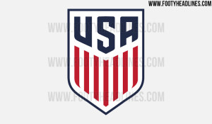
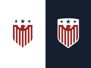
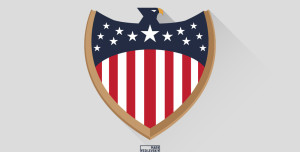
After a lot of thought, I realized that I could use designs form US sports teams that I have loved watching over the years. I went on google to refresh my memory, specifically searching for the following two designs:
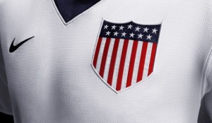
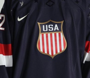
These are the crests of the US Men’s National Soccer and Hockey teams respectively. Since I would be using plywood to back my mural, I decided to lean more towards the soccer crest.
The first step was to get the right bottle caps. We have a bottle opener mounted on our wall which is behind a bar and in a corner, which means the bottle caps are seldom picked up. I went through our stash and found a lot of red, white, and blue and started organizing them to see how I would place them. At first I thought I would do 5 stripes, but realized that was too small and quickly changed to seven. In following the USMNT (soccer) crest, I knew I needed a line of blue across the top and settled on a depth of two bottle caps, with the stripes being proportionally five bottle caps deep on the ends, descending down to eight in the middle. This was mostly done by placing the bottle caps on my plywood and seeing how it looked.
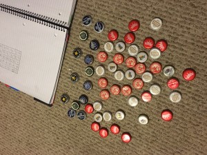
After I had the bottle caps placed, I used a strait edge and traced the design on the plywood, which I had left over from a previous wood-working project.
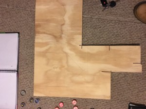
I then cut out the outline of the crest using a power saw.
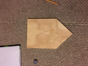
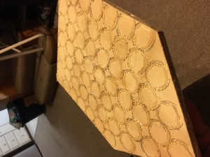
Next I figured out exactly how I wanted the bottle caps to align, and in what pattern, and used hot glue to adhere them to the wood. This was actually pretty tricky, as at first I tried putting the glue on the crown of the bottle cap. This ended up being messy and innefective, and soon I was placing each bottle cap, tracing it with a pencil, gluing a round my pencil marks, and then placing the bottle cap. The result was as follows:
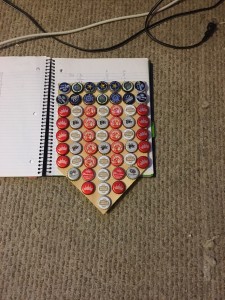
I didn’t like the wood color poking through after I was finished, so I ended up prying all the bottle caps off and starting over.
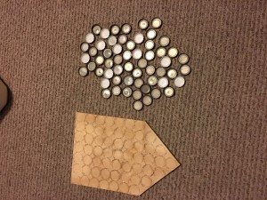
The hot glue (now cold and hardened) was not a problem to get off the bottle caps, but it wouldn’t come off the wood, so I had to cut a new piece, this one more symmetrical and better looking than the first.
I decided I would spray paint the background silver this time.
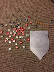
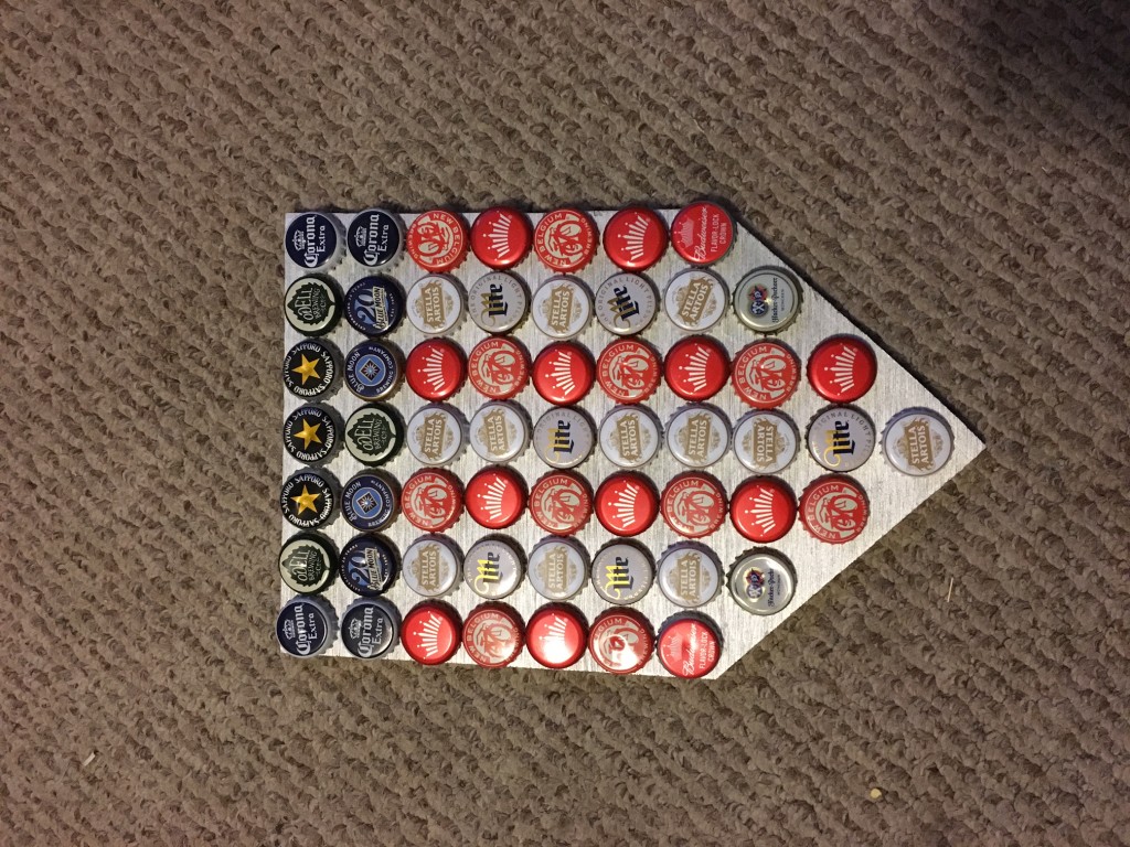
After the spray paint, I let it dry and then put the bottle caps back on, this time in a slightly different configuration.

(I don’t know why it’s coming out sideways).
My design process started out being very linear, until I decided I didn’t like the wood look, and didn’t think it went with the aesthetic. At this point the process essentially started over, except I already had the design and the bottle caps (total of 58 bottle caps used).
Like I said before, my inspiration was this great country we live in, with the added bonus of using beer caps to do it. I have always liked the “American” aesthetic, filled with red, white, and blue, and complete with the stars and stripes.
In the end I am very happy with how it turned out. I’m very glad I decided to start new and get the background painted silver, I think it really completes the aesthetic. If I had more bottle caps, or accumulate enough over the next few years, I would like to make an American flag as originally intended.
Sources:
http://uniformcritics.com/wp-content/uploads/2014/02/usa1-620×540.jpg
http://news.sportslogos.net/wp-content/uploads/2013/03/620x361q80-590×343.jpeg
https://d13yacurqjgara.cloudfront.net/users/75825/screenshots/1615571/usa_soccercrest-01.jpg
http://fscomps.fotosearch.com/compc/CSP/CSP995/k16750203.jpg
https://pbs.twimg.com/profile_images/464132499996549120/UkHuGpxq.png
36 Comments. Leave new
My wife and i ended up being so excited when Louis could round up his investigation through the ideas he got when using the web site. It is now and again perplexing to just always be making a gift of concepts people today could have been making money from. And now we fully grasp we have got you to thank for this. The type of illustrations you made, the simple web site navigation, the friendships you will help instill – it is many astonishing, and it’s helping our son in addition to our family feel that the situation is thrilling, which is very pressing. Thank you for the whole thing!
Awesome idea and cool final product
The silver behind the caps really makes the caps stand out. I think it was a good decision to add that.
Good move on spray painting it silver! It would look cool next to your mounted bottle opener.
I think silver was a really good idea. It offers a lot of contrast with the red and blue, and offers an off-white background to emphasize the striping.
There’s a lot of irony in this product. For example, Stella Artois, Budweiser and Corona are owned by a company in Belgium. Maybe they’re not the most “American” (Budweiser is still an american lager, though) of beers to include in your crest. It might be really cool to do a Colorado flag made of bottle caps from local breweries. Anyways, good work!
The crest follows the aesthetic very well! Time to mount it above the bottle opener.
I like the color combination and inspiration. In the future, it might be be interesting to make it larger so you could make a more intricate pattern
Love the american look. Gotta say you kinda cheated by adding beer caps from other countries! Kidding lol great crest man
It would be really fun to make a full scale flag in the future, and use it to make a table top (or to top a corn hole set). You would have to collect caps over the next couple of years. Nice work!
I think you definitely got the ‘merica aesthetic. I wonder if you could somehow incorporate a bottle opener into it.
The overall aesthetic is clean and simple. Nice work!
Great crest, love the alternating pattern of the caps too. It would be amazing if you made this with only American beers, and every single cap was from a different beer. You’d have to go dig through a lot of bottle caps to get there though, haha. Good stuff!
It looks very clean. I hope you used American beer for the American crest! Where are you planning on hanging it?
cool creative way to reuse your old bottle caps! Great college aesthetic .
Nice to hear what you were going for and what your project ended up looking like. Good excuse to buy extra beer. It looks great to. I am glad you changed the wood color. Now it looks like an aluminum sheet. If you have more time and more beer bottle caps you can do a full American Flag
Not my favorite aesthetic, but you took it to completion. There is a little ironic undertone in the elements that makes me thoughtful. What was your intent for a statement?
I like the inspiration behind your design. It was also interesting to see how your design evolved over time. I think the silver spraypaint really helps the look. Maybe only use American beer for your caps next time, if you wanted to be really consistent with your symbolism.
Like the crest rather than a flag, smaller scale and highlights the colored caps. Any thought to using curved edges rather than straight lines for the backing. Would prefer to see all American beer used but I think you achieved your goals well.
I like how you managed to have some with stars on them for the blue section! I wish you had all American beer bottle cap brands on there but considering how you had to pull from an existing collection, it would have been very expensive to achieve this.
I like the color coordination of the bottle caps, it helps with the overall pattern. I also like that you put the design through some iterations to get a better end result.
This is a great upcycling idea for bottlecaps. I wonder if having the bottom of the crest be curved would enhance the aesthetic.
Peyton Manning would appreciate your taste in beer.
Legendary comment.
This really matches the aesthetic that you were going for! I like how you went through some iterations to get that great final design you ended up with!
Good choice switching it to a silver background. I agree that it captures the aesthetic better.
Nice crest, the pattern came out well. The size is also quite nice, you can display it really easily. It would be cool if it were made completely from American beer caps too.
Cool project. I would’ve liked to seen the curvature seen in the actual logos instead of the sharp tooth.
I thought it was a metal plate 1st, silver was a better choice. nice work
I really like the silver background. I think that was an excellent design choice. Well done
This is a really cool design. I like the ‘Murica aesthetic of the crest, and also emulates the college party experience well too. How much beer did you have to drink in order to finish the project?
This is a cool project. It is similar to the bottle cap table and the Colorado flag string project. Good job!
Nicce implementation of the classic beer bottle aesthetic. Despite the limited resolution for the emblem seet by the size of the caps and the size of the panel, I was able to recognize it, so good job on making it look like the real thing!
Came out very clean and I like the American color coordination.
I think your crest looks great Jake! The silver background really adds a lot. How did you decide on this color over white or others? Different background colors in different regions might help pull out the bottle cap colors and pull everything together, but I like the silver look.
I bet it was hard to find all the proper and same bottle caps. I think using the same bottle caps along stripes might give a more consistent look if you can find them next time.
It seems like you thought about this but how did you decide to mix the miller lite and stella caps vs. using just on brand per stripe?
Swoopy, curved cuts are hard to get right and symmetric but I think this or sanding the edges would help achieve a more polished look.
It is really impressive that you took it all apart and started over just because you didn’t like the look.
The project turned out great. Job well done!
It is cool to see your design go from the idea stage to a product. It came out better then I imagined. I figured that you would make this on brown cardboard, I was pleasantly surprised.