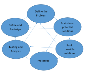
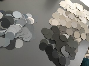
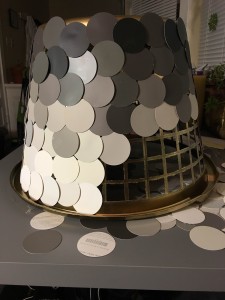
My vision for this project began with bettering the light in my living room. Much like many college homes in Boulder, the main rooms lack built in lighting. There is a lack of lighting over our kitchen table so I decided to design a chandelier that would add character to the room and light our kitchen table. With this determination in mind, I needed a structure that would allow the chandelier to maintain its shape and was light weight enough be supported by our 100 year old house. The purpose of this project was to upcycle materials so I began my design process with finding the appropriate reusable material. I found myself wandering around Goodwill. I discovered a broken laundry basket that was the desired size, shape, and weight. The structure would also allow light to pass through it. However, it’s broken and worn black frame was in need of a facelift. With the frame shape established, I was able to determine the design of the chandelier itself. I was looking to add color and have seen many projects with paint chips recently. Using the tools I had around the house, a circular punch tool and a hot glue gun, I was able to make the basket more aesthetically pleasing. The most difficult part was arranging the chips in the correct color order. It was also necessary to sort blue based colors from brown based colors. I also used a can of gold spray paint to brighten up the original black frame. Although I had a vision for the original design, I had to make changes and additions to the design as I began building the prototype. It followed a similar design process to a classic design loop. It began with defining the purpose and guidelines of the project. I then brainstormed ideas, using the available materials as potential ideas for the design. The prototype was created, tested, and altered until I approved on the final product.
My inspiration was not entirely from one source. I found nothing like my completed project, but I used several ideas and integrated them. I received my originally vision was from the many statement chandeliers I shared in my progress report last week. I have copied them below.
![Geometric Inspiration [1]](https://www.aesdes.org/wp-content/uploads/2016/01/Chandelier_1-200x300.jpg)
![Whimsical Colorful Inspiration [2]](https://www.aesdes.org/wp-content/uploads/2016/01/Chandelier_2-200x300.jpg)
![Paint Chip Fading Inspiration [3]](https://www.aesdes.org/wp-content/uploads/2016/02/Paint-Chip-Heart-Art-199x300.jpg)
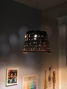
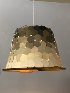
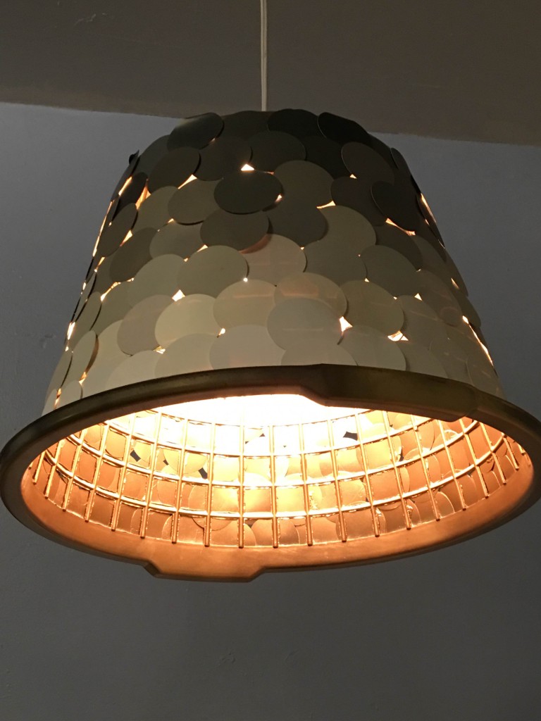
My functional goals was to increase the amount of light in the room at night. The chandelier adds light to the room, but not as much as I had originally intended. The paint chips are as thick as card stock and don’t allow much light through them. I put separation between the chips, but if I were to do it again I would add even more space between the chips. This would allow more light to stream out the sides. The chandelier, however, does allow lots of light to stream out the bottom and lights up the table quite well.
My aesthetic goal was to design a chandelier that was visually attractive in both the light and night. I feel that I have achieved my goal with the structure of the chandelier. I did have to spray paint the inner frame to cover up the text from the paint chips and blend the laundry basket into the chandelier. I am delighted with color fade from the paint chips and the way the light shines through the structure. The color and style works well with the room. The only additional change I would make would be to enhance the look of the cord.
![Wrapped Cord [4]](https://www.aesdes.org/wp-content/uploads/2016/02/cordcover1-200x300.jpg)
![Electrical Wiring Change [5]](https://www.aesdes.org/wp-content/uploads/2016/02/cordcover2-231x300.jpg)
![No Sew Cord Cover [6]](https://www.aesdes.org/wp-content/uploads/2016/02/DIY_cord_cover4-210x300.jpg)

42 Comments. Leave new
I really like the color scheme you used in the chandelier, and the gradient of colors from the bottom to the top (or top to bottom) works really well from an aesthetic standpoint.
It was nice to see the paint chips around the exterior, helped the look. The gold inside was really nice for reflection. Are you concerned at all about the color of light? Also, there could be some bad heat build up if you don’t have any ventilation.
Nice work! You should consider maybe making it so the light bulb can hang down more, or show more, cause it could make it a bit more like a crystal chandelier, which could be cool.
You turned a laundry basket into a lamp that looks completely at home in any home. Pleasantly surprised to see learn it’s not 50 shades of gray themed.
The use of the paint chips turned out great, I’m a big fan of the gentle color gradient. As long as you use fluorescent or LED lights I think it should be fine without venting holes at the top.
This turned out really well. The paint chips look so neat. What inspired your color scheme? The gold paint is a great touch.
The paint chips really gives it a modern feel. I love the way the light diffuses through the basket holes.
I like the colors you chose on the lamp. I really dig the degradation of the paint chips. Excellent idea of having a more attractive cord. Ventilation might save this from melting. I also like that it provides a dim light, keep it like that don’t change it
I like the color gradient. I think it would be cool if there was more of a uniform pattern between the circles to let the light out. Or have the gaps get bigger down the chandelier. Nice job!
This chandelier looks really cool, love the grayscale gradient you used with the chips. As Prof. Hertzberg mentioned, it might be good to poke some holes in the top. Good stuff!
I like the contrast between the interior and exterior with the gold white. The lighting looks a little dim, would a brighter bulb be enough or does there need to be more areas for light to escape? Good work!
The chandelier looked extra beautiful when the class was dark and the blue screen was projected at it , and painting the insider with goldish color really gave it special touch.
Really cool aesthetic when it is dark and lit up. Awesome work.
A Laundry basket as a lamp shade? Crazy cool, it turned out really nice. If you hang it up high I think it will give off enough light. How did you decide on the paint chip colors?
The color gradient looks great! I really like the contrast of the gold on the inside to the darker grey/brown/white on the outside. Was it awkward to take Home Depot for all they had? you did a really nice job integrating a bunch of different recycled sources.
I actually think that the cord is fine. It really compliments the paint chips. A brighter bulb is a definite must! While the gold was an accident, it really works well with it. You could also do a silver to continue with the color theme.
Interesting look, great idea using a laundry basket, gives a bigger performance than a std lightshade, maybe shave the handles for a cleaner finish.
I think this is the definition of an upscale project! I really like the modern aesthetic and have seen these types of lamps around Crate & Barrel, Macy’s, etc. How will you install the final product: Nailing to your roof or an interesting set up to keep damage minimal.
The gold paint came out really nice – I’ll have to keep that in mind for future projects. I liked your use of complementary paint swatches!
awesome idea and great turn out!
The gold paint on the inside works great– gives warmth to the color of the light reflected downward.
Upcycling win here! Everything being upcycled makes for a cool project. I think that Prof. H’s idea about holes in the top of the lamp (bottom of the basket) would help with the amount of light (and heat dissipation).
Cool way to recycle a laundry basket! I like how you added space between the paint samples so a little bit of light comes through
Good use of paint chips. I like to see a project that took significant time to incubate.
It gives a nice, soft light and is very visually appealing. Definitely succeeded as a modern take on a chandelier.
The chandelier turned out great! While it isn’t as bright as you wanted, the holes create a really cool pattern on the wall. I think this would work great over a little table as the light is very directed.
Clever idea, I particularly like the use of paint chips. The circular shapes and colors have a nice effect. Painting the inside gold also give it a more finished/formal appearance. Nice job.
I love the modern look you went for. It turned out great and the colors you used blend in well. ! really cool when you plugged it in and the light shined through the small holes.
That is an incredibly aesthetic final product! It looks like something that you can see in a professional setting like a hotel or something that you would be able to buy! I particularly like how it looks when the light is on.
the chandelier looks great! It looks like you spent a lot of time putting the exterior paper on the basket.
I like how the end of the lamp is light and gets darker near the base. Is it possible for the exterior (paper/paint chips?) to catch on fire? How ere you planning on hanging it on the ceiling. The holes in the exterior add a cool (disco ball -ish) aesthetic.
Good job, I couldn’t tell it was a laundry basket at first. It fits a modern-chic aesthetic perfectly. Just make sure to provide ventilation in case you use an incandescent bulb!
I really like how the light casts through the gaps in the paint chips. Great project!
I really like the colors you chose and the gradient scheme – looks modern and chic.
Looks awesome. It gives off a soft romantic light. Creative outside circles!
I like how functional it is. Seems like you can really put it to use in your house…and keep your roommate who’s not the most fond of the dark safe! Are you going to add a sleeve to the chord like the one you posted about?
Adding a wrap to the cord would be really cool. I’ve heard there are some pretty cool heat-shrink options for cord wraps. The colors are really nice as well.
Painting the inside gone is a really nice touch- I agree with your idea about wrapping the cord to continue to beautify the piece. The paint chips are a creative layering idea also.
This is a really cool design. It looks very clean and professional. I really love the color palette you used to go with all sorts of rooms. I like the gold inside used for artistic purposes as well as the function. This is a beautiful design and I love the light that shines through the small openings! Great project!
This is a great way to upcycle and the paint chips are nice! I have always wondered what to do with old laundry baskets because my family’s has been cracked for a long time.
I really like the color scheme in your lamp! I think you did a great job transforming the individual elements of your project into the lamp!
Cool idea, I think the colors are a bit dull for my taste. I think the colors need more contrast between the lightest and darkest color.