Below is my design report for the upcycling project.
Design Vision/Specifications:
When looking into starting the upcycling project I knew that I wanted to make a piece of furniture for my apartment. While I enjoy creating art, I felt that it needed to also have a function in order to be justified in bringing something else into a small college apartment. I knew that I wanted to embrace the meaning of upcycling by using the largest amount of recycled material as possible, and spend the minimum amount of money that I could.
As for the artistic vision of the project, I wanted to focus on having the piece look like it fit the other furniture in the apartment and didn’t stand out too much. Currently my apartment has a lot of blacks, browns, and blues in it. I knew that this would be a good starting point for a color scheme of the project.
Design Inspiration:
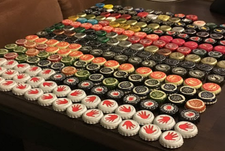
After determining the vision of the project, I had to find some inspiration for how to go forward with the project. Looking around the apartment I noticed that we had a bottle cap collection laying around.
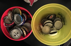
Bottle Cap Collection
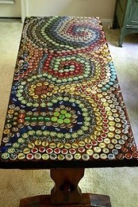
It was with this observation that the idea for the execution of my upcycling project came into being. What if I were to use the bottle caps as some kind of decoration for a table? I knew from some previous experience that bottle cap art is a prevalent aesthetic in today’s society and specifically tables that are topped with bottle caps. A quick google search revealed all of the different cool thinks that have been made from bottle caps as seen below.
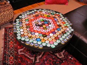
http://www.instructables.com/id/Bottle-Cap-Table-with-Poured-Resin-Surface/
https://www.pinterest.com/explore/bottle-cap-table/
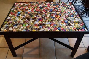
http://sadtohappyproject.com/diy-bottle-cap-art-and-craft-ideas-to-recycle-bottle-caps/
The idea of a table topped with bottle caps seemed like the perfect fit for a piece of furniture for a college apartment. I finally had an idea to move forward with for my upcycling project.
Project Creation:
It was with this inspiration in mind that I set out to the thrift stores and scrap piles at Mcguckins to find the components that would make up my piece of furniture. The result from my adventures; an old outdoor pot holder stand, a framed mirror, some old sheets of acrylic, and a ton of hot glue. All in all costing me around $10.
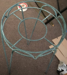
Old Pot Holder Stand
With supplies in hand I began to build. First I arranged the bottle caps in a pattern on the mirror and glued them down to the mirror as seen below. Next step, creating a top.
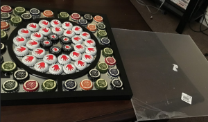
Bottle Caps Arranged on Mirror
From my progress report I received some feedback to look into creating a resin top for the table. I looked into this more and saw some pretty cool looking bottle cap table tops. However, because of the mirrored surface I wasn’t convinced that that was the way to go. While playing around with the piece of acrylic I found I really liked the look it had when placed on top of the bottle caps. The bottle caps sat a little bit higher than the frame of the mirror causing the acrylic to give a cool floating appearance as well as allowing for plenty of light to hit the mirror and cause reflection of the bottle caps.
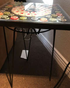
Floating Table Top
Finally, I painted the stand with some black paint I had laying around, attached the acrylic with some glue dots (ended up being virtually invisible on the top giving more of a floating appearance) and attached the top to the stand with copious amounts of hot glue (yay hot glue). The final project, as seen below, turned out nicely. It serves the purpose pretty well and I was happy with the result.
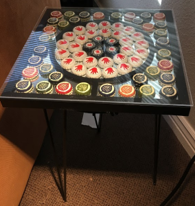
Final Result Side View
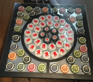
Final Result Top View
Ideal vs Actual Design Process:
Looking back on the project, it is interesting to view the project in the mindset of the design process. In class, our team created a design process for engineering projects that is similar to the flow chart seen below.

Traditional Design Process
Traditionally in the design process, a problem is defined with requirements specified. A brainstorming session is then held to come up with ideas. These ideas are then whittled down to a single idea for moving forward. This idea is then prototyped, tested and analyzed. After analyzing the design either goes on to the final design, goes back to prototyping, or goes all the way back to the problem being redefined.
Compared to the traditional design process, the process I went through, as can be seen below, was very different. In my upcycling project I went through the very linear process of creating design specifications, gathering inspirations from online search, determine what supplies I had available for the final design, perform some small prototyping to find the best way to use the materials, and then create the final product.

Upcycling Design Process
Unlike the traditional design process, there was very little room for iteration in this project. This mainly had to do with the fact that I had limited supplies with which to iterate. When I made a decision on how I wanted something to look I had to stick to that decision or loose the scrap material that I had. Because of this I had to be very thoughtful when proceeding from step to step.
Functional Goals:
Functionally, the table ended up working really well. It is the perfect height for the couches in the apartment and fits nicely next to it. The only problem I have with it is that it is not the sturdiest of furniture piece. It works for it’s intended purposes but I would maybe make some changes if I were to do it again.
Artistic Goals and Aesthetic:
As for the aesthetic design of the piece, it definitely fits the overall aesthetic of upcycling as all of the components are recycled from something else. Diving a little deeper, the table also has a sense of bottle cap art and college DIY. The final result certainly has an appeal, but does not pretend to be high quality at all. Overall it fits nicely into the aesthetics of the apartment and the characteristics of the tenants that live there.
Conclusion:
Overall I am pretty happy with how the end table turned out. It fits well in the apartment and has found a home for the foreseeable future. I liked the concept of working with bottle caps and might use this project as an initial exploration I the cool things that can be made with them.

48 Comments. Leave new
Sami, your bottle cap end table turned out incredibly well! It would look really cool if you could find an pretty old wooden table and refinish the top of it with the bottle cap idea. No only would it possibly make it more stable, but it could also make the table a little bit bigger. That being said, using a flower pot stand is a really crafty way to address the stand. I also love the bottle cap “floating” effect that you mentioned, as it gives the table top a little more depth.
Leaving a second more substantial comment. I am interested in the radial and symmetrical pattern of the bottle caps on the mirror, it allows the eyes to travel across your piece without being hindered. The mirror with the black frame and paint, kind of create a negative space going on which make the bottle caps appear to float. Which is really pleasing to the eyes. Also, if you have a little wobble issue, I would recommend just putting felt on the bottom legs, because they make easy dampeners. Your design process was pretty linear, would you be interested in being a little more “loopy” during the next project?
I love the use of the patterns with the bottle caps! Also adding the mirror to the top of the table was a fantastic idea! An idea to fix the instability of the end table would probably just to add small diagonal beams between the legs. Overall, beautiful aesthetic and honestly I wouldn’t even think you just made it rather than bought it from high quality it looks!
That is a really cool way to enhance the appearance of a table. I like the whole bar table aesthetic.
Nice and functional project that has a modern style to it.
It is awesome to see the completed table! We discussed the table during the last few classes, it looks clean and fits the college room aesthetic nicely! Way to use local brews too.
I really admire the seamlessness of this project! It’s hard to tell what holds it together, it just looks like it all fits so well. Also, I think the radial symmetry of the hands is really cool. It adds a lot of inherent motion to the project as your eyes scan over it.
This turned out awesome. I never realized before I saw your product how different bottle caps carry different aesthetics themselves. This would be a really easy design to extrapolate into a line of products; seasonal themes (leaves), different color patters, really anything because bottle caps are so individual and varying.
Nice stand and I like the color matching you have in your design. The symmetry you have is really aesthetically pleasing to look at. Is Acrylic durable with the application of the table. Like can you put hot plates/cups on it? Will glass help? Where will this go?
I liked how you focused on using all reused materials. It really worked for you here. The mirror on the top was an unexpected touch, and I think it’s awesome! It adds another layer of interest to compliment the bottle caps. I wonder if there would be a way to add stability to it without getting different or more legs. Maybe you could try adding extra surface area to the bottoms of the legs?
I like the bottle cap pattern that you went with. The corners of the table look very pointy, which can be dangerous. The mirror is a nice touch. Good work!
I really like the design, it is highly creative and fun. I was wondering if you ever considered painting the bottle caps vs using designs you already had. If you wanted to do this in the future, you could probably go to local places that bottle beer/other drinks and ask for reject caps.
The bottle cap layout looks great! It would be interesting to see how you could play off of the cap’s themes to create an integrated artistic design.
Cool design with the bottle cap arrangement, definitely appealing to the college crowd. Would you use a 4 legged stand next time?
Awesome table! The look of the table is awesome! Really like the cap idea! It would be a more functional table If the design of the structure becomes more stable.
Looks amazing and the college DIY aesthetic is really neat and it looks much more professional than most things I see using that aesthetic. The only question that matters: Are you confident enough in the three leg design to place a few full beers on it? Again really cool design and end product!
My favorite part is the design that you were able to make with the caps. The left hand cap design is pretty interesting and I’m glad that you used fun bottle caps as opposed to like coors light. Do you know how much weight it can hold?
The final layout of your bottle caps looks really good! The mirror and the acrylic make it look very professional, well done!
When I first saw your table, I thought it had sushi on top! The bottle caps just looked that way. Which got me thinking, maybe next time you could paint the caps next time. While your project was beautiful and captured the upcycling spirit perfectly, if you did this in the future it could help you branch out to different aesthetics too.
I really like the mirror under the bottle caps. It gives it more depth and dimension. I also like the pattern and colors you used for the caps. It may be a good idea to use a sturdier frame if you make something similar in the future.
Great job creating a finished looking product. I really like the invisible fastening of the top sheet.
I really like the appearance of your design. It is very College DIY and I love the acrylic floating above the bottle caps so that it doesn’t look glued on. Great job!
I love that you used all recycles materials and integrated them into one entirely new piece. The mirror adds a nice light reflection. My one suggestion would be to make a more structural design that ensures drinks or food would not spill when weight was placed on it.
If converted into a stool (rounded top), this would look sweet at a bar! Looks great.
I like the idea that you used a mirror and this DIY project is so college! It doesn’t take up much space and it’s a great conversation starter. I like the bottle caps with the hands. The way you positioned them in a circle makes it look like the hands are touching.
The table frame looked really beat, but ended up looking really nice after you repainted it. I wonder if the acrylic top will be scratch resistant enough? In the future you could replace it with a piece of glass if it becomes an issue. It would be cool to make a few of these for an outdoor BBQ setting.
College diy… dig it! Did you have problems using “opened” bottle caps that are warped? Green to black was a good call too, matches really well!
Nice clean design, I really like the pattern of the bottle caps on top as well as the use of a mirror as the mounting surface for the caps.
The design looks really cool. It was interesting to hear about how you got all the bottle caps and how it fits your apartment furniture. It also might be helpful to use a able with 4 legs next time.
“College” aesthetic indeed. You mentioned stability is an issue- perhaps joining the legs diagonally with wire could increase stability?
This is such a cool project with great execution. Adding a mirror below the bottle caps added a great perception by adding depth to the table. My only suggestion is to round the edges of the acrylic top because they tend to have sharp edges.
I love the use of the mirror under your bottle caps! It looks very beautiful and adds depth your table top! It would be really cool to have a large circular acrylic top to the table to make it even larger and draw more focus to the circular center of the table.
Nice execution and good use of bottle caps. The black frame and mirror goes well with the color patterns on the bottle caps.
I really like the pattern of bottle caps you arranged. The mirror really adds some depth to the table in a cool way.
Like the use of bottle caps to create patterns and if you add led’s to edge you would get a glowing table! Phase 2?
I like how you took beer caps which are usually thought of as trash and turned it into something that looks so classy. I’m sure it really classes up the “college” feel of your house.
Really clever idea to use the garden pot stand as the base, definitely a cheap and innovative way to make an end table.
Love the idea. Excellent able especially for a college student or beer advocate. Really like how you used similar caps to create a design.
This project stood out to me as I was perusing the blog this weekend. I think this is a really appealing project which would look good in any beer lover’s home!
This is a super cool way to recycle what I would have otherwise considered trash. You should get together with some friends, collect more caps and create a larger scale table!
You showed me pics and talked about it, but its cool to see the final product. Looks very well put together. Nice job!
Really great design. I love the Lefthand Brewery white caps in the center, makes a really appealing aesthetic. Very well done.
Did you do any dimension measurements before starting or just added as you went?
Awesome execution getting this done, and also liked your resourcefulness! How durable is the acrylic surface if the table is picked up by it?
I love the design you made with the bottle caps. The hands “flowering” outward is really cool and I’ve always loved the Odell’s caps. Also, props for doing it all with Colorado Breweries! The metal frame also adds to a brewery, sort of industrial, aesthetic. Nice job!
Great table! I thought it was bigger from the pictures! I love the color coordination of the bottle caps, it definitely looks very clean and well put together. How long did it take you to get it all set-up and glued? Would you consider making bigger tables or maybe countertops or something along those lines?
That is an awesome looking table! I like how you even used local Colorado beer bottle caps too. Where did you get the outdoor pot stand from? Pretty cool find for your upscale project.
This was a really cool project. I like how you painted the stand black in the end, I think it makes the table look more thoughtful and “clean”. Are you concerned at all with the hot glue holding up over time? If it seems to have trouble staying together I would recommend using a 2 part epoxy. They have a large variety for gluing different materials together which might serve your purpose really well.