For my Upcycle project, I recreated the board layout used for the board game SORRY. This idea came about because I like the idea of converting scrap wood from a previous project into something useful. It sucks when you can’t use small sections after cutting up the main piece! Additionally, I have an Uncle who actually does a lot of upcycling by turning trash or various simple objects into tools, games, or even things which he sells as decorations.
Initially, I was thinking about turning scrap wood into a nice walking/hiking stick, but then I changed my mind when I started wondering about fabrication. Upon thinking about the laser cutters in the ITLL, I decided that I wanted to involve some wood engraving with those machines.
Why? Because I greatly enjoy the aesthetic of wood carvings and engraving! I find these types of work pleasing and easy to appreciate. With this decision made, next came the choice about how to redesign the board.
My aesthetic vision for this product was ultimately twofold: I wanted it to look very clean and rustic, and for the new spin on the board to reignite an interest in this game. Initially, my idea started out as applying the aesthetic of “nature” to the board. This could have looked really nice because the tall towers could have been turned into trees with cool root systems and…that is where I stopped with the nature design because a bigger and better theme popped into my head. SPACE. Here are some great pictures that portray space and that I knew I immediately wanted to use:


These are ideal space pictures in my mind! Personally, I define this specific space aesthetic as “childhood space imagination”. When I was a child, these rockets and spaceships are the first images that came to mind when presented with the idea of outer space.
Before jumping onto the laser cutter, it was necessary to start my virtual design…Oooof! What a time suck this has been! Fun, but quite time consuming to practice with SolidWorks and CorelDraw (which is the program that talks to the laser cutters).
Here is an initial view of the virtual board as I was beginning iterative improvements:
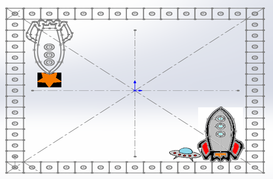
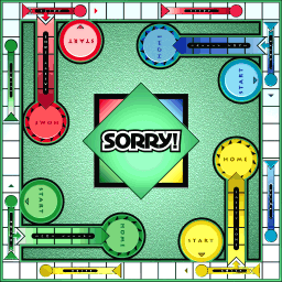
Iteration and testing were the names of the game for me in order to complete a product that I am actually quite happy with. There was not a chance in the world that this project would have been completed in high quality through a linear design process. Once my ideas about the board were flushed out and the virtual design was started, I relied on test cuts to refine my design and help with my knowledge about the process. There were even a few times when I went back to the very beginning to think about the basic SORRY layout. After the first two tests I actually started the SolidWorks design over again entirely from scratch in order to improve its usability!
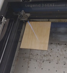
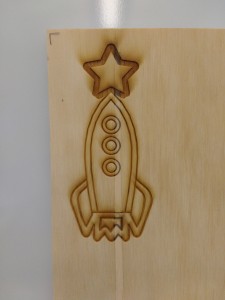
The two pictures to the right show my first wood piece in a laser cutter and ready for the first test cut, along with the result:
What did I learn from this first cut?
- The final board will look sweet with all the engraving J
- 50/50 power/speed settings look good, but did make the board slightly sticky and there was noticeable burning around the start.
- Change the windows of the rocket, and make the flames of the rocket longer to allow for room for the (eventual) pegs
- Expand the star on top to allow for room for the (eventual) pegs, and reduce the size of its engraved line (reduce the burning)
Next Test: Decide on pegs that are small and won’t ruin the aesthetic of the board.
Solution: Lego axles with 3/16″ holes (first tried the next smallest drill size and it was too tight)
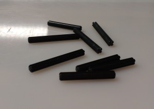
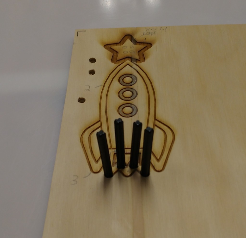
After this was the next laser cutter test, including changes made to the design!
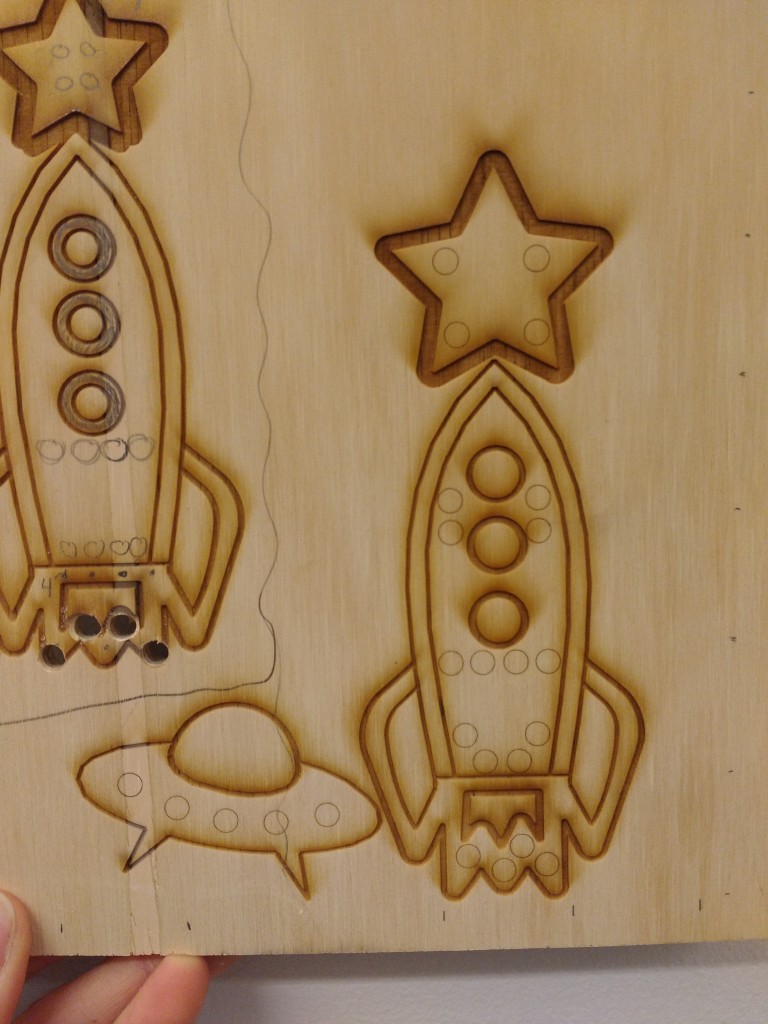
The small circles left (above) were the initial peg-locations which were unfortunately going to require separate drilling (because the ITLL laser cutters aren’t used for cutting through wood).
One of the next steps to finish after this point was to prepare my final piece of wood – this actually entails a cool note. Thanks to my blog update, I got advice from a friend about making my fabrication easier! I was informed about the laser cutter in the BTU Lab on campus likely being able to cut through wood. I looked into this more and unfortunately this machine was unavailable, but I was still in the mind set of using a laser cutter to cut all of the peg holes – did NOT want to hand drill them all. This led to two things, I reduced the number of peg holes to the correct # (originally there were more holes because of my family’s rules), and found a large piece of balsa wood to use instead of the particle board that I found first. I checked with the ITLL, and was allowed to attempt cuts through this softer wood as long as I did extra cleaning steps. I used a 3rd test cut to prepare the machine settings for this different wood.
My virtual design also had to be finalized by deciding on the remaining decals/images and their placement. My test cuts definitely helped with the iteration of these placements and sizing. For the remaining decals, I created shooting star and flying rocket outlines. They came out better than I expected!
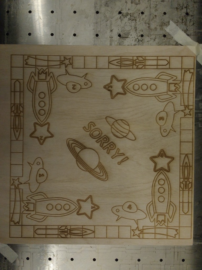
Here’s the final board design:

Here is the final board both in the laser cutter, and fresh out of it:
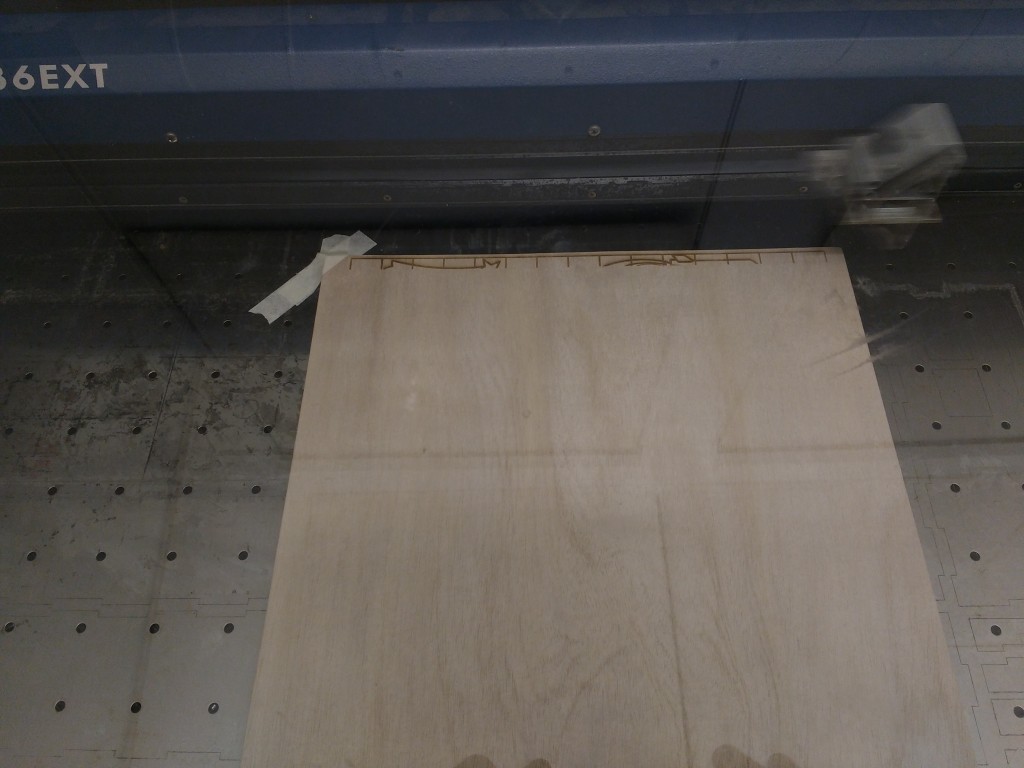
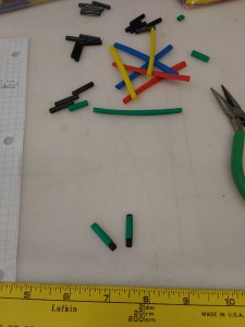
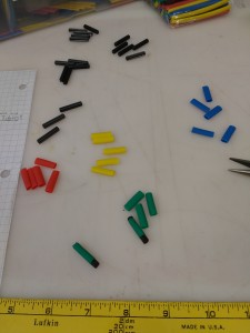
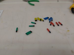
My last task was to decide on a way to differentiate between playing pieces. At first I thought that I would have to resort to paint or construction paper, but then I found the perfect solution: heat shrink tubing. Now these pegs fit perfectly in the board – they aren’t too tight and aren’t loose.
Conclusion:
In the end, I definitely have to say that my main challenge was the virtual board design. It was pretty time intensive to figure out how to do this process, but now looking back, if I have the chance (or excuse) to do this again it will go much faster now that I am familiar with it.
My two big takeaways from the project are that I am happy with the end result and believe that this is a great way to give old wood a unique purpose. The quality that resulted makes me glad that this board with be a family gift to mom soon because she loves the game, and the chosen space aesthetic worked out well with how it can be used to represent every aspect of the game! I can’t wait to play this with my family since it turned out so well and functions exactly as it needs to.
Things I will do differently when I do this type of work again are to be more familiar with the game beforehand to improve the designing time-frame, and look into stains/varnishes to protect the board and enhance its longevity!

45 Comments. Leave new
[…] a Sorry game board in this course a couple years ago. To see Matthew Sturms complete work click here. I figured this would be an excellent chance to work on new skills as I have very limited […]
Honestly, the laser engraving looks professional and I was amazed with it when you showed it to the class. Making the SolidWorks sketch for it must have been real fun! I love its rustic wood look, but painting it could make the design really pop!!
I think using a laser cutter was an excellent choice. The burnt wood effect really gives it an old-timey aesthetic.
As a space enthusiast I really enjoy your theme. If you are planning on staining or painting, be careful about filling the game holes as the pegs will not fit in them properly anymore. Your CAD design looks sweet, I did not realized how hard it was to make that board.
How did you convert those images to vectors? Or did you print them as rasters? Have you considered the use of magnets rather than holes?
SORRY! was one of my favorite games as a kid, but I always felt that the ‘50s aesthetic of the game board was always a bit dated. I like how you put a clever twist on the theme of the game, being that there really is no functional consequence in regards to the theme, and thusly it can really be anything. Lastly, the incorporation of the upcycled Lego pieces as the game pieces was magnificent: very well done.
This turned out really cool. I think your idea of a stain or varnish would make this really professional looking – I was thinking some sort of glossy varnish to make it smoother as well. On a different note, this was the best smelling project I saw today!
Great Job. I love the fact that you are using wood and am impressed that you are using that in the laser cutter. Nice board I like its simplicity. Can you add colors to the board? Or have 3rd dimension added to it? I would love to have some carved spots for the cards and the pins. Just a simple thing to keep everything together.
The space theme is cute, it’s the perfect thing for kids. I like the wood and the slightly darker lines from the laser cutter: it’s a nice effect. Is the game board supposed to be centered on the piece of wood? It looked a little weird with the extra strip on one end. You have some serious dedication to draw all that in SolidWorks. How long did that take you?
Nice use of the laser cutter. I can see the incorporation of inlays (a darker, contrasting veneer) looking really nice. I would recommend making the board thicker, then maybe use a router to give the edges a nice, clean shape. A polyurethane finish will help it last longer too. I like the rockets. Well done!
This is such a cool idea, re-imagining a game to make it fresh and new to people is a cool idea. I liked your design and that you laser cut the wood. It could have been laid out better though and it would have been neat if it had cards to match the board. You had a very creative way of designing the game pieces and using drilled holes to move the pieces and keep them in place.
I am not sure how you made the design on your computer, but it is interesting and awesome. I did not get to handle the game, but I was wondering about how easy it would be to get a splinter when holding the edges, was anything specific done to the edges to prevent splinters/board decay?
Really neat design and great aesthetics. Could you attach spaceman lego heads to the pieces to complete the look?
This is a neat idea. I think there is potential to incorporate an electrical lighting element as well if you wanted to continue with this design in the future.
At first glance one might think this project was simple but actually you were creative and went through iterative process. I think this project would be awesome gift for a kid especially they can color it.
Nice work.
Heat-shrink on the pegs was a great idea!
The game board looks awesome. Really want to see the how it turns out.
I really like how you engraved all the wood as opposed to just attaching stickers. Are the stars and the rocket ships like shortcuts? If so that’s pretty fun.
Finally I have one last question… “Is it too late now to play sorry?”
I like how you didn’t include colors and kept it very rustic and sleek. Why did you recreate the board in SolidWorks? This seems like a lot of extra work when CorelDraw can interpret .jpg files for engraving. That way you could have just used a Photoshop like program that would be easier for photo editing.
This was a great way to repurpose old wood. It’s a fun idea to personalize the popular board game and use whatever theme most interests you.
Very creative and good use of the laser cutter. It looks like a lot of work went into generating the SolidWorks files.
Your project looks great, very well done. I wonder where your graphics came from… they look really appealing and fun! I’m surprised that you used SolidWorks for your design rather than native CorelDraw.
The wood looks really nice. I would suggest staining or coating the wood. This will protect the wood and also really show off the grain. Creative use of heat shrink on the lego pieces. It’s also good to know that someone will get use from this design.
The board design looks very intricate and precise, it looks like the laser did a good job.
Great job! This was a really creative use of laser engraving/cutting. All designs on the board were clean and neat, and you definitely captured the rustic aesthetic you were going for. I also like that you didn’t paint it. Next time, look into fabricating the pieces as well to finish the aesthetic!
Awesome space theme, it turned out great! Sorry definitely needed a new look
I like how you weaved your childhood inspirations into this project. The board turned out great and I like that you kept it looking rustic and clean by not including a ton of color. The solidworks you did on this project is quite impressive as well. This would look really great in anyone’s living room. Nice clean presentation
The space theme engraving the board looks very clean. Adding rockets and space ships will certainly make the game more appealing to kids. It would be great if you went more in depth on how you designed the ships on solidworks.
Although outside the scope of the project, it would be awesome to create the cards to keep in theme with your board. If you could find some wood print paper, you could raster each of the numbers with a custom design. Are you planning on putting a lacquer coat on top? I think that you could seal it in without loosing the nice burned wood aesthetic. Nice job!
Great use of a laser cutter, gives the recycled wood a clean well produced finish. Adding splashes of color or stains to give a bit of variety to the finish.
I could totally imagine this in a specialty toy shop. Reminds me of the Melissa and Doug toys. Great Solidworks graphics!
Great Idea. This would make an awesome present to a friend or younger child. Can only imagine the amount fo games you can replicate or create your own board game!
Solidworks layout is very impressive, and use of legos + heat shrink as game pieces was very creative. Good work!
The new design for the board game is very appealing. It has a very natural, clean appeal for the board game. My one suggestion would be to add some colors. If kids are playing this game, they would be more attracted to it if there was more colors.
The board looks super clean and rustic, and very professionally done! It would be cool to try and stain different parts of the board to exemplify the artwork on the board.
I really like the space theme you went with! I really like how the pieces can be stuck into the holes which makes it super easy to keep track of the pieces better so that they don’t slide around. I’m curious if you plan on using it or already have.
This is super sick! I like that you didn’t paint it, and just left it with the laser-cut wood look.
How’d you design the layout to be engraved- adobe illustrator? cad? Looks awesome.
I really like the burnt wood look. It is really clean and professional looking. Great idea on the heat shrink tubing! overall looks really great!
I like that you took an existing board game and made a DIY version of it. It would be cool to make the plans widely available online so people could make their own board games. (Provided you’re prepared to get a cease and desist letter from Hasbro at some point).
I would like to see the game board centered on your wood.
Very interesting idea. I like how you utilized the laser cutter in the ITLL. Board looks very clean and well done.
I have never played sorry! But the engraved wood looks awesome and fun
The engraved wood definitely adds an elegant/sophisticated air to the classic game. Very nice!
The game board came out really cool! I love the cartoony space design.
What was the motivation behind this project? What made you want to modernize a board game board and make it out of wood? I like the look, and it looks a lot more robust than a cardboard type board. Are you considering painting it?
This is wonderful, I forgot to ask what you intended to do about the other pieces to play? Did the printer not sit square on the board, if you have a chance I think making the dimensions more even and centering the board would do a lot. This reminds me of those really fancy chess boards you find at snooty hotels. I’m very impressed, great use of resources.