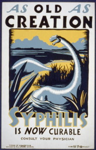
Art to spread awareness for syphilis?
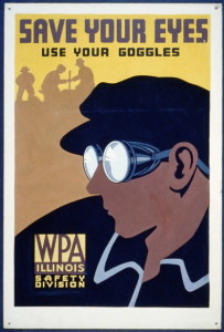
During the depression in the 1930’s, jobs were hard to come by for most everybody in the United Sates. Artists especially felt the squeeze as Americans worried more about putting food on the table than supporting the arts. As part of the New Deal, the Works Progress Administration (WPA) recognized unemployed artists and developed the Federal Art Project (FAP). The WPA designated one branch of FAP artists in New York to produce posters for public service. Out of this newly created poster division an aesthetic to promote messages for public agencies formed. To reach the masses, over 2 million posters from thirty-five thousand designs were produced. The aesthetic of the posters was primarily influenced by the artists’ adaptation to and use of processes required to mass produce the posters. Although WPA lost funding as the economy improved, the influences of the WPA aesthetic can be seen in many propaganda materials during WWII. The aesthetic dwindled with modern printing methods, but can still be seen in propaganda for the national parks and other organizations.
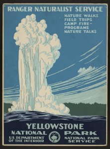
Most posters of the era were hand painted requiring hours of work for one reproduction of the poster. To help mass produce the posters Anthony Velonis, an artist working in the poster division with experience in screen printing, suggested adapting the process for posters. This technique, coined as serigraphy and employed later by artists such as Andy Warhol, significantly influenced the aesthetic of the posters produced. Screen printing is not kind to incredibly intricate designs and requires successive addition of colors. Thus strong lines and bold designs where emphasized. Although many posters are striking and colorful, artists had to think carefully about color use since shading and gradients are hard to achieve.

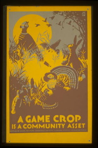
While many different artists brought their owns styles to the poster division, a cohesive aesthetic is easily recognized. The poster’s almost exclusively utilized sans-serif fonts to aid in legibility and clarity at distances. The artists behind many designs are unfortunately unknown, as the works were predominately unsigned. Although only a couple thousand designs are left today, there are many remaining examples of beautiful posters promoting public safety, government propaganda and american values. Many original works are also now reproduced for art and souvenirs.
Sources:
http://www.utne.com/arts/the-art-of-the-new-deal.aspx
http://www.keengraphics.net/keenblog/?p=181
http://www.loc.gov/pictures/collection/wpapos/

4 Comments. Leave new
I never knew the history of these posters. I figured that it was simply a style that was used at the time and did not have much logic behind it. It is interesting to know why this style was created and why the color choices are very limited. For some strange reason they remind me a little of the “keep calm and carry on” posters from WW2. I wonder if the posters were limited in detail and color by how much more it would cost. Not too sure if this is a artistic theme for the posters, or if it because of how much colors cost, but I don’t see many bright colors. The colors seem to be more dull and paint a more depressing picture for me.
Yes, the screen printing technique was used in a lot of posters in the WW2 era as well. Look at the Uncle Sam posters and the yes we can do it!
It’s not so much the limited amount of colors as the way you can use them. Basically, its only one solid “block” of the color and a gradient can only be quasi achieved with different shades of “blocks”. If you look closely the designs are all blocks of one color with distinct lines between the the next as the colors are added one at a time.
Yes, of course only a few colors makes it easier and cheaper but it’s not necessary. It does take a little more creativity and thought make more intricate designs, which is why I am so impressed by some of the posters in either their detail or beauty.
I would bet the screen printing technique was used for the keep calm posters, but I’m not sure. It was the primary method for poster not requiring hand painting after it was popularized by the FAP.
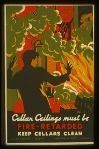
One thing you mentioned was that artists had to be very conscious of their color choices, as it was not easy to mass produce certain contrasts. I found it interesting that some of the pictures you provided had a significantly larger diversity of color than others. For example, the picture promoting a clean cellar has at least six distinct colors that are woven intricately together, while most of the others have no more than four (sometimes only three) and are more simple in their mixing of the colors. Perhaps the fire picture came towards the end of this aesthetic’s era when techniques were more advanced?
It is very interesting to know more of the history of the familiar look of these posters – specifically it does make sense now that the original style was influenced by the great depression/WWII. The look of these posters even makes me think of some of the pictures in the senior design studio in the idea forge…so the look has definitely not gone away!