
I love Wes Anderson films. Primarily, I love his aesthetic- regardless of which film you’re watching, you can always recognize his distinct style. Specific elements that I think underscore this.
First, his shot and scene composition are super-intentional. Visual symmetry and balance are huge elements of each shot he constructs. This video from Vimeo user kogonada illustrates this really well:
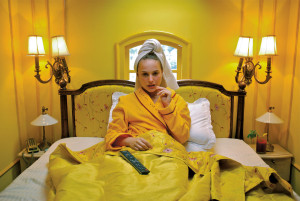
Secondly, these shots are often immaculately composed in their color coordination. Often a near monochromatic color palette is used for emphasis in certain scenes, like this yellow hotel shot from The Darjeeling Limited:
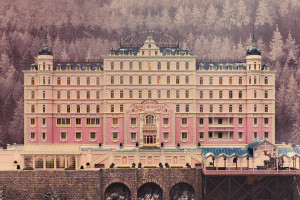
Or the purple and pink cast around “The Grand Budapest Hotel”:
Anderson also has a love for a specific typeface- Futura Bold, which I also adore. It appears in almost every one of his films.
I’ve even gotten criticized in the past for using Futura bold in a film title once, being told, “That’s a little too Wes Anderson”. I suppose this means his aesthetic is so well established that even using single elements of it is considered derivative.
4 Comments. Leave new
[…] clearly values a highly-curated visual aesthetic— her music videos have the look of a Wes Anderson movie mixed with the awkwardness of The Lobster. Surprisingly, she tells me she isn’t very […]
I’ve always been drawn to Wes Anderson’s films from an aesthetic standpoint, and I’ve always felt that his portrayal of the world is one that I would very much like to live in. What’s most interesting to me is how an individual can make aesthetic choices feel like them (i.e. your example with the Futura typeface: you see that typeface, and immediately think of Wes Anderson).
Nice post. I knew he likes to use colors like yellow, pink,etc in his films. But didn’t know about the symmetry, very interesting!
I’ve seen all those films and loved them, but I confess I never connected them by filmmaker. Thank you. The Vimeo montage made my husband laugh out loud.