A movie poster is is meant to draw the eye, tell a story, and encourage movie goers to spend the movie on their film. They are the combination of commercial purpose and artistic expression. Movie posters began in the late 1800s as paintings, usually of a scene from the movie, with a small block that named the title, producer, and director. As the quality of still pictures improved, movie posters were printed with highly edited pictures instead with bold, flashy titles. Most posters on today’s wall remain this way. However, a new form of graphic art has formed from today’s movie posters, minimalist movie posters.
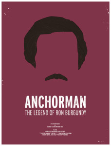
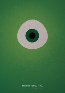
The minimalist graphic art movement can be identified by three periods the De stijl art movement, architects such as Van Der Rohe, and traditional Japanese design. The focus of minimalist design is to keep things simple in color, shape, and typography. The backgrounds are usually solid colored. Minimalist graphic design is popular today in technology ads as well such as Apple.
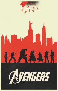
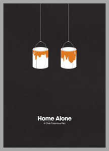
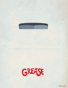
The simplistic movie posters use few colors and focus on a key image that could be easily identified in the movie. For example, the Home Alone poster uses paint cans that were used by the main character, Kevin McCallister, as he was trying to defend his home against robbers. The Grease poster uses a similar key item, the comb. While, the Avengers poster focuses more on a key scene rather than an item.
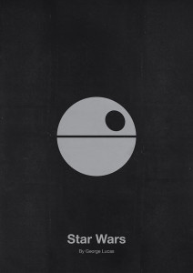
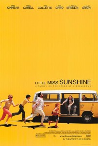
While these posters may not be commonly used in the movie industry, they are considered works of art and can be found on a few DVD movie covers. However, some movie posters are migrating towards a simpler image like the Little Miss Sunshine poster below. The simplistic graphic art movement has influenced more than just the movie poster image. These posters have turned a story into a work of art.
References:
- http://designshack.net/articles/layouts/minimalist-design-is-taking-over-heres-why/
- http://randommization.com/tag/posters/page/7/
- http://everyguyed.com/lookbook/10-movie-posters-inspired-by-mens-style/
- http://splashnology.com/article/100-fresh-minimal-movie-posters/9176/
- http://www.pastemagazine.com/blogs/lists/2012/02/the-best-movie-posters-of-the-past-100-years.html?p=4
- http://www.gamesradar.com/100-amazing-minimal-movie-posters/
- http://www.rsvlts.com/2012/09/24/137-minimalist-and-alternative-avengers-movie-posters/avengers-alternative-minimalist-movie-poster-064/

2 Comments. Leave new
Personally, I love this style of artwork in advertisements. It conveys the message so simply that it almost seems to give it more meaning. The passerby must stop to think of the message and through this process develops a connection with what is being conveyed before even seeing the actual product being advertised.
I truly believe less is more and I try to live my life as simply as possible, eliminating clutter and unnecessary distractions. By being less cluttered, I am able to focus more attention onto what matters.
Seeing as you enjoy this artwork as well, do you try to live your life simply as well or is it purely the aesthetic that draws your attention?
Gotta say I’ve never noticed this trend but the simplistic movie posters certainly draw my eye more than complex ones.
If you had to give your life a movie poster what would it be??