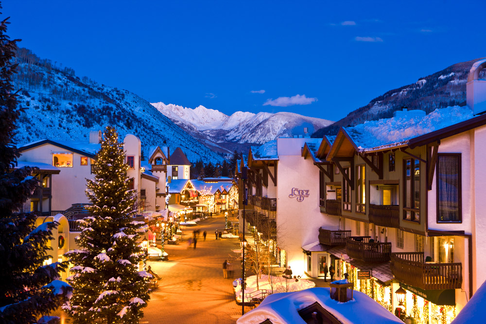
After spending the weekend skiing at Vail (a rare and lucky treat), I’ve been thinking about the quintessential “ski town” aesthetic that the town has established. From your first turn off of I-70, you know that you’re in a special kind of mountain town, one that certainly emphasizes aesthetics and experience over economy or accessibility. In addition to the world-class skiing, I think that visitors are drawn to Vail by its “alpine town” aesthetic, reminiscent of classic European ski towns and alpine villages.
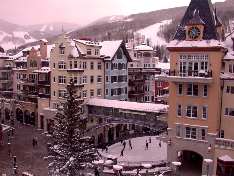
When I began looking at what makes Vail look so classic, I was drawn to the colors and shapes of buildings. Most buildings are brightly colored (notably the Ritz-Carlton, which is humongous and yellow), and many have pointed roofs and/or spires (again, note the Ritz-Carlton). This is such a notable aesthetic because modern architecture often favors duller colors, and towns are often a more varied assortment of building shapes and sizes.
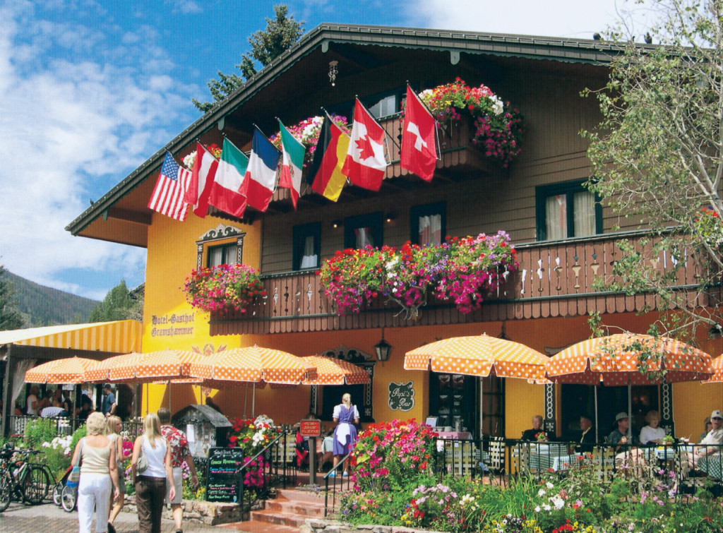
Another great aspect (and my favorite detail) of this aesthetic is the use of balconies, shutters, and trim work on all of the buildings. For instance, the wooden balcony railing at Pepi’s (restaurant with the flags in the images below) has such a characteristic look to it, framing the numerous flower boxes. This ornate detail suggests that visitors can actually enjoy the establishment (and its outdoors) regardless of season, which seems to be a look that much of today’s architecture ignores.
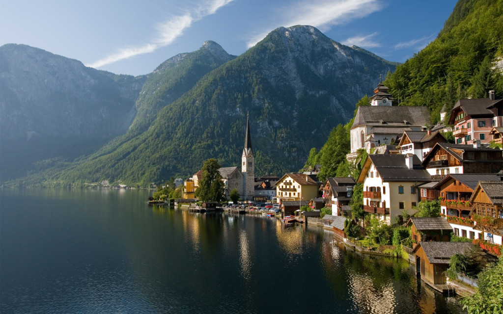
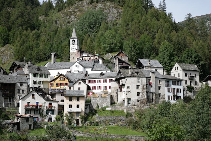
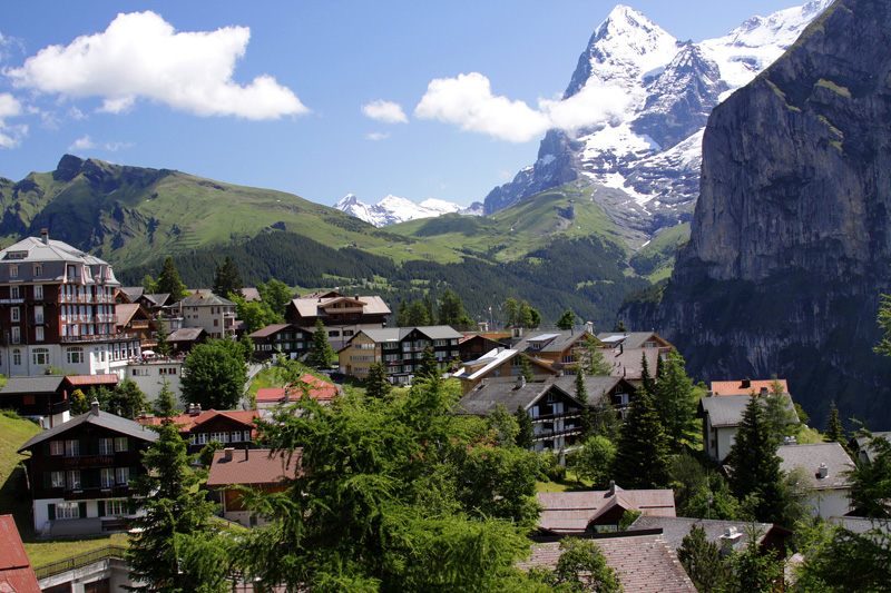
Sure enough, this architecture isn’t unique to Vail and it was indeed inspired by traditional European villages in Austria, Germany, Switzerland, etc. I’ve included some images from these places as well.
My favorite part of most of these images (and the general alpine town aesthetic) is the varied shapes, sizes, and colors of the many buildings framing narrow roadways better suited for pedestrians and cyclists than cars. I hope you enjoy the following images, and if any of you would like to take me to Hallstatt, Austria, I would happily oblige.

2 Comments. Leave new
Nice comparison, Chip. Vail is definitley a town that takes the classic ski town architecture to the limits. Where Vail tends to build vertically, other, smaller, ski towns like Aspen and Telluride and even Crested Butte have grown horizontally due to building height restrictions. I’m not sure exactly how the classic Austrian, French and Swiss ski towns have grown, but it would be interesting to further compare Vail to them.
Great post! I had never thought about the fact that ski towns are so heavily influenced by classic European mountain towns. I like that you mention the year round appeal of the ski town aesthetic. I also like that you used image galleries to condense your images, but I wish that you had included captions on them, if possible, to explain the significance of each (even though you do touch on it in the text).