Google’s Material Design Guidelines (Google.com)
The “Flat” or “Material Design” aesthetic is gaining popularity across multiple different mediums- from digital design to print, to cars, and even fashion. Making a first appearance in 1950s and 1960s magazines and tabloids, the flat aesthetic has continued to gain popularity. After a modern culture boom in skeuomorphism (think fake wood-texture paneling in the 1970’s through the 3D theme of early iPhones), the Microsoft Zune was the first mainstream re-introduction of the minimalist, flat digital theme. Apple adopted the 2D aesthetic again in 2013, rekindling the flat revolution that continues to expand.

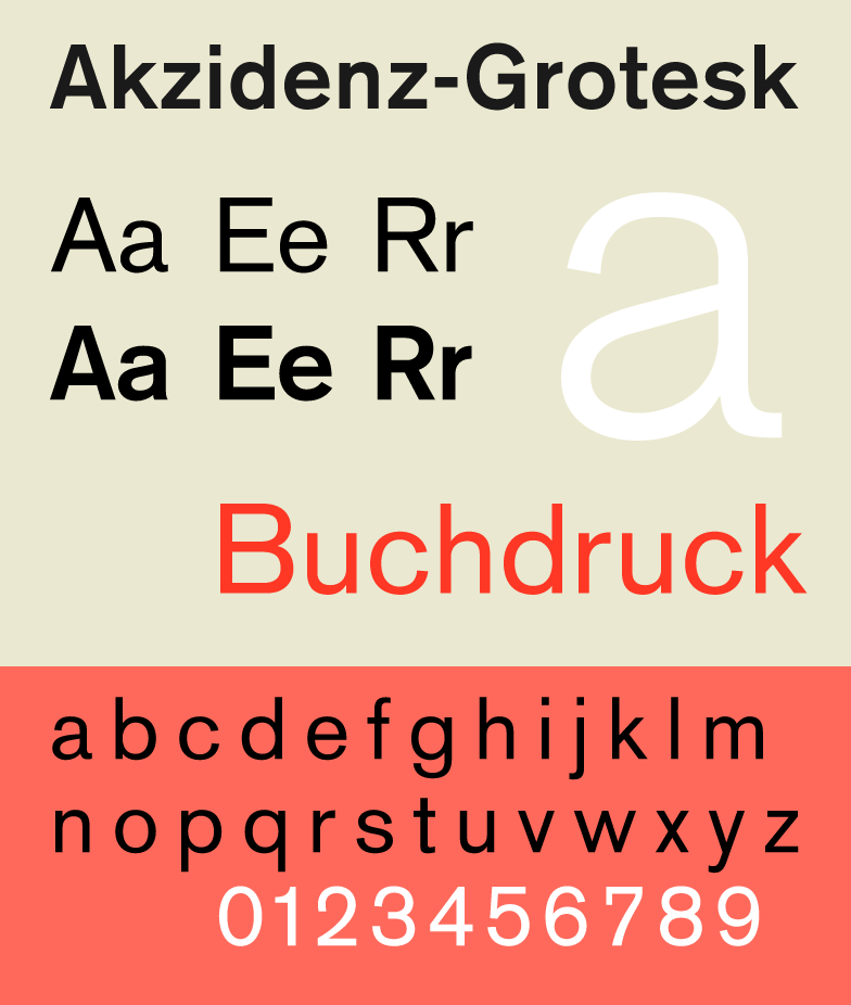
The International Typographic Style, while seemingly “modern” and “trendy”, actually began in Sweeden in the 1950s (above), and saw its American Culture boom in the 70s and 80s. (Pinterest.com)

Flat design on multiple digital platforms (Wikipedia.org)
While digital-medium flat aesthetics continue to grow, the gap has also been bridged to fashion and physical design. Seen below, a flat UI (user interface) browser is used to purchase flat-themed shoes. #FlatCeption

A digital Flat User Interface being used to purchase a Flat-themed pair of shoes (TopDesignMag.com)

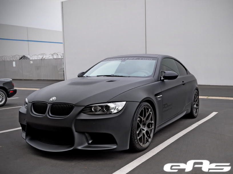
BMW’s “Frozen” factory paint option, ditching the 3D highlighting gloss for a matte, almost 2D finish (Cars.com)
References:
https://www.smashingmagazine.com/2009/07/lessons-from-swiss-style-graphic-design/
http://thenextweb.com/dd/2014/03/19/history-flat-design-efficiency-minimalism-made-digital-world-flat/
http://www.awwwards.com/flat-design-an-in-depth-look.html
https://www.google.com/design/spec/material-design/introduction.html#introduction-principles
https://en.wikipedia.org/wiki/Flat_design
https://en.wikipedia.org/wiki/Flat_design
http://www.topdesignmag.com/?s=flat+design
https://en.wikipedia.org/wiki/International_Typographic_Style

1 Comment. Leave new
Dear Kevin,
For a post on “flat” design, this was a very dynamic introduction. This aesthetic is one that I recognize, but wouldn’t have identified myself. It seems that many modern websites (even the one I’m using now) seem to follow this aesthetic. I wonder how far it will go, before more ornate details become more popular again.