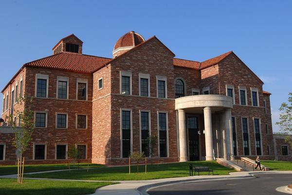
In modern architecture, the retro-style appears when brand new buildings are built with the same features (brick facades, roof materials, etc.) as the older buildings that surround them. The time difference between the new and old buildings is often nearly a century. This aesthetic instills a sense of oneness/homogeneity and nostalgia to the region in which it is applied. Modern baseball stadiums (since the early 90’s) have heavily used retro-style architecture.
Here are some examples:
Left to right: Coors Field (1995), Mine & Smelter Supply Warehouse (1909), Zang Building (late 1800s)


Left to right: Camden Yards (1992), B&O Warehouse (1899)
Left to right: AT&T Park (2000), Baker & Hamilton Building (1905)


Left to right: UMC (1953), Norlin Library (1939), Koelbel (2007), Champions Center (2015)


1995 New York Times article discussing the architecture of Coors Field upon first impression.
“With all that retro ornament, it’s as if the stadium had been dipped in sepia.”
A great article from the Baltimore Sun about Camden Yards, which opened the retro movement in the MLB.
“…the stadium became a unique, organic component of the rejuvenation of the downtown area.”
A bit of history behind the “Tuscan Vernacular” style of CU-Boulder’s buildings.
“…Klauder returned with the buildings sketched in a new wrap of laid-up sandstone walls, red tile roofs, and Indiana limestone trim…To this day, all Boulder campus buildings have been constructed in the unique style and vocabulary of building materials.”


3 Comments. Leave new
I think Retro Architecture is quite prevalent now. It seems like there are a lot of industries and subsections of life where retro is making a comeback. Your side by side visual comparison helped to illustrate the similarities between the architecture.
I see this aesthetic applied in many ski towns across Colorado, where the new construction is built to mirror earlier “classic” ski area construction. This is especially apparent in Steamboat CO where all new commercial construction must meet city mandated visual cues.
Yes! I know the CU Architect has been very protective of the Tuscan Italianate look of the campus, trying to keep it consistent over time. There are notable exceptions, unfortunately, like the Engineering Center….