Opposite Upcycle Aesthetic: Realistic Body Proportions
My upcycle aesthetic is on the abstract side of art with inspiration from the artwork of Duane Flatmo, an artist based out of Eureka, California. I feel compelled to state that there has been a design update before being able to properly launch into the discussion of an opposite aesthetic.
I am currently making a paper mache head with a foam body that uses elements from this style. The marionette body was a slight change from my previous design that instead set a bakery scene with a platform as a stand. I received two insightful comments for my last blog post that highlighted how the baker’s head in the last design could lead to support issues with the head being top heavy, which could cause the baker to fall over. A couple of days before I got these comments, I watched two videos made by an artist named Rod Bergeron that instructed how to make a marionette head and body.
Videos (Opens Youtube link in a new tab):
I have acquired the materials for the paper mache, but still need to construct the head and body.
Opposite Aesthetic
The opposite of Duane Flatmo’s style in my opinion would be a correctly proportioned body. To fully get this effect I would use the form of a person in proper perspective to make the head and the body sized realistically in relation to one another.
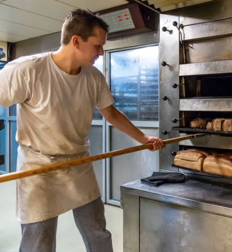
For inspiration, I found a photo of a baker taking bread out of the oven and used that pose for a realistic sketch outlining the body positioning.

Image 1: Baker taking Bread out of Oven (istockphoto.com)
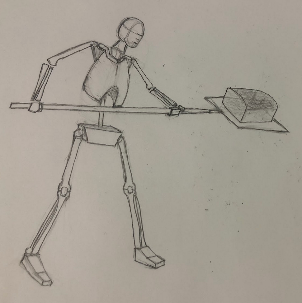
I then sketched the same body position for my proper body proportion realist aesthetic.

Image 2: Baker Skeleton with Realistically Proportioned.
If I was to continue down this path, I would make a model using this sketch and a thicker paper mache mixture. The thicker mixture could be more like clay, which would be a better material for a sculpture.
References:
Rod Bergeron’s YouTube channel: https://www.youtube.com/@WatercolourQuickandEasy
Istockphoto: https://www.istockphoto.com/photo/baker-taking-bread-out-of-oven-gm1333704500-416097001?phrase=dutch+bakery&searchscope=image%2Cfilm

2 Comments. Leave new
This is a really cool point of view in terms of your aesthetic. Since your aesthetic incorporates wacky and unproportional designs, I like how you used the proportional point of view for your opposite aesthetic. Do you think that making the paper mache head in a wacky shape would be easier to carve out of foam or paper mache?
Hi Andres, thank you for the nice comment. After doing the paper mache, I think the foam would have been easier to manipulate and place the facial features on the head, but it might have been more difficult to paint. I will have to try using foam instead and let you know what I think!