Blog: What are your current project aesthetics compared to 20th Century design movements? Also, cast your project into 3 other wildly different aesthetics; illustrate with annotated sketches at least.
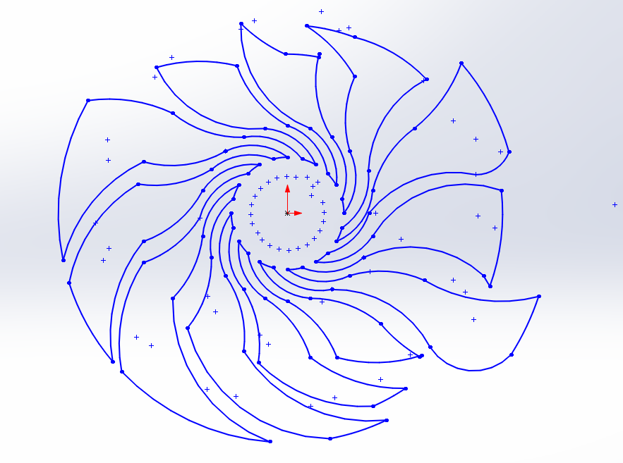
My dynamic kinetic aesthetic creates an eye-catching abstract design. It does this by combining sharp edges, curves, and a couple other visually appealing components. The blades will be either acrylic or wood and be attached to the base of a wooden frame. The wood will be stained a dark color, and various etches can be made if time is left over. Additionally, I can play with adding a couple LEDs.

Due to the ease of cutting the blades I’ve created, a 20th century art movement could be easily created and compared to the one I have created. In fact, my aesthetic resembles abstract already. However, shown below are a couple other other potential designs.

Pop Art: Due to the geometry of the blades, I can add a 20th century pop to the already existing abstract design. This can be done once the blade is cut out or even cut into the center of the blade using small dots, comic art, or any other cultural object.

Cubism: Instead of changing the design of the blades, I can also change the design of the base with smaller pieces of wood or stain the wood in multiple areas. This would give the aesthetic of cubism which is a 20th century art movement.

Neo Impressionism/Pointillism: I also have an idea of keeping the base the shape, but taking paint and adding a 20th century design of neo impressionism. This art movement emphasizes spontaneity and randomness.


3 Comments. Leave new
Nice! I like your version with the different smaller pieces of wood. I feel like this could be a cool direction to take your project.
Clare, I absolutely love the work of Georges Seurat, who is perhaps the most well-known pointillist painter. How would you apply the aesthetic to your work in a way that is not limited to a coat of paint? I am sure there is some room to combine the qualities associated with kinetic sculpture and the aesthetics of pointillism.
Cubism played a lot with space. I would be interested in seeing what you would do to further introduce the Cubist interpretation of space as a major component of kinetic sculptures, which are focused entirely on the exchange of movement and the space in which the movement takes place.
By the way, I had more words for that last sentence but that was all I could chop it down to in the time I had remaining.
The design is pretty cool, and in this you played around a lot with adding different designs to the base of the project. Have you considered what you will put on the base of this to further enhance the aesthetic, if anything?