My aesthetic is something that I am defining as Chaotic. There is hardly order in the structure of what visually makes up this lampshade. What you see on the outside are pointed leaves of multicolored paper shrouding the light in a way that has no pattern. Light is able to peek through at random spots where there is enough of a break between two leaves.
The brainstorming activities we did in class didn’t help much sadly….
- I struggled coming up with both WHAT I would make and HOW I would make it.
- I couldn’t decide which question to start with
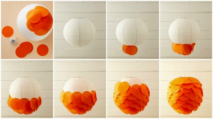
- Eventually, I had an idea to make some sort of lantern similar to the one below because I could use many different types of materials in building one. I liked the way it followed a repetitive pattern as well.

Once I decided on my Object…
- I messed around with what a lantern would entail. I figured that I would personally want to add some sort of lighting.
- Rather than devise a way to light an object by itself, I realized that making a lampshade was similar to a lantern.
- Finally, I have had a bunch of newspaper sitting around, so I decided to put some to use.
- Materials:
- Newspaper
- Cardboard disc
- Glue
- Scissors
- Paper bowl
- Stapler
All of the materials apart from the newspaper were found around my workspace at work.
I envisioned making something that was a low more flowy that what ended up being created, which in hindsight would have required many more long strips than I made. Furthermore I would have tried using a different frame for a better shape.

Cardboard base 
initial structure of the frame 
all the newspaper at my disposal 
the newspaper cut into flag strips 
my second and final frame design 
my second and final frame design 
In the process of gluing on strips

Next Step:
I’m going to actually use it!
If I remade it I would like to use a different material, newspaper was just readily available and free.
- If i used fabric and ironed each piece, they would hang down nicely
Try different shapes
- Maybe a box, or a better sphere shape
https://docs.google.com/presentation/d/1gUdlGVbD1e6R5JMCBDpv_MhGVFWOwEIDpKIJ_fycVJ8/edit?usp=sharing

12 Comments. Leave new
[…] Upcycle Final Post […]
the project turned out nicely. good job. loved the use of newspaper to spread the light. would be cool if you could somehow make the strip of paper to show an image of some sort.
The use of something lightweight like newspaper gives this a underwater feel when you move it. It’s mesmerizing to look at. Hanging it outside (on a dry day) would look cool too.
Sam, I like the chaotic aesthetic and I’m glad you included a picture of it in use. I think maybe you could have used less strips or maybe different kinds of paper to allow the light to shine threw a bit more.
I really like the aesthetics behind this design. In addition, I like how you executed this idea using newspaper. I think using metal and fabric will make this design look more aesthetically pleasing.
Hi Samuel,
Nice project and presentation! I really like the out of the box thinking you used to come up with this project idea. I think the final product turned out really nice and I love the idea that you are able to use it in your everyday life as well. Great job!
The shade looks really good in use. I would like to see it made with a fabric like you said you want to do in the future. I think having control of the color scheme will add a lot to this project! I’m sure it took a lot of patience so great work!
I really like the chaotic approach to this project, especially with all of the random newspaper clippings. I think using fabric would be a good idea for future revisions of this project, and you could use more variety in your designs. As you mentioned, you could use one solid color for the “leaves” of the shade, or even multiple different colors/textures to maintain that chaotic aesthetic.
Hello Sam, you did a great job with your presentation. You did a great job applying your aesthetic to your piece, and created something that could actually function in the role you designed it for. There are definitely some improvements you could make, but you covered most of them in your presentation. Great job!
It reminds me of a Truffula tree from the Lorax. Maybe use thinner paper or colored tissue paper that they use for gifts to allow more light to shine through.
This is a very unique idea. It forsure looks cooler when it has an actual lamp under it. It would be really neat to see what this project would look like using fabric instead. Maybe give that a shot if you ever have a ridiculous amount of free time.
Such an original idea! I don’t think I’ve ever seen a lamp shade made out of newspapers before. I am surprised not more light comes out since it is just paper. Good job!